De Toren Brand Identity by Myrthe Koppelaar |
Home > Winners > #107010 |
 |
|
||||
| DESIGN DETAILS | |||||
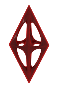
| DESIGN NAME: De Toren PRIMARY FUNCTION: Brand Identity INSPIRATION: The owners of De Torren are down to earth with an ambition to deliver sky high quality. These high standards along with their company name, which refers to our majestic city church, inspired me to implement the upwards geometric shapes into the design. We wanted to break the mould for Cafeterias, by developing a logo that emphasised the high standards and quality, rather than meeting the common design type associated with the industry. UNIQUE PROPERTIES / PROJECT DESCRIPTION: The logo of ‘The Tower Cafetaria’, is an abstract representation of marrying the core product and the love for their majestic city church. Influenced by the excellent standards in product preparation, the geometric shapes take formation of a shield. OPERATION / FLOW / INTERACTION: The visual brand identity and with the most important item, the logo, reinforces the brand since it is a recognizable clear identity. Especially since the identity by its whole is recognizable and repetitivly shown. Both offline and offline, on the road with deliverys and in the cafetaria itself. I made sure in the complete customer journey from approaching the cafetaria, entering, using, leaving the brand is visible by the customer itself and by others in the surrounding. PROJECT DURATION AND LOCATION: The project started on march 2019 and was launched februari 2020 FITS BEST INTO CATEGORY: Graphics, Illustration and Visual Communication Design |
PRODUCTION / REALIZATION TECHNOLOGY: Before starting on the design of the logo, I conducted ‘brand sessions’ with the client to get a feeling for the work they do, their beliefs and their passion. I dived into the product(s), their working processes, competition and target. I designed the logo in Adobe Illustrator. I will draw and shape the feeling that initially comes to me with my Wacom Pen. Out of curiosity and striving for perfection, I will adapt and create up to a dozen variants to ensure the optimum option is available. In the logo I applied synergy in geometry and aligned the logo by using the ‘Rulers’ and ‘Transform Tool’ in illustrator. SPECIFICATIONS / TECHNICAL PROPERTIES: I aligned the design in shape and whitespace. The vertical cut-outs have the same width and the titled vertical cut-outs in the top of the logo have the same width as the lines of the logo itself. The vertical white spaces between the lines are twice the width of the lines. Within the design I have repeated certain dimensions. On the points where I didn’t meet the exact alignment and coordination thereof, I made the design smooth for the eye. Alignment and using golden ratio is supportive to my design, not a goal. TAGS: Brand identity design, logo design, geometric design, geometry, food, cafetaria RESEARCH ABSTRACT: Next to the branding sessions where I dig into the clients belief, passion, work processes I researched the product, experience and taste as well as the into the product, and client I research the competitors. This was orientated on the communication style, visual identity and branding of competitors nationwide and abroad. I focused on what is common for the type of business, why the product and brand is or should be unique and what the motives of the customers were to buy the product CHALLENGE: At the start of the project, I had an uncertainty about the company name; De Toren. The name is orientated on the current location (the church parallel to the Cafetaria), which could become a restraint on expanding the business to new locations in the future. My challenge was to explain this to the owner, as I believe my duty as brand manager is to forsee upcoming events and highlight any barriers or opportunities that may arise to the business of my client. ADDED DATE: 2020-06-24 07:53:01 TEAM MEMBERS (2) : Interior Design: https://www.Interieurrr.nl, Rudi Rijvers, Maartje de Ronde and Website Design: B-online, Bente Hemmes, Kevin de Widt IMAGE CREDITS: Video and sound credits: Photographer Ruben Klink Aerial Photography, 2019. Image #2 credits: Photographer, Bas de Nijs, B-online 2020. |
||||
| Visit the following page to learn more: http://www.cafetariadetoren.nl | |||||


| CLIENT/STUDIO/BRAND DETAILS | |
| NAME: De Toren Cafetaria PROFILE: De Toren Cafetaria is a friendly restaurant in the city centre of Breda, The Netherlands. Very common for the Dutchies, but they serve from a vending machine! It has little-coin operated compartments from which you can grab a typical Dutch snacks such as a ‘kroket’. This restaurant also serves fresh and tasty fries which the Dutchies like to drown in a topping called ‘Mayonaise’. At least.. that’s what they said the now infamous scene In Pulp Fiction! De Toren beliefs in a new form of craftmanship and their passion for traditional cuisine and selected selected quality ingredients go hand in hand with local partnerships and the latest techniques. Also their typical and oldskool vending machine has been improved with wireless payment! |
|

| AWARD DETAILS | |
 |
De Toren Brand Identity by Myrthe Koppelaar is Winner in Graphics, Illustration and Visual Communication Design Category, 2020 - 2021.· Press Members: Login or Register to request an exclusive interview with Myrthe Koppelaar. · Click here to register inorder to view the profile and other works by Myrthe Koppelaar. |
| SOCIAL |
| + Add to Likes / Favorites | Send to My Email | Comment | Testimonials | View Press-Release | Press Kit |