DESIGN NAME:
Blue Moon
PRIMARY FUNCTION:
Classroom
INSPIRATION:
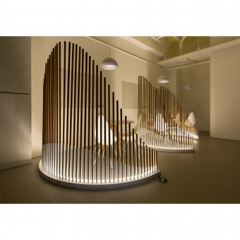
A phenomenon whereby the full moon does not appear according to the calendar rules is called Blue Moon. Once in a Blue Moon is a metaphor of this project, which not only describe the unique concept of the project but also brings out the imaginative space. The different sizes of the floating concrete decoration represent mysterious feeling of the moon. The freely arrangement of the screen consists of the two sinusoids and the circle is exactly mimicking the moons changeable but periodic characteristics.
UNIQUE PROPERTIES / PROJECT DESCRIPTION:
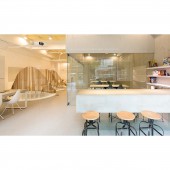
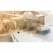
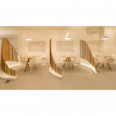
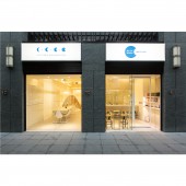
Unlike the learning environment of conventional cram schools, this project runs through the entire design with smooth and open circulation planning and transparent visual scale. All fixed objects in the space are supported by reinforced glass, and the design of floating cement makes each of the teaching area be plainly visible. The screens in public areas are designed with the concept of elements, undergoing an organic arrangement, and freely adjusted and configured according to the needs. The facade of the screen brings the sinusoidal curve concept.
OPERATION / FLOW / INTERACTION:
The left half part of the space is planned as the study group discussion space, which visually presented as a dynamic and tangible louver wall, which can be adjusted flexibly and create a variety of spaces. The right half part is planned as classrooms, displayed with static invisible glass, which greatly reduces the stiffness of the space. The completely transparent and free space not only allows students in the teaching group to interact, but also enables communication between different teaching groups. It also allows the space to express itself and form a connection with the community.
PROJECT DURATION AND LOCATION:
The project finished in January, 2019 in Taipei, Taiwan.
FITS BEST INTO CATEGORY:
Interior Space and Exhibition Design
|
PRODUCTION / REALIZATION TECHNOLOGY:
The create the louvers that are used to separate the interior space with sinusoidal curve shape, the length of the first layer of the iron pipe is welded to the iron base, and the second layer using wood material to create a different magnification, combined with LED light on the white iron mart so that the arc-shaped design can be highlighted. The concrete wall of the classroom space is supported by the floor slab slab, and the design of glass partitions and glass doors below is used to allow the space to visually bring imagination of the concrete wall floating in the air.
SPECIFICATIONS / TECHNICAL PROPERTIES:
The design area is about 105,7856 square meters, and the layout is divided into classrooms and toilets.
TAGS:
Chord, round, Language agency, Commercial space, organic, floating.
RESEARCH ABSTRACT:
In response to the business philosophy that the client believes that learning English should be learned in daily life and implemented in daily environment, yet the biggest issue in this case is the balance and interaction between public and private spaces. How to define public and private space, whereas the public spaces must be open and shared, while private spaces mush be private. After the functional goals, the visual and auditory feeling are achieved in the common space.
CHALLENGE:
The design team must first sort out the suitable space layout for this kind of learning environment, and then achieve the functional concept of this educational institution to meet the functionality of different group learning methods in a limited space. In addition, the wall used to define the size of the classroom is also challenging during the production process. The design team uses the mathematical formula to accurately calculate the curve using sine graph, so that no matter the louver is reorganized of decomposed, it can maintain the beauty and rhythm of the space.
ADDED DATE:
2020-06-24 05:53:20
TEAM MEMBERS (1) :
Andrew Chih-Chieh Liu
IMAGE CREDITS:
TO DESIGN CO., LTD.
|


