DESIGN NAME:
Dr Pet
PRIMARY FUNCTION:
Commercial Space
INSPIRATION:
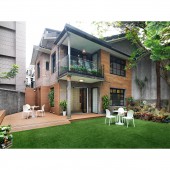
The two-story brick building was originally the residence of wealthy people in Taiwan in the early days. However, since the former family that lived there left the place, the building was abandoned for a long time without use, and has so many signs of age. After the meeting, the client decided to transform it into a pet club, citing the similar pronunciation of doctors / probiotics, and named the club "Dr. Pet", as a custom pet food containing probiotic ingredients, at the same time, provide each customer with a beautiful space where they can communicate with each other and accompany their pets.
UNIQUE PROPERTIES / PROJECT DESCRIPTION:
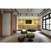
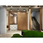
As modern people pay more and more attention to pets, child-friendly commercial space have appeared. According to the client's brand concept and product characteristics, this project especially created a comfortable pet club with the popular photo-check-in culture, ingenious product display, lively color matching, spacious indoor and outdoor areas. In addition to trying to draw closer to the neighborhoods through open space planning, the design concept retains the original historical value of the building, uses the original features and materials of the house.
OPERATION / FLOW / INTERACTION:
The whole area is mainly based on the old site, highlighting the original characteristics of the old house, and giving the building new value. However, since the site was originally a residential building, it is now used as a commercial space, so that the spatial layout is inevitably different. In addition to have more interaction to the community with open space, the design team has re-planned the circulation at the entrance of the building and the compartments on the first-floor area to bring a smoother and more spacious activity area.
PROJECT DURATION AND LOCATION:
The project finished in September, 2018 in Taipei, Taiwan.
FITS BEST INTO CATEGORY:
Interior Space and Exhibition Design
|
PRODUCTION / REALIZATION TECHNOLOGY:
Brick grille, imitation stone tiles, terrazzo, natural wood veneer, customized furniture, iron, clear glass, sleepers, artificial turf, stone paint.
SPECIFICATIONS / TECHNICAL PROPERTIES:
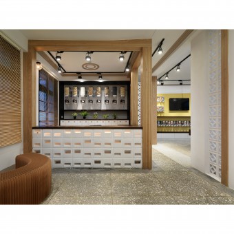
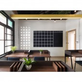
The design area is about 132.23 square meters, and the layout is divided into grass hall, reception area, rest area, live broadcast area, display area, and office.
TAGS:
Old house renovation, commercial space, hard and soft materials, brick house, modern, pet club.
RESEARCH ABSTRACT:
The design team combines the original historical culture of the site with the popular equipment to create a bright and comfortable resting space for this purpose. The overall layout is to create a unique space like a pet amusement park with open and spacious spaces, lively color selections, and a natural and comfortable environment. The reception design is mimicking the traditional counter just like the one in the traditional Chinese medicine shops, echoing the brand's spirit of tailor-made food according to the pet's physique.
CHALLENGE:
The design team not only needs to repair the old equipment of the building, but also needs to readjust the layout with the consideration of modern commercial space, to achieve the purpose of the brand setting up a store. A site with many years of history with more than a decade ago design techniques used, and the overgrown environment are all the difficulties encountered during the construction process. However, because the design team invited the experts from various fields to identify the site problems and find suitable solutions, through continuous thinking to overcome the conditions of the site one by one.
ADDED DATE:
2020-06-22 10:42:16
TEAM MEMBERS (1) :
CHUN-HSUN HUANG
IMAGE CREDITS:
QI-MIN WU
|
