DESIGN NAME:
Tranquility
PRIMARY FUNCTION:
Residential
INSPIRATION:
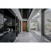
When a structure is surrounded by illuminated water and greenness, the design is no longer merely decorating the space, but to adapt to the environment, to arrange the best circulation around it, and to maximize the beauty of the environment itself so that the rustic taste of nature could be integrated into life. In addition, the unrestricted, timeless design vocabulary of the structure's black, gray, and white appearance was extended into the interior, creating a quiet and contemplative space.
UNIQUE PROPERTIES / PROJECT DESCRIPTION:
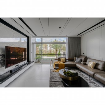
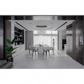
The large French window view fully presents the outdoor garden landscape. Constructed with only simple, clean-cut outlines and Morandi colors, sunlight floods every corner of the residence and projects onto the orderly display. As time passes, the pattern of intertwined light and shadow depicts the composition of joyous times. Meanwhile, via reflections of mirrors, the scenery outdoors is cleverly introduced into the room.
OPERATION / FLOW / INTERACTION:
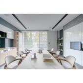
The clients can enjoy the unobstructed view of the garden in the dining area on the first floor, the living room, study, and bedroom on the second floor. The front of the garage is directly connected to the rear, and with it being an open space, the greenery in the garden could be seen at a glance. At the same time, multi-layered light strips are utilized as a visual reference, and exhibition lights were installed in multiple angles so that the technical light source could project onto the gray and white semi-open space of the main structure.
PROJECT DURATION AND LOCATION:
This project finished in the 2020 East District in Chiayi City, Taiwan.
FITS BEST INTO CATEGORY:
Interior Space and Exhibition Design
|
PRODUCTION / REALIZATION TECHNOLOGY:
Marble, Quartz, Dekton, Fenix, Mineral coating, Laminate flooring, Titanium plating
SPECIFICATIONS / TECHNICAL PROPERTIES:
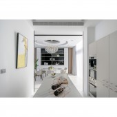
The designers altered the design of the high-ceiling loft by reducing the number of partition walls, which cleverly increases the horizontal space. The usage of squares, lines, and colors of different shades divides spaces with different functionalities and creates a visual partition effect. With the supplement of the titanium-plated mirror-like ceiling design, the longitudinal visuals are able to extend upward, stretching the vertical axis of the space and creating a more spacious visual effect while also increasing the sense of multi-layered rhythm under diffused light.
TAGS:
Minimalism, Morandi colors, Enframed scenery, System cabinets, Mirror surface, Titanium plating, Italian coating material
RESEARCH ABSTRACT:
Massive windows allow the landscape outdoors to become the visual subject. The interior is constructed with only simple, clean-cut outlines and Morandi colors, sunlight floods every corner of the residence and projects onto the orderly display. As time passes, different angles and aspects come to the forefront. The stones used to refurbish and decorate the interior adorn the warm-colored wooden furniture, creating freshness and elegance for life. The mirror surface and titanium materials used in the ceiling design stretch the longitude of the space under diffused light and shadow and drive the visuals covertly.
CHALLENGE:
There were many beams and columns in the original structure, so the designers divided the space with the use of precise square lines and paired it with clever circulation planning to create the effect of lights and shadows extending and reduce visual blockage, and to construct layered and variable intersecting axes to space, creating a set of more livable vocabulary. As for the issue of the ceiling is relatively lower, the designers were able to extend the space upwards not only through the utilizing of a mirror surface and titanium plating.
ADDED DATE:
2020-06-22 07:10:11
TEAM MEMBERS (1) :
KENG YAO CHANG, CHIUNG YING CHIU
IMAGE CREDITS:
SAN.O INTERIOR DESIGN
|
