Novacolor Paint Showroom by Peihe Xie |
Home > Winners > #106881 |
 |
|
||||
| DESIGN DETAILS | |||||
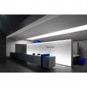
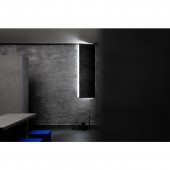
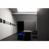
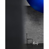
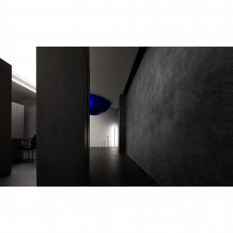
| DESIGN NAME: Novacolor PRIMARY FUNCTION: Paint Showroom INSPIRATION: It is located at a mall's corner, which seems like a forgotten area because of its low person flow. Therefore, changing this situation is a very important part of the design strategy. Novacolor was established in Italy, and originated from developing some natural mineral paints that have a long history. The design team aims to display 200 paints' textures and colors harmoniously in a 180-square-meter space, and attract more customers through eye-catching exhibition and wonderful experience. UNIQUE PROPERTIES / PROJECT DESCRIPTION: The transitional space's opening is specifically downsized, which is a clue to enter a world of different emotions and styles. The small blue ellipsoid hung on the top echoes with the curve of the plane and generates a strong sense of power. A flexible space is divided by a sphere. The perceptual area is created through the meticulous geometric order. It's a place of contradiction and coordination. OPERATION / FLOW / INTERACTION: Generally, a space is enhanced by proportions, shapes, material, light and details, but this time, the focus of the space is material, which needs to be exhibited. The space provides people with more opportunities to communicate and interact. The natural white color, gray cement texture, silver metallic paint wall and the black travertine wall of the entrance are organically integrated in the space. PROJECT DURATION AND LOCATION: Design time: March 2020 Completion time: July 2020 Location: Shantou, Guangdong Province, China FITS BEST INTO CATEGORY: Interior Space and Exhibition Design |
PRODUCTION / REALIZATION TECHNOLOGY: In terms of material, the natural concave-convex metallic texture and the blue sheepskin texture create a contrast. Meanwhile, more than 200 material templates are employed in a low-key way to demonstrate their conciseness in the space. An artistic paint showroom is presented through contradiction. SPECIFICATIONS / TECHNICAL PROPERTIES: Area: 180 sqm Main materials: Stainless steel, paint, microciment, transparent film, switchable glass TAGS: Art, Paint showroom, AD Architecture, Cinematic and dramatic RESEARCH ABSTRACT: Light is an important medium for expressing the emotion of a space. Tesioned membrane structure is applied in a large area to emphasize the softness of light. The structure enhances the products' lighting effect. Besides, the light and shadow are partially intensified to express the texture of the material and the restless feeling of the space. A repressive power is likely to be released. This time, the team regarded the design as an aesthetic practice, and tried to do something heart -touching. CHALLENGE: The biggest problem of this project is located at a mall's corner, which seems like a forgotten area because of its low person flow. Therefore, changing this situation is a very important part of the design strategy. ADDED DATE: 2020-06-22 06:19:31 TEAM MEMBERS (3) : Chief designer: Xie Peihe, Design team: AD ARCHITECTURE and IMAGE CREDITS: Ouyang Yun |
||||
| Visit the following page to learn more: https://reurl.cc/NXrObp | |||||
| AWARD DETAILS | |
 |
Novacolor Paint Showroom by Peihe Xie is Winner in Interior Space and Exhibition Design Category, 2020 - 2021.· Press Members: Login or Register to request an exclusive interview with Peihe Xie. · Click here to register inorder to view the profile and other works by Peihe Xie. |
| SOCIAL |
| + Add to Likes / Favorites | Send to My Email | Comment | Testimonials | View Press-Release | Press Kit |

