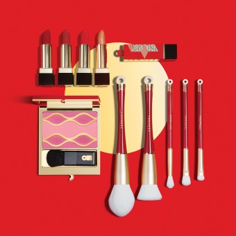
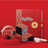
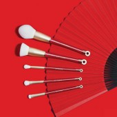
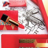
China Red Cosmetics Packaging by Centdegres Cent Degres Co Ld |
Home > Winners > #106781 |
| CLIENT/STUDIO/BRAND DETAILS | |
 |
NAME: CENTDEGRES PROFILE: Founded in Paris in 1988, centdegrés is an independent international brand intelligence and design firm. Through all the international agencies, centdegrés counts more than 100 creative people. The agency stepped into China in 2008 and has been accompanying local clients to build strategically unique, valuable, durable, desirable brands. Through years, centdegrés has acquired a good understanding of the Chinese culture and heritage. Chinese background combined with the French creative expertise allows the agency to answer accurately its clients demand. |
| AWARD DETAILS | |
 |
China Red Cosmetics Packaging by Centdegres Cent Degres Co Ld is Winner in Packaging Design Category, 2020 - 2021.· Press Members: Login or Register to request an exclusive interview with Centdegres Cent Degres Co Ld. · Click here to register inorder to view the profile and other works by Centdegres Cent Degres Co Ld. |
| SOCIAL |
| + Add to Likes / Favorites | Send to My Email | Comment | Testimonials | View Press-Release | Press Kit |

