Anta Office by Oatson Interior Design |
Home > Winners > #106420 |
 |
|
||||
| DESIGN DETAILS | |||||
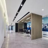
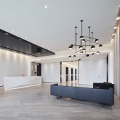
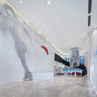
| DESIGN NAME: Anta PRIMARY FUNCTION: Office INSPIRATION: The characteristics and positioning of Anta's different brands were taken into account during the design of each floor. In fact, the visual elements related to sports and Anta can be seen as early as in 1F. Smooth grey lines, the huge sports figure formed by white lines, the red "A"-like brand logo, and numerous black figures indicating different sports events, all outline the brand strength, speed and beauty. UNIQUE PROPERTIES / PROJECT DESCRIPTION: As one of the most popular sportswear brand in China, Anta has set the pace and won over its rivals in several major transformation and upgrading processes of sports goods in the past years. To lay out the international strategy, Anta took an important step to establish Shanghai headquarters, which is undoubtedly noteworthy. The interior design of the headquarters was approached based on Anta's special needs, which is personalized and eye-attracting. OPERATION / FLOW / INTERACTION: In the resting area on 2F, the brand red color was utilized as the main backdrop hue, signifying Anta's vigor and progressive spirit. Besides, the words "To become a respected world-class, multi brand sportswear group" on the wall clearly convey its brand vision. 3F takes FILA's iconic blue as the key color, highlighting the brand's characteristics with a bright bold design style and distinguished spatial ambience. PROJECT DURATION AND LOCATION: The project started in May 2017 and finished in April 2019 in Shanghai, China. FITS BEST INTO CATEGORY: Interior Space and Exhibition Design |
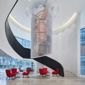
PRODUCTION / REALIZATION TECHNOLOGY: For 1F, part of its space has a high ceiling of 8 meters, and the large LED screen is visible from the outside. Rolling advertisements for the brands in Anta Matrix on the screen show the unique brand positioning and serve as a clear identifier. On the outer side of the swirling stair railing are, from top to bottom, the silhouettes of the Shanghai, indicating the location of Anta headquarters. SPECIFICATIONS / TECHNICAL PROPERTIES: In the Shanghai headquarters, each of the floors from 2F to 5F is occupied by one brand, such as Anta, Fila, Kolon Sport, and Descente. TAGS: interior design, workplace, brand, modern, international RESEARCH ABSTRACT: In an era greatly valuing the appearance, Anta has put many efforts in improving the style and image of products. And in Anta's numerous stores, the capacious circulation, decent displays and dynamic posters produce a high-end and comfortable interior atmosphere. As the base of Anta brands, the interior design of Shanghai headquarters also attaches great importance to the appearance and visual impressions, which not only provides a comfortable working environment for employees and managers, but also salutes Anta's ambitious path of brand internationalization CHALLENGE: The finishing materials used in the project include custom aluminum plate paint, steel plate paint, cement effect paint, ultra-white painted glass, oak wood veneer, Ariston marble, and granite, etc., which present a simple and natural overall design style and also manifest craftsmanship in a plain manner. Besides, they are also green and environmental-friend ADDED DATE: 2020-06-04 12:14:32 TEAM MEMBERS (2) : Chief designer: Yan Deng and Chief designer: Jia Rong IMAGE CREDITS: Oatson Interior Design, 2020. |
||||
| Visit the following page to learn more: http://www.oatson.com/ | |||||
| AWARD DETAILS | |
 |
Anta Office by Oatson Interior Design is Winner in Interior Space and Exhibition Design Category, 2020 - 2021.· Read the interview with designer Oatson Interior Design for design Anta here.· Press Members: Login or Register to request an exclusive interview with Oatson Interior Design. · Click here to register inorder to view the profile and other works by Oatson Interior Design. |
| SOCIAL |
| + Add to Likes / Favorites | Send to My Email | Comment | Testimonials | View Press-Release | Press Kit |
Did you like Oatson Interior Design's Interior Design?
You will most likely enjoy other award winning interior design as well.
Click here to view more Award Winning Interior Design.


