DESIGN NAME:
Less Is More
PRIMARY FUNCTION:
Sales Center
INSPIRATION:
A city's undertones and spirituality can be glimpsed in the architectural space, and the development of the city and its buildings and interior spaces have always been complementary to each other. Based on the philosophical proposition of the relationship between the city and the times, this project in Wenling, attempts to address the frontier spirit and future direction of a city through a spatial art installation.
UNIQUE PROPERTIES / PROJECT DESCRIPTION:
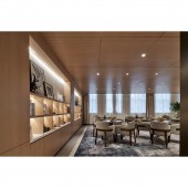
This project, Huahong Shi Dai Jiu Zhu, located in the center of Wenling City, presents the trend of simplicity and cleanliness in the language of space design. It replaces complex elements with geometric artistic installations, leaving abundant blank space in the rooms, where light grows in harmony with space, and expresses the artistic conception of space that "simplicity" is "minus".
OPERATION / FLOW / INTERACTION:
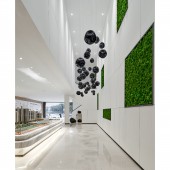
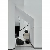
In the square interior space, several artificial green plants are placed against a white background wall on one side. The green vitality breaks the pure white, refreshing the atmosphere in an instant. The pendant art installations come straight down from the upper floor to fill the monotony of space. The sunken irregular black sphere artwork joins to make the white and green brighter. On the other side of the room, several lines of large characters on the location of the superior project are embedded to look simple and steady, adding a business touch.
PROJECT DURATION AND LOCATION:
The project finished in January 2020 in Wenling.
FITS BEST INTO CATEGORY:
Interior Space and Exhibition Design
|
PRODUCTION / REALIZATION TECHNOLOGY:
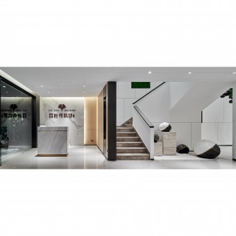
Unlike the designs of other sales offices, the reception area is not the first visual focus for customers when they step into the space. By sidelining the reception area, the visual design attracts the attention of customers straightly to the grand sand table as soon as they enter the first-floor space. Nevertheless, the designer does not ignore the details in the design of the reception area. Unified and minimalist marble reception counter and background wall give customers a clue to the overall style of the space design as they enter.
SPECIFICATIONS / TECHNICAL PROPERTIES:
380 Sqm
TAGS:
Sales Center, Simplicity, Cleanliness, Modern Art, Fashion
RESEARCH ABSTRACT:
Located in the middle of coastal Zhejiang Province, Taizhou Wuling City, with its unique geographical location, is known as "the first place of the dawn of the new millennium and the first dawn of the new century in mainland China", and has also nurtured the city's spirit of tolerance and openness, forward-looking and enterprising. This project, located in the middle of the city of Wenling, between the natural seclusion of Jiulong Lake Wetland Park and the bustling modernity of Yintai Shopping Center, blossoms with its own unique color.
CHALLENGE:
The challenge of this project is the structural limitations of the building and the limitations of the spatial heights; and how to rationalize the spatial dynamics and sense of scale.
In terms of functionality and aesthetic design, this 380 sqm sales office was designed to be two floors. The spaces on the upper and lower floors are independent of each other and have spatial needs to support each other, together fulfilling the mission of this project.
ADDED DATE:
2020-06-02 07:08:19
TEAM MEMBERS (3) :
Yang Song, Zhou Yu and Wang Maoyu
IMAGE CREDITS:
Image #1: Photographer Da Wei, Less Is More, 2020.
Image #2: Photographer Da Wei, Less Is More, 2020.
Image #3: Photographer Da Wei, Less Is More, 2020.
Image #4: Photographer Da Wei, Less Is More, 2020.
Image #5: Photographer Da Wei, Less Is More, 2020.
|


