Nan Hsing Interior Design by Yuan Chang Tsai and Pin Yu Chen |
Home > Winners > #105920 |
 |
|
||||
| DESIGN DETAILS | |||||
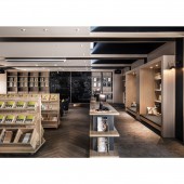
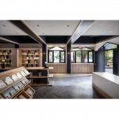
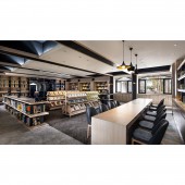
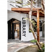
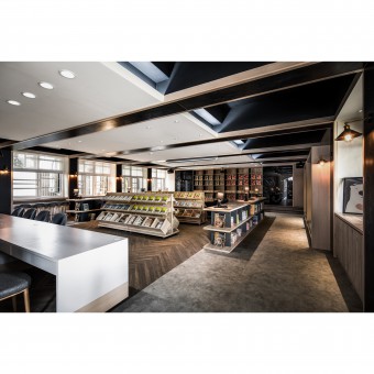
| DESIGN NAME: Nan Hsing PRIMARY FUNCTION: Interior Design INSPIRATION: The library is a space where people can relax and study, the initial inspiration was to create a space for children to use their favorite position without restraint.Children can stand up, sit down or even lie down to read in their favorite position. UNIQUE PROPERTIES / PROJECT DESCRIPTION: Most old style schools in Taiwan are structural with many beams and columns, the previous design also had a cement convex structure under the window sill, and the door was added to use as storage. The part of the beams and columns uses a two-color shape to weaken its heavy volume, and indirect light sources are added to form a power of the array. After the window sill area was removed, a window with a relatively high platform level was left. The bar reading area was built at the original height by the window. It can provide different seating and reading fashion. If you are tired, you can look at the greenery outside the window. OPERATION / FLOW / INTERACTION: The reading environment should be quiet and calm, so the children's space does not have too many colors and too many cartoon patterns. This design is to allow children to read and learn in a relaxing and comfortable space. Therefore, such a space can really allow children to concentrate on reading and learning PROJECT DURATION AND LOCATION: The project started in Changhua, Taiwan in February 2018 and was completed in Changhua, Taiwan in May 2019 FITS BEST INTO CATEGORY: Interior Space and Exhibition Design |
PRODUCTION / REALIZATION TECHNOLOGY: Material: Super wear-resistant floor tiles. Laminate hard plastic sheet. Plastic aluminum plate. Black mirror. Customized aluminum frame SPECIFICATIONS / TECHNICAL PROPERTIES: The size of the space 1494.780 sqft,Re-plan and change the design with the old space TAGS: design,Elementary, school ,library, school library,read,story RESEARCH ABSTRACT: In order for the children to concentrate on reading, whether it is lighting layout or material selection, it is designed after a holist approach. The color of the space is black, white, gray and wood grain color, so that the space has a calm feeling. It allows sunlight to enter and pass through a large number of windows, and the position of the lamps is changed to improve the lighting of the indoor space as well. CHALLENGE: it is difficult to do too many styling designs due to the budget is limited, try to reduce too many design techniques, so use tonal materials, lighting and change the way of reading as the design fashion for this time. ADDED DATE: 2020-05-14 12:40:49 TEAM MEMBERS (2) : YUAN-CHANG TSAI, and PIN-YU CHEN IMAGE CREDITS: Image #1: Photographer LIN MING JIE, Image #2: Photographer LIN MING JIE, Image #3: Photographer LIN MING JIE, Image #4: Photographer LIN MING JIE, Image #5: Photographer LIN MING JIE, video /YUAN-CHANG TSAI |
||||
| Visit the following page to learn more: https://www.archdaily.cn/cn/943279/nan-x |
|||||
| AWARD DETAILS | |
 |
Nan Hsing Interior Design by Yuan Chang Tsai and Pin Yu Chen is Winner in Interior Space and Exhibition Design Category, 2020 - 2021.· Read the interview with designer Yuan Chang Tsai and Pin Yu Chen for design Nan Hsing here.· Press Members: Login or Register to request an exclusive interview with Yuan Chang Tsai and Pin Yu Chen. · Click here to register inorder to view the profile and other works by Yuan Chang Tsai and Pin Yu Chen. |
| SOCIAL |
| + Add to Likes / Favorites | Send to My Email | Comment | Testimonials | View Press-Release | Press Kit |
Did you like Yuan Chang Tsai and Pin Yu Chen's Interior Design?
You will most likely enjoy other award winning interior design as well.
Click here to view more Award Winning Interior Design.


