Marcaron House Interior Design by Yuan Chang Tsai and Pin Yu Chen |
Home > Winners > #105919 |
 |
|
||||
| DESIGN DETAILS | |||||
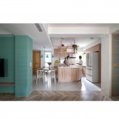
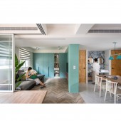
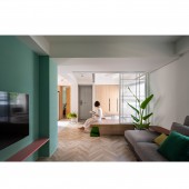
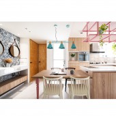
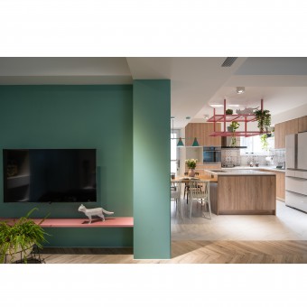
| DESIGN NAME: Marcaron House PRIMARY FUNCTION: Interior Design INSPIRATION: The original layout of the old house had many partition walls, which resulted in insufficient space and insufficient lighting. After the layout was re-adjusted, the light in the whole room became bright and transparent, and the field of view and movement lines were more spacious and smooth, allowing everyone to enter the space. It feels like the house is getting bigger! Because it is a space for women, many colors are used to make the space feel lively and soft. UNIQUE PROPERTIES / PROJECT DESCRIPTION: To design an open type multi-functional lounge through a space swap and increase the brightness by taking more natural light into the building.Considering the usability, to used soft colors to paint the wall surfaces integrated into the cabinets, also this improves space storage and consistency in colors. In order to meet the storage requirements of all aspects in daily life, the interior views with classic tiles, and the double sinks placed in the flow further distinguish the restroom areas to save more spaces. OPERATION / FLOW / INTERACTION: In terms of space configuration, change the previous concept that the living room is the main space when entering the door. The partition wall of the old room is knocked out, and the two spaces of the living room and the bedroom are reversed to increase the sense of extension and amplification of the space and make it an open and diverse The activity space can be used as a bedroom, a Japanese room, a chat room, a mahjong room...The compartments and timber are removed, so that the light from the left and right windows can be incorporated into the space, making the space more brighter. PROJECT DURATION AND LOCATION: The project started in September 2018 in Taichung Taiwan and finished in October 2019 in Taichung Taiwan FITS BEST INTO CATEGORY: Interior Space and Exhibition Design |
PRODUCTION / REALIZATION TECHNOLOGY: Material: Imported tiles, Super wear resistant with herringbone parquet floor, Baking varnish, Custom-made iron parts, Aluminum frame sliding doors, Moru glass, Pebble, System cabinets, Laminate hard plastic sheet, South American radiation pine plywood. SPECIFICATIONS / TECHNICAL PROPERTIES: The size of the space is 640.620 square feet, re-planning and changing the design of the old space TAGS: Interior design, Family, Light, colour, room, stockpile RESEARCH ABSTRACT: After communication, redesign of this space in a bright and multi-colored with Kitchen Island and a long table as the main structure of the restaurant, family member who likes to cook can play with talents in the kitchen and let this kitchen serve as its maximum usage. A toilet was added for the family to use at the same time. Part of the indoor space was allowed to be used as a laundry and a separate toilet. The hand-washing sink, which was frequently used, was placed in the corridor to make good use , It’s twin sink system for family use and after the restroom as well ,the hand washing area is focus of a enrich in the entire public area. CHALLENGE: The most difficult part is water leakage and light, there are many pipelines and water leakage problems in old houses. The problem of water leakage in the house can be solved by re-construction of pipelines, and the original space was dim due to too many compartments, so the compartments were removed to increase the number of windows, therefore, the original dim room became brighter. ADDED DATE: 2020-05-14 12:38:06 TEAM MEMBERS (2) : YUAN-CHANG TSAI and PIN-YU CHEN IMAGE CREDITS: Image #1: Photographer LIN MING JIE, Image #2: Photographer LIN MING JIE, Image #3: Photographer LIN MING JIE, Image #4: Photographer LIN MING JIE, Image #5: Photographer LIN MING JIE, video /YUAN-CHANG TSAI |
||||
| Visit the following page to learn more: https://mp.weixin.qq.com/s/dIjaCwACihoP- |
|||||
| AWARD DETAILS | |
 |
Marcaron House Interior Design by Yuan Chang Tsai and Pin Yu Chen is Winner in Interior Space and Exhibition Design Category, 2020 - 2021.· Read the interview with designer Yuan Chang Tsai and Pin Yu Chen for design Marcaron House here.· Press Members: Login or Register to request an exclusive interview with Yuan Chang Tsai and Pin Yu Chen. · Click here to register inorder to view the profile and other works by Yuan Chang Tsai and Pin Yu Chen. |
| SOCIAL |
| + Add to Likes / Favorites | Send to My Email | Comment | Testimonials | View Press-Release | Press Kit |
Did you like Yuan Chang Tsai and Pin Yu Chen's Interior Design?
You will most likely enjoy other award winning interior design as well.
Click here to view more Award Winning Interior Design.


