DESIGN NAME:
Typotect
PRIMARY FUNCTION:
Corporate Identity
INSPIRATION:
When I was in NewJersey, studying graphic design, I learned about Piet Zwart who was known as a pioneer of modernism. I thought his works were very unique and shows his identity very well. He only used 3 primary colors mostly in his works. Also using a linear shapes and composition in his works were very attractive to me because he actually was a typo&graphic designer and also an architect. Inspired by this, I thought it would be fun interpreting his pieces and making an identity of Piet Zwart.
UNIQUE PROPERTIES / PROJECT DESCRIPTION:
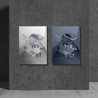
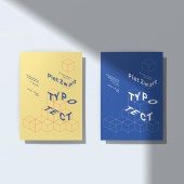
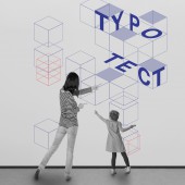
'TYPOTECT' is a modern museum of 'Piet Zwart' who was a pioneer of modernism. The name of the museum is a mixed word with 'Typography�9; and 'Architect';, due to his designer career. He used 3 primary colors, line and plane shape in his works. By reinterpreting his works, the identity of 'TYPOTECT' museum has designed. Modernism designers are still inspirationing many designers these days and I thought reinterpreting his works could give more inspirations to many people.
OPERATION / FLOW / INTERACTION:
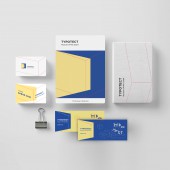
Main characteristics of the project is using 3 primary colors, a linear shape and making a composition in the space. The light line which is mostly used with color red on the top of every brand application must used very thin stroke. Also color-based pain shape is better using color blue and yellow because it's less outlooking then red. Plain shape, reshaped square and a line must be used in logo with 3 main colors.
PROJECT DURATION AND LOCATION:
The project was started in 2016 in NewJersey and finished in March, 2020. The reason why it took so long is because I wanted to keep developing it and renewal it to keep it in the trend. The latest version of the proeject won the Silver Winner in Asia Design Prize 2019.
FITS BEST INTO CATEGORY:
Graphics, Illustration and Visual Communication Design
|
PRODUCTION / REALIZATION TECHNOLOGY:
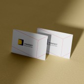
It is mostly print-based brand identity design. It could be printed on the paper(for example, namecard and ticket), or on a sticker so it can be decorated on the wall.
SPECIFICATIONS / TECHNICAL PROPERTIES:
This are print-based works. Poster was worked in 594(mm)x841(mm) but could be change in a same ratio. Name card is basically 50(mm)x70(mm).
TAGS:
branding, identity, communication, design, art museum, modern museum, museum, graphic, graphic identity
RESEARCH ABSTRACT:
For this project, I tried to go to all the modern museums in Newyork City. It gave me an idea of why people enjoys modern art and what makes people feel interesting about it. Also I researched about Piet Zwart by googling him and looking up by books. Basically he was famous designer so it was easy to find his pieces but it was hard go know his personal insights and thoughts. Reading books and some instructions about his design pieces helped me finding out and making up the identity of TYPOTECT museum. In conclusion, I could find out his main characteristics inside his works and could reinterpret his works for new type of modern museum branding.
CHALLENGE:
After done with finding out the characteristics of his works and reinterpreting it, it was challenging how I could make this brand identity not only looking and feeling like his original works and careers but also new modern design museum. I tried to make it simple and kept using a linear shapes to show his work identity.
ADDED DATE:
2020-03-28 04:28:18
TEAM MEMBERS (1) :
IMAGE CREDITS:
Seulah Choi, 2019.
|
