Ricky's Kitchen Restaurant by Alvan Suen |
Home > Winners > #103901 |
 |
|
||||
| DESIGN DETAILS | |||||
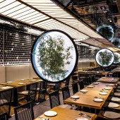
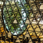
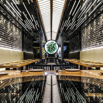
| DESIGN NAME: Ricky's Kitchen PRIMARY FUNCTION: Restaurant INSPIRATION: Advocating the spirit of fusion while reinterpreting and illustrating Hong Kong in the design is what the goal is, which parallels with the goal of the brand. Inspiring by this unique scenery of the city of Hong Kong, illustrating a “one-line sky” scenery, that represents what people see overhead in the street while surrounded by high-rise buildings. Contributing to the “one-line sky”, cantilever structure above the walkway is seen very often in the city to further narrowing the street due to highly valued land, which we try to create that feeling abstractly. The feature wall was inspired by the night view of the city, the use of the material is symbolizing “concrete forest” the nickname of Hong Kong. LEON light is also used due to the impression internationally, the way of representation is coming from the traffic of highway in the camera under long exposure. UNIQUE PROPERTIES / PROJECT DESCRIPTION: Reinterpreting “Hong Kong”, translating it into visualization while keeping the identity of the brand has become the challenge of designing the Ricky’s Kitchen branch. For the feature wall, the use of materials represents forest of concrete, the geometry renders the building facade with balconies as well as the density of the city, and the lighting mimics the households in the buildings. For the ceiling, the white LED in the center represents the “Linear Sky Exposure” of Hong Kong, the Leon light on both sides imitate the long exposure photography of highway, symbolizing prosperous Hong Kong and heavy traffic. In terms of futuristic touch, linear LED light, the floating-like portal with bamboo and infinity mirror are designed in respect of the original. OPERATION / FLOW / INTERACTION: The "T" layout creates four semi-private zones for different sizes of gathering, including the head, the two wings, and the middle. Bench with movable tables also allows flexibility in terms of operation to cater to different groups of guests. PROJECT DURATION AND LOCATION: The project is located in K11 Art Mall, Kowloon, Hong Kong. The design was started in June 2019 and the construction was finished in November 2019. FITS BEST INTO CATEGORY: Interior Space and Exhibition Design |
PRODUCTION / REALIZATION TECHNOLOGY: For the feature wall, the blocks were not made and installed one by one but in a few prefabricated panels. The pattern was designed with the script, generated and calculated by the computer. In order to make sure the final result is ideal and everything works and fits, the project was mainly created in the computer; rendering is heavily used for testing different materials and calculating lux as well as color temperature for all lightings throughout the entire design process. For communicating on-site with the contractor, besides the construction drawing set, a virtual reality walk-through was also created for the workers to quickly understand the project. SPECIFICATIONS / TECHNICAL PROPERTIES: Area: 1358 sq.ft. Capacity: 66 TAGS: Hong Kong Style, Fusion, Lighting, Leon, Futuristic RESEARCH ABSTRACT: - CHALLENGE: To preserve the local elements of Hong Kong on one hand, whilst incorporating Japanese elements on the other has been a great challenge to us in the development of the design as both of these cultures are unique and significant in their own way. We experimented with various expressions on the traditions and cultures with representation in the spaces and choice of materials. For instance, in order to create a large sense of space in the relatively narrow site, a fair amount of mirrors has been implemented. ADDED DATE: 2020-03-19 03:36:04 TEAM MEMBERS (5) : Director: Alvan Suen, Designer: Jesie Chan, Designer: Hazel Ching, Designer: Alan Tang and Designer: Bryan Hui IMAGE CREDITS: Photographer: Yui Zhu, Kaman Tjang Video Credits: Yui Zhu, Kaman Tjang PATENTS/COPYRIGHTS: Copyrights belong to Alvan Suen, 2020 |
||||
| Visit the following page to learn more: https://www.thefoodstoryhk.com/rickyskit |
|||||
| AWARD DETAILS | |
 |
Ricky's Kitchen Restaurant by Alvan Suen is Winner in Interior Space and Exhibition Design Category, 2019 - 2020.· Read the interview with designer Alvan Suen for design Ricky's Kitchen here.· Press Members: Login or Register to request an exclusive interview with Alvan Suen. · Click here to register inorder to view the profile and other works by Alvan Suen. |
| SOCIAL |
| + Add to Likes / Favorites | Send to My Email | Comment | Testimonials | View Press-Release | Press Kit |
Did you like Alvan Suen's Interior Design?
You will most likely enjoy other award winning interior design as well.
Click here to view more Award Winning Interior Design.


