Rb5 Vinicola Visual Identity by Victor Weiss |
Home > Winners > #103658 |
 |
|
||||
| DESIGN DETAILS | |||||
| DESIGN NAME: Rb5 Vinicola PRIMARY FUNCTION: Visual Identity INSPIRATION: Each Bartolini brother focused on studying one kind of grape, one kind of wine. Each brother has a specialty, one of the secrets of the success of RB5. Today Joao Vitor, (son of Rodolfo Bartolini) is the head of the company, combining quality and tradition with technology and innovation. With the visual identity we wanted to convey: Quality, tradition, seriousness, good taste, class. UNIQUE PROPERTIES / PROJECT DESCRIPTION: The RB5 is a winery located in the city of Sao Leopoldo / RS, in a region of Italian colonization. RB5 Begun in 1853 with the devotion of the 5 Bartolini brothers. The father of the Bartolini family (Giovanni Bartolini) had the dream of migrating to Brazil and starting a winery where he could apply all the technique developed in a life-time of learning in Palermo/Italy. Rodolfo, Andres, Gorges, Antonio, and Hugo dedicated their lives to fulfill their father's dream. but they did not stop there. OPERATION / FLOW / INTERACTION: The core behind RB5 Winery is to create a sophisticated experience to the client. To stand-out from big mass production wine companies, as a unique artesanal "handmade" product. RB5 farms the grapevines, create the perfect alcoholic combinations and store the final product for years until its ready for retail. The product can be found in several premium supermarkets and stores through South America. PROJECT DURATION AND LOCATION: The project started in may 2017 at our first meeting with client in Porto Alegre. And finished in January 2018 in Sao Leopoldo. (With the re-brand launch). FITS BEST INTO CATEGORY: Graphics, Illustration and Visual Communication Design |
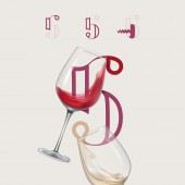
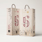
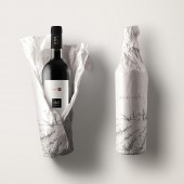
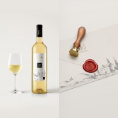
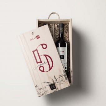
PRODUCTION / REALIZATION TECHNOLOGY: All of the materials were designed Studio Victor Weiss and produced with premium printing agencies in south Brazil. Several production techniques/materials were used, including embossing, golden folio, crepe paper, annealed glass and clean cut premium wood. All of the processes were supervised Rodolfo and Weiss. SPECIFICATIONS / TECHNICAL PROPERTIES: The icon is a monogram, created with the hidden letters "R and B" inside a clean serif 5 number. We also designed in the negative space a wine opener silhouette. The complete visual identity project included several collaterals. Business cards, envelopes, shopping bags, custom documents, wooden package boxes, care manuals, wine bottle packaging, in-store uniforms, tags, UI/UX for website. TAGS: Branding, Wine, Packaging, Wood, Winery, RB5, Vinicola, monogram, Iconic, elegant RESEARCH ABSTRACT: 1. Target Audience. It was important to understand who were we directing with the built visuals. Answering questions such as target demographic, location, industry, income range, hobbies, communication, thought, importance, reach, challenges, purchase decision making, and objections we started to understand who are we speaking to through our design. 2. Persona. By creating a specific avatar of who the end costumer is, we can create specific strategies and explore direct possibilities. 3. Brand attributes. We needed to list the values that identify and differentiate competitors without a point of sale, as well as the performance of the final product. 4. Archetype. A brand archetype is a universally familiar character or situation that transcends time, place, culture, gender and age. Defining the brand archetype helped us through the bench-marketing process and also directly into typography selection and colors in the over-all look and feel of the project. For Rb5 we used The Ruler archetype. The next steps were to develop the brand tone of voice and manifest. When the strategic part of the process was done, we begun the design by creating a stylescape and exploring the visual possibilities. CHALLENGE: We needed to develop a visual identity that could tell the amazing Bartolini family story, but also show that it is a modern company with up to date machinery. One of the most important touch points of the brand is its website, so it needed to work well both physically and digitally. It had to be both modern and antique. We understood the naming process was gonna be one of the most important leverages to telling the story and also having a modern feel. R - Rodolfo (Father of current CEO) B - Bartolini (Families name) 5 - Reference to the 5 brothers that created the company. In conjunction the naming felt modern and bold. We had achieved our objective. By creating a simple and yet clever monogram, we were able to input all 3 elements of the name into one simple icon. What at first may seem like a beautiful number 5, is actually a complete brand name, rb5. We understood the icon should work alone for responsive platforms and small locations (such as a profile picture), but also, in conjunction with the name. If the icon were an obvious monogram, it would read "RB5, RB5". This repetition would be tiring and common. That is why we chose an abstract formation for the icon, in witch can be used both next to brand name or separate. ADDED DATE: 2020-03-12 21:37:19 TEAM MEMBERS (1) : IMAGE CREDITS: Victor Weiss, 2019. |
||||
| Visit the following page to learn more: https://bit.ly/VWeiss | |||||
| AWARD DETAILS | |
 |
Rb5 Vinicola Visual Identity by Victor Weiss is Winner in Packaging Design Category, 2019 - 2020.· Press Members: Login or Register to request an exclusive interview with Victor Weiss. · Click here to register inorder to view the profile and other works by Victor Weiss. |
| SOCIAL |
| + Add to Likes / Favorites | Send to My Email | Comment | Testimonials | View Press-Release | Press Kit |
| COMMENTS | ||||||||||||||||||||
|
||||||||||||||||||||

