Cut and Paste Branding by Lisa Winstanley |
Home > Winners > #103530 |
 |
|
||||
| DESIGN DETAILS | |||||
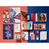
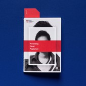
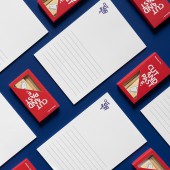
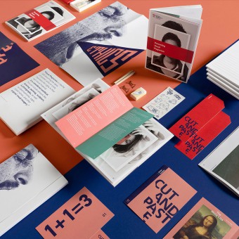
| DESIGN NAME: Cut and Paste PRIMARY FUNCTION: Branding INSPIRATION: The designs were inspired by constructivist layout with rich, culturally appropriate imagery and bold, angled typography. The brief was to create an integrated design system which would appeal to a target audience of young Singaporean designers, to guide them through complex topics via an active learning pedagogy. UNIQUE PROPERTIES / PROJECT DESCRIPTION: This project addresses a topic that affects everyone in the creative industry at some point in their career. Yet visual plagiarism is an issue that is seldom discussed, perhaps due to the ambiguity between taking reference from an image and copying from it. Rather than preach morality, what this project provides is awareness; enabling participants to make informed choices. The collaterals were created to support an active learning workshop with the main aim to provide a platform for discussion OPERATION / FLOW / INTERACTION: This project intends the user to fully interact with each component of the pack. The book is intended to be a tool for sketching ideas, writing notes and experimenting. The postcards are designed as case studies for discussion and debate. The A6 activities as practice based and require users to ideate and experiment. The stationery set facilitates this interaction and the outer folder provides a study container to house the full kit. PROJECT DURATION AND LOCATION: The project was launched in January 2020 at the School of Art, Design and Media, Nanyang Technological University, Singapore FITS BEST INTO CATEGORY: Graphics, Illustration and Visual Communication Design |
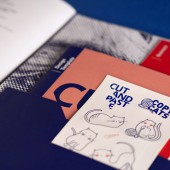
PRODUCTION / REALIZATION TECHNOLOGY: This project was printed on RJ Maple bright stock of various weights dependent on the item. The outer folder is a bespoke die cut as is the 36pp book which contains a double sided poster, bookmark, A6 postcards and sticker set. The stationery kit is custom designed and contains pencils, paperclips and a sharper to complement the custom note paper SPECIFICATIONS / TECHNICAL PROPERTIES: The book is A5 with a bespoke die cut folder at the back which contains the folded A3 poster, A6 4pp activity, die cut bookmark and kiss cut sticker sheet. These are all housed in a bespoke die cut outer folder which also contains an A5 notepad and pocket for 5 A6 postcards TAGS: branding, logo, book, poster, stationery kit, postcards, stickers, bookmark, workshop RESEARCH ABSTRACT: To support an active learning workshop, print collaterals were developed including, an outer folder, a 36 page book, bookmark, posters, postcards, stickers, a notepad and a custom designed stationery kit. The brief was to create an integrated design system which would appeal to a target audience of young Singaporean designers, to guide them through complex topics via an active learning pedagogy. CHALLENGE: The design utilises the existing colour palette and fonts of the University brand, alongside culturally appropriate imagery and rich, real-world examples of visual plagiarism, homage, pastiche and parody. The notion of a cut and paste visual culture is present throughout, as a reminder for participants to consider ethical intentions as part of their creative practice and the secondary, juxtaposed theme of ‘copy cats’ is playfully illustrated; humorously referencing this common idiom and introducing a more palatable lightness to a somewhat serious topic. ADDED DATE: 2020-03-09 10:17:46 TEAM MEMBERS (4) : Art Director: Lisa Winstanley, Research Assistant: Wu You, Photographer: Lisa Peh Jiaxian and Film: Eugene Lim Ming Zheng IMAGE CREDITS: Photographer: Lisa Peh Jiaxian Film: Eugene Lim Ming Zheng PATENTS/COPYRIGHTS: Copyrights belong to Lisa Winstanley, 2020 |
||||
| Visit the following page to learn more: http://shorturl.at/vFNT9 | |||||
| AWARD DETAILS | |
 |
Cut and Paste Branding by Lisa Winstanley is Winner in Graphics, Illustration and Visual Communication Design Category, 2020 - 2021.· Press Members: Login or Register to request an exclusive interview with Lisa Winstanley. · Click here to register inorder to view the profile and other works by Lisa Winstanley. |
| SOCIAL |
| + Add to Likes / Favorites | Send to My Email | Comment | Testimonials | View Press-Release | Press Kit | Translations |

