Emosync Social Media Platform by Rounak Bose |
Home > |
 |
|
||||
| DESIGN DETAILS | |||||
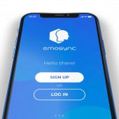
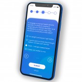
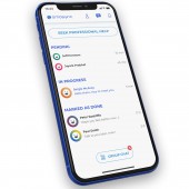
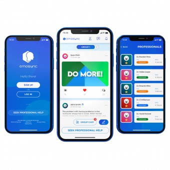
| DESIGN NAME: Emosync PRIMARY FUNCTION: Social Media Platform INSPIRATION: Suicide rates are on a steady rise with every passing day. Mental health is a pressing concern; yet people approach this subject with a sense of hate and disgust. Those who are suffering from mental-health problems often end up having to call dysfunctional helplines - leading to increased frustration. It is optimal, that in such a situation, they can reach out to everyone on this platform anonymously, and yet receive expert help and advice - because mental well-being is a universal birth-right. UNIQUE PROPERTIES / PROJECT DESCRIPTION: A one-of-a-kind experience that brings together people with mental health-issues on a common medium, and gives them a platform to communicate anonymously. Mental well-being is crucial, and Emosync is a mobile application aiming to erase the stigma associated with mental-health. This offers a safe haven to not only those people who require help and advice, but also those who want to help and make people's lives better by giving professional advice. OPERATION / FLOW / INTERACTION: Taking into account all the recommendations made by Google’s Material Design system and Apple’s Human Interface Guidelines, this design was made to interact in a way that led to the minimum number of hard taps necessary for a user to reach a desired state, starting from any given location in the web-app. The contrast ratios have been looked into for all elements of the design, and all accessibility issues have been dealt with in the iterations leading upto this final design. The interactive flows contain micro-interactions, subtle enough to invoke a sense of belonging to the platform, while also not being so jarring as to disorient people with disabilities, or senior adults. All flows have been through multiple iterations to guarantee the best possible in-app routes for each operation. PROJECT DURATION AND LOCATION: The project started in August 2019 and it was finished and made production-ready in October 2019, designed and developed in Kokata, India. FITS BEST INTO CATEGORY: Interface, Interaction and User Experience Design |
PRODUCTION / REALIZATION TECHNOLOGY: Stakeholder analysis was used to determine all the end-users and the roles they would be playing in this ecosystem. Kano Analysis was used to determine the necessary and mandatory features of the first version of this platform. Paper prototyping was carried out based on the set of features from the Kano Board. These low-fidelity sketches were finally used to design the high-fidelity prototype using Figma and proceed to developer handoff. The progressive web app was then developed and made deployment-ready. SPECIFICATIONS / TECHNICAL PROPERTIES: The dimensions for the screens that were designed using Figma, was 375x812 pixels, which is the scaled down version of an iPhone X screen by a factor of 3. This was then used to develop the mobile version of the PWA. Although the base structure was an iPhone X screen, the design and consequently developed product was not only responsive in nature, but also adaptive. TAGS: health, life, experience, wellness, mental well-being, professional advice, mental health RESEARCH ABSTRACT: The research was of evaluative and generative type, through the use of design methods. The main objective was to understand the thought-processes of people who were suffering from mental-health problems, or had suicidal intentions - which was very challenging. Interviews and cognitive walkthroughs were the main tools. Task analysis allowed for realisation of the possible features for a social media platform targeted towards anonymity and expert help and advice. Kano analysis and critical incident techniques narrowed down the features to focus on the most necessary ones. Roughly 30 interviews and 5 focus groups were performed and most of the results cemented the need for anonymity, yet a sense of belonging to a group. The participants were eager to be onboarded onto such a platform and that was a great moral boost for designing Emosync. CHALLENGE: The hardest parts of the design activity were - 1. Getting in touch with people suffering from mental-illness, or those with suicidal motives 2. Getting them to open up about their needs, or to ask for help. Once they had trust in the research team, they helped to champion the cause and make the research process successful. ADDED DATE: 2020-03-05 14:48:40 TEAM MEMBERS (1) : IMAGE CREDITS: Rounak Bose, 2019. |
||||
| Visit the following page to learn more: https://emosync.com/ | |||||
| AWARD DETAILS | |
 |
Emosync Social Media Platform by Rounak Bose is Runner-up for A' Design Award in Interface, Interaction and User Experience Design Category, 2019 - 2020.· Press Members: Login or Register to request an exclusive interview with Rounak Bose. · Click here to register inorder to view the profile and other works by Rounak Bose. |
| SOCIAL |
| + Add to Likes / Favorites | Send to My Email | Comment | Testimonials |

