Portugal Vineyards Retail Space by Ricardo Porto Ferreira |
Home > Winners > #103170 |
 |
|
||||
| DESIGN DETAILS | |||||
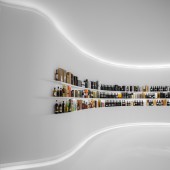
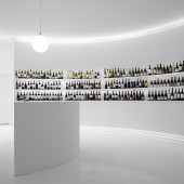
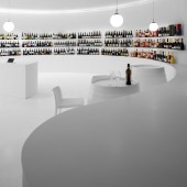
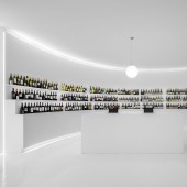
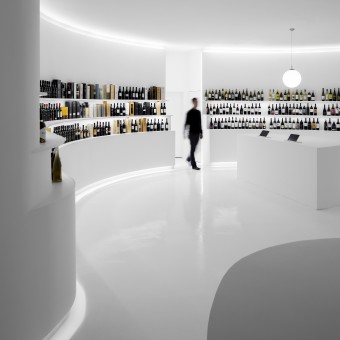
| DESIGN NAME: Portugal Vineyards PRIMARY FUNCTION: Retail Space INSPIRATION: The traditional references to dark cellars and wood materials had to be completely disregarded. Out of this brief we immediately interpreter the need for light and an open plan. Also, while designing a retail space, where emotions tend to be rationalised and as a designer, we work to find solutions beyond the existing condition. UNIQUE PROPERTIES / PROJECT DESCRIPTION: A white canvas for the Portuguese wine to shine and be displayed. The interior is a blindingly white and minimal space with circular circulation. The shelves are carved out of the walls in reference to the wine terraces on a 360 degrees immersive retail experience with no counter. A retail space where staff are on the client side, suggesting, promoting and serving. OPERATION / FLOW / INTERACTION: Space with very linear, clear and open circulation where the staff is placed in center stage. From the moment clients enter the space they are accompanied side-by-side, with no counters, shelves or walls dividing or separating them from the staff members. PROJECT DURATION AND LOCATION: The project duration was from April to September 2019. FITS BEST INTO CATEGORY: Interior Space and Exhibition Design |
PRODUCTION / REALIZATION TECHNOLOGY: The curving walls are made of a gypsum board supported by a metal frame and the shelves are engineered wood supported in the same structure. The color is an element of the wine tasting process. After taking the decision to have a bright space we found that the RAL 9003 is the recommended color to be used as a background when observing the aging wine in the wine tasting events. It made sense to us to apply it to our concept as retail is all about the exhibition. SPECIFICATIONS / TECHNICAL PROPERTIES: Knauf, drywall system; Marilina, epoxy floor; Cin, paint; Ezpeleta, chairs; Lumit, lighting; Charme Versatil, fit-out. TAGS: Portugal Vineyards, terraces, curved walls, white space, minimal interiors RESEARCH ABSTRACT: The initial challenges behind the space were to find the answers through geometry, to allow enough footfall to have the 600 references the clients intended to display, the design should allow the space to be used as a venue for suppliers presentations and to have an area for wine tasting. These requirements were answered through the definition of a radious that allowed the inner circle to gather about 50 people; three levels of terraces where all the bottles rest and a loop circulation that would be broken by the access points. CHALLENGE: The creative challenge of this project was to find that a circle plan could be the best answer for a squared existing space. Facing a squared plan, a cornered entrance and a secondary access we found our answer in the use of geometry. The displays are carved out of the walls in reference to the vineyard terraces in a circular shape that fills the customer field of view sensitively with indirect lighting and the sharp contrast between the product and the space. ADDED DATE: 2020-03-04 00:18:28 TEAM MEMBERS (1) : Ricardo Porto Ferreira IMAGE CREDITS: #1: Photographer Ivo Tavares Studio PATENTS/COPYRIGHTS: Copyrights belong to Porto Architects, 2019 |
||||
| Visit the following page to learn more: http://www.portoarchitects.com | |||||
| AWARD DETAILS | |
 |
Portugal Vineyards Retail Space by Ricardo Porto Ferreira is Winner in Interior Space and Exhibition Design Category, 2019 - 2020.· Press Members: Login or Register to request an exclusive interview with Ricardo Porto Ferreira. · Click here to register inorder to view the profile and other works by Ricardo Porto Ferreira. |
| SOCIAL |
| + Add to Likes / Favorites | Send to My Email | Comment | Testimonials | View Press-Release | Press Kit | Translations |

