Pizzamax Rebrand by Salvita Bingelyte |
Home > Winners > #102715 |
 |
|
||||
| DESIGN DETAILS | |||||
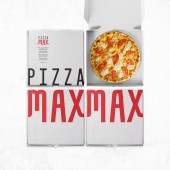
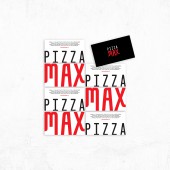
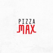
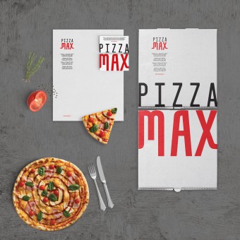
| DESIGN NAME: Pizzamax PRIMARY FUNCTION: Rebrand INSPIRATION: Pizzamax is a small pizza restaurant chain in Lithuania. They were established ten years ago, but the packaging and branding was not resonating with the market, so it was time for new branding. The name of the pizzeria also changed. Originally it was the Lithuanian word for pizza, unrecognizable to non native speakers. Now the name is universal, clearly readable and understandable for everyone. Pizzamax wanted to remind customers that they walk the line between good value and good food. UNIQUE PROPERTIES / PROJECT DESCRIPTION: The initial visual identity had been thrown together in a rush, and was a mishmash of graphic styles as the founders were focused on getting the business up and running. Because of this, the customer experience was largely unbranded, you got your food and that was it. What makes the redesign unique is how the words, pizza and max, are displayed on different sides of business cards and pizza boxes. OPERATION / FLOW / INTERACTION: The logo was simplified and supported by a simple and clear visual identity. I wanted to keep the classic Italian pizza colors, red and black, but make the brand modern and expressive. I brought in a bit of playfulness by giving the M and X letters curved ends, representing people, specifically bakers who carry pizzas with straight arms. It also symbolizes that you can go for a quick and delicious meal. PROJECT DURATION AND LOCATION: Started in June 2019 and finished October 2019 in Vilnius, Lithuania. FITS BEST INTO CATEGORY: Graphics, Illustration and Visual Communication Design |
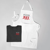
PRODUCTION / REALIZATION TECHNOLOGY: I opted to use classic colors on white and black backgrounds. SPECIFICATIONS / TECHNICAL PROPERTIES: I created business cards, letterhead, pizza box and clothing branding. TAGS: Pizza, pizzeria, rebrand, visual identity, logo, branding, graphic design, Salvita Design, Lithuania RESEARCH ABSTRACT: With strong color combination and bold lettering, the new brand creates high visibility, energy and spontaneity. CHALLENGE: The challenge was to redesign a brand that would retain current customers, but be more memorable and inviting to new customers. ADDED DATE: 2020-02-28 22:12:11 TEAM MEMBERS (1) : IMAGE CREDITS: Copywriter Erin Hope Stevens |
||||
| Visit the following page to learn more: https://www.salvita.lt | |||||
| AWARD DETAILS | |
 |
Pizzamax Rebrand by Salvita Bingelyte is Winner in Graphics, Illustration and Visual Communication Design Category, 2019 - 2020.· Read the interview with designer Salvita Bingelyte for design Pizzamax here.· Press Members: Login or Register to request an exclusive interview with Salvita Bingelyte. · Click here to register inorder to view the profile and other works by Salvita Bingelyte. |
| SOCIAL |
| + Add to Likes / Favorites | Send to My Email | Comment | Testimonials | View Press-Release | Press Kit |
Did you like Salvita Bingelyte's Graphic Design?
You will most likely enjoy other award winning graphic design as well.
Click here to view more Award Winning Graphic Design.


