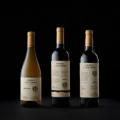
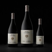
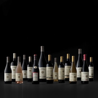
Sierra Cantabria Wine Family by Estudio Maba |
Home > Winners > #102555 |
 |
|
||||
| DESIGN DETAILS | |||||
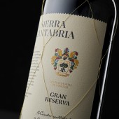
| DESIGN NAME: Sierra Cantabria PRIMARY FUNCTION: Wine Family INSPIRATION: The heraldic symbols of the family that have accompanied the brand for 150 years and a rigorous wine tradition give rise to a classic label but full of content and nuances. The brand must be perceived emphatically, monopolizing the label full of typographic contrasts. UNIQUE PROPERTIES / PROJECT DESCRIPTION: Sierra Cantabria is an extensive family of wines from one of the most traditional wineries in Spain. The different variants that it has give rise to a very large family, whose branding is worked as a whole, but also retaining subtle differences between one of the bottles to give rise to a range full of elegance and expressiveness. OPERATION / FLOW / INTERACTION: The most interesting part of the project is that the family gives a total of 53 combinations of labels, which, together with a series of elements, highlight the brand image in a strong and nuanced way. A renovated classic and full of exquisiteness. PROJECT DURATION AND LOCATION: January to September 2019 FITS BEST INTO CATEGORY: Packaging Design |
PRODUCTION / REALIZATION TECHNOLOGY: Cotton paper label with high relief, stamping and varnish strokes. SPECIFICATIONS / TECHNICAL PROPERTIES: Bordeaux and Burgundy Bottles TAGS: Wine, design, bottle, label, brand RESEARCH ABSTRACT: A joint work between the management of the company, winemakers of great tradition and the creative team to achieve the most appropriate tone that the brand represents in a powerful and consistent way. CHALLENGE: The exercise on all bottle variants, starting from a few elements has been the most complex part of the project, to maintain consistency in the whole and also the point of differentiation between the range. ADDED DATE: 2020-02-28 18:14:44 TEAM MEMBERS (2) : Strategy Direction: Beatriz Suarez and Creative direction and design: Miguel angel del Baño IMAGE CREDITS: Estudio Maba PATENTS/COPYRIGHTS: Bodegas y Viñedos Sierra Cantabria |
||||
| Visit the following page to learn more: http://estudiomaba.com/en/trabajos/famil |
|||||
| AWARD DETAILS | |
 |
Sierra Cantabria Wine Family by Estudio Maba is Winner in Packaging Design Category, 2019 - 2020.· Press Members: Login or Register to request an exclusive interview with Estudio Maba. · Click here to register inorder to view the profile and other works by Estudio Maba. |
| SOCIAL |
| + Add to Likes / Favorites | Send to My Email | Comment | Testimonials | View Press-Release | Press Kit |

