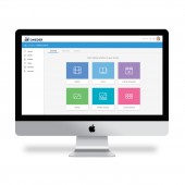
Oneder Website by Dana Freud |
Home > Winners > #102510 |
 |
|
||||
| DESIGN DETAILS | |||||
| DESIGN NAME: Oneder PRIMARY FUNCTION: Website INSPIRATION: The inspiration for this product came from interviews and observations of special needs students and their teachers. Knowing that special education teachers had little time to create a lesson assignment, it was necessary to design a clear, intuitive, and efficient interface. In addition, because the students were on a wide spectrum of disabilities, it was important for the product to be accessible, functional, and minimalistic as well as aesthetically and appealing. UNIQUE PROPERTIES / PROJECT DESCRIPTION: Oneder is a digital product for teachers and students with special needs, which enables teachers to build and share their own curriculum that is aligned to academic standards and suited to their individual students’ exclusive learning skills. Oneder's academic app enables the students to practice educational yet enjoyable tasks from their day-to-day situations. Conclusively, this platform presents the analyzed and quantitative data in an intuitive and efficient display for the school administrators. OPERATION / FLOW / INTERACTION: The product flow consists of three steps: First, the teachers create in the desktop app customized lessons for their students. Then, the students fill the assignments through their tablet app. The students perform the tasks at school or at home, and send the teachers the filled assignments. The teachers receive a report for each student and class, and the extensive data is summarized in a clear and efficient dashboard for the school administrators. PROJECT DURATION AND LOCATION: The project started in December 2015 and finished in January 2017. |
PRODUCTION / REALIZATION TECHNOLOGY: The methodology of "design thinking" was used to create several concepts which will serve the teachers in the most efficient and intuitive way. A group of four educators were included in several brainstorming sessions to generate the most accessible and varied solution for communication with the students. SPECIFICATIONS / TECHNICAL PROPERTIES: Due to the fact that this is a cross-platform product, the dimensions and specifications are dynamic and responsive in that they automatically adjust to the screen size and type of device being used. TAGS: educational design, UI, UX, website design, dashboard, tracking, data RESEARCH ABSTRACT: The research objective was to define the personas of the product and understand the accessibility standards. The methodology used was qualitative interviews with special needs teachers, psychologists, and school administrators. Data collection was done on 15/40 of the relevant population. Participants were special needs students and teachers and the key insights that there are three personas and three different platforms to consider. The results of the research created an empowering product for teachers and a powerful and meaningful tool for communicating with their students. CHALLENGE: The challenge for the student-designed product was to create a platform that had to comply with the most stringent accessibility regulations, since its users were on a wide spectrum of disability: from vision or hearing impairment to autism. Issues such as typography sizes, contrast, and color choices were carefully selected and followed by a number of user testings. ADDED DATE: 2020-02-28 17:15:15 TEAM MEMBERS (1) : IMAGE CREDITS: Dana Freud, 2020. |
||||
| Visit the following page to learn more: http://bit.ly/FreudOnder | |||||
| AWARD DETAILS | |
 |
Oneder Website by Dana Freud is Winner in Education, Teaching Aid and Training Content Design Category, 2020 - 2021.· Read the interview with designer Dana Freud for design Oneder here.· Press Members: Login or Register to request an exclusive interview with Dana Freud. · Click here to register inorder to view the profile and other works by Dana Freud. |
| SOCIAL |
| + Add to Likes / Favorites | Send to My Email | Comment | Testimonials | View Press-Release | Press Kit |
Did you like Dana Freud's Education Design?
You will most likely enjoy other award winning education design as well.
Click here to view more Award Winning Education Design.


