DESIGN NAME:
Nostalgia
PRIMARY FUNCTION:
Perfumery Store
INSPIRATION:
Nostalgia for the 60-70s of the 20th century is new, it is nostalgia for believing in a bright future. Old industrial landscapes are perceived as artefacts of the era carried away by a new digital reality. Abandoned metallurgical workshop became an inspiring idea of this project.
UNIQUE PROPERTIES / PROJECT DESCRIPTION:
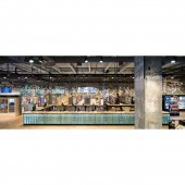
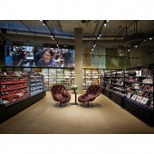
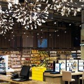
The hybrid design of the store embodies the image of the trading space of the post-consumerism era and disappointment in the myths of glamor. A rusty profiled sheet of old fences creates an atmosphere of complete freedom of expression. The metal structures of the equipment made of hot-rolled steel of different sections create a realistic intonation of anti-utopia. Granite countertops and shabby plaster add to the interior industrial chic of the sixties.
OPERATION / FLOW / INTERACTION:
The industrial environment of the store creates an atmosphere of democracy, freedom of expression and accessibility. This was the ideological basis of this project. The store is a place of attraction and communication for more than 2000 people daily. Presentations of new products in the field of perfumery and cosmetics, master classes of famous makeup artists are held here. Make-up artists and cosmetologists share their professional skills, train, put on makeup and just talk with customers.
PROJECT DURATION AND LOCATION:
The store is located in the center of Moscow. The project was completed in 2018.
FITS BEST INTO CATEGORY:
Interior Space and Exhibition Design
|
PRODUCTION / REALIZATION TECHNOLOGY:
Main construction materials: hot-rolled steel, tinted stainless steel, profiled sheet, granite, oak
SPECIFICATIONS / TECHNICAL PROPERTIES:
The total area is 1630 sq.m.
TAGS:
interior design, retail space, metal, stone, industrial, sixties
RESEARCH ABSTRACT:
Among the modern metropolis, the design of the store resolves the contradiction between the individuality of particular person and the leveling difference of the city's strength, between the individual human I and the monolithic urbanistic WE. Therefore, the Gold Apple inverts the external and internal, interchanges the city and man, introducing an urban spirit into the interior space.
CHALLENGE:
The creative challenge of the project was to recreate the industrial atmosphere of the 60-70s of the 20th century. As a solution, various types of manual processing of steel were used in the manufacture of equipment. The special warmth of the space is added by old window frames, sawn and laid vertically on the wall. Together with the old profiled sheet, they allow the viewer to experience historical authenticity.
ADDED DATE:
2020-02-28 09:51:59
TEAM MEMBERS (2) :
Lead Architect: Dmitry Pozarenko and Associate Architect: Elena Sonyak
IMAGE CREDITS:
All images: photographer Mick Pomortsev, 2019.
|


