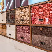
KitKat Chocolatory Interior Design by Justin Vinet - Model/ctzn |
Home > Winners > #101411 |
 |
|
||||
| DESIGN DETAILS | |||||
| DESIGN NAME: KitKat Chocolatory PRIMARY FUNCTION: Interior Design INSPIRATION: For Kitkat Chocolatory we were approached with the design opportunity to create the first permanent North American location. Our design concept was centered around ideas of a Chef Table and Maker Studio to ensure that the result would not only be beautiful, engaging, and interactive but would work well for the malls target and existing clientele. Technical for the project was from our extensive combined operational experience at Modelctzn in tandem with knowledge from Nestles previous popup. UNIQUE PROPERTIES / PROJECT DESCRIPTION: Represent the new concept & overall brand in a innovative way through the design of the store, specifically for the Canadian market and Yorkdale Clientele. Using the experience of a previous pop up and international locations to innovate and rethink the entire experience and program of the operation. Create a ultra-functional store, both in the FOH & BOH, that would work well for a very high traffic, programmatically complicated space. OPERATION / FLOW / INTERACTION: The primary focus is the customer can come in and customize a Create Your Break Kitkat bar. They do this by choosing a chocolate base, choosing various inclusions, and customizing a message for the packaging. The second interaction is core to the Chef Table concept and takes place at a purpose-built area in the open kitchen section of the retail experience. The third interaction takes place as a more standard retail experience where the customer can purchase pre-made Kitkat bars and associated merchandise. PROJECT DURATION AND LOCATION: The project began February 12th 2019 and finished on November 14th 2019 in Yorkdale Shopping Centre. FITS BEST INTO CATEGORY: Interior Space and Exhibition Design |
PRODUCTION / REALIZATION TECHNOLOGY: The success rested upon execution and coordination of 60 custom millwork pieces. On our end, utilizing software for design development, rendering, and drawing execution, we worked through design stages rapidly, parallel pathing to expedite the process in a tight timeline. This subtle representation comes in the execution of the floor tiles, the floor inlayed messaging, custom lighting. This was to have the store resonate with the brand and have customers psychological associations be subliminal and intriguing. SPECIFICATIONS / TECHNICAL PROPERTIES: - TAGS: pop-up, interactive, branding, experience, flagship, RESEARCH ABSTRACT: All research was utilized from the pop-up conducted the previous year along with the insights gained from the various locations in other markets, most notably the Australian location. There was also a lot of insight gained from the information provided by the mall. This research enabled us to understand the real-world requirements for the various functions of the store and to ensure that the space could be maximized. CHALLENGE: It was challenging to determine best methods to appeal to multiple demographics and stay true to brand while creating a fun experience. The tight timeline was a hurdle but in this case because of intricate design many interrelated parts, called for coordination. There are design guidelines the needed to be followed that created additional criteria outside of standard building codes and guidelines of a project not in a mall. The small space size added a hurdle, in the small setting all trades had to work over each other at any moment during construction. ADDED DATE: 2020-02-26 21:25:30 TEAM MEMBERS (11) : Design: Justin Vinet, Branding: Patricia Tay, Architecture: Steven Fong, Builder: Nilton Tavares, Millwork: Ferro Corrente, Flipboard: Jeff Nowak, Stone: Liz Margles, Lighting: Kate MacNeill, Signage: Simon Ho, Flooring: Raffaele Calafati and Furniture: Jared IMAGE CREDITS: Photographer: One Method, 2019 PATENTS/COPYRIGHTS: Copyrights belong to Nestle, 1911 |
||||
| Visit the following page to learn more: http://bit.ly/3a8cPkj | |||||
| AWARD DETAILS | |
 |
Kitkat Chocolatory Interior Design by Justin Vinet-model/Ctzn is Winner in Interior Space and Exhibition Design Category, 2019 - 2020.· Press Members: Login or Register to request an exclusive interview with Justin Vinet - Model/ctzn. · Click here to register inorder to view the profile and other works by Justin Vinet - Model/ctzn. |
| SOCIAL |
| + Add to Likes / Favorites | Send to My Email | Comment | Testimonials | View Press-Release | Press Kit | Translations |


