DESIGN NAME:
Chinese Space and Tea Space
PRIMARY FUNCTION:
Drink and Buy Tea
INSPIRATION:
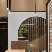
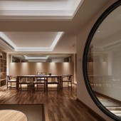
This is the design of a tea shop ,There are thousands of tea brands in China .I want to make a design that looks ordinary on the outside, but beautiful on the inside and choose the facade of the door head. Don't be disturbed, slowly feel the brand culture of "Xigu Liuxiang focuses on doing one thing in his life" and gradually present the spirit of "Oriental Tea aesthetic life".There is a strong traditional oriental sentiment in the space, and the display of products, the browsing area of customers, and the route of tea artists to introduce products are integrated with the prevailing garden style in the south.
UNIQUE PROPERTIES / PROJECT DESCRIPTION:
The design simplifies the space, weakens the design technique with the environmental protection natural material, and harmonizes the space, tea fragrance, flower art and people.
OPERATION / FLOW / INTERACTION:
Outside the door, the first thing to enter the field of vision is a large glass window with unobstructed transparent glass. The window is like a viewfinder, through which you can see a small part of the space, but not all of it. And the "mystery" of this small part of the interior is enough to attract the guests to "go in and find out".
PROJECT DURATION AND LOCATION:
The project started in December 2018 in lianjiang Fujian China and finished in May 2019 inlianjiang Fujian China
FITS BEST INTO CATEGORY:
Building Materials and Construction Components Design
|
PRODUCTION / REALIZATION TECHNOLOGY:
In the material selection of the space, log is mostly used as the veneer and solid wood lines throughout the space. The ground adopts the combination of Chinese black marble and wood grain archaize brick to make the space simple and elegant; the plain cement is used to set off the natural simplicity of the space on the large white wall
SPECIFICATIONS / TECHNICAL PROPERTIES:
The whole space is 250 ㎡. The first floor is the product display area and sales area. The second floor is the tea room and salon training area. It's an indoor art. The space dynamic differentiation is very obvious. The purchase is displayed on the first floor. The brand and products are displayed. The second floor is used as incidental
TAGS:
Tea、china、Buddhist mood
RESEARCH ABSTRACT:
Different from the traditional Chinese style of "antique" tea house and tea space, "the whole exhibition hall adopts black and white color and log color, which is quite fashionable. The public area is mainly yashibai, with the traditional elements of ink and wash. The space reveals a strong traditional oriental sentiment. The display of products, the browsing area of customers, and the route of tea artists' introduction integrate the prevailing garden style in the south. The designer makes a bold attempt to infiltrate "simplicity, nature and fashion" into the space, so as to make everything within his eyes have a long artistic conception, endless aftertaste and different temperament
CHALLENGE:
-
ADDED DATE:
2020-02-25 09:07:11
TEAM MEMBERS (1) :
GaoXiong;XieTuan
IMAGE CREDITS:
Li di
|


