DESIGN NAME:
The Wild
PRIMARY FUNCTION:
Corporate Identity
INSPIRATION:
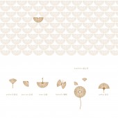
Design team applied traditional Chinese aesthetic feeling meanwhile kept its simplicity to the design. The reason to use the crane as a logo, is associated with the dream life that lots of people who choose to live in mountains desired: living idle lives like the cloud and wild crane, there is also a meaning of artistic conception. Designers got inspired by the rich characteristics of wild animals and plants in Huangbai mountain, therefore came up with different icons to represent wild animal and plants by using the same pattern element.
UNIQUE PROPERTIES / PROJECT DESCRIPTION:
This is a brand design for a new luxury resort, which is built on top of Huangbai mountain. We extracted the rich characteristics of animals and plants in that forest and used the feathers of cranes as a pattern. This basic pattern can form all kinds of animals and plants(which exist in the mountain), by applying same pattern through the entire design making this visual identity unified and harmonious.
OPERATION / FLOW / INTERACTION:
-
PROJECT DURATION AND LOCATION:
The project started in Jan 2019 in Hangzhou and finished in April 2019 in Hangzhou.
FITS BEST INTO CATEGORY:
Graphics, Illustration and Visual Communication Design
|
PRODUCTION / REALIZATION TECHNOLOGY:
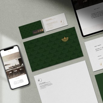
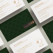
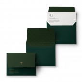
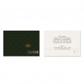
Using traditional Chinese painting:ink painting to create logo, which is a simple but artistic crane. the final products, e.g. business card, greeting card applied gold stamping on special paper, showing a tastefully low key luxury design.
SPECIFICATIONS / TECHNICAL PROPERTIES:
Business card: 90mm x 50mm
Letterhead: 297mm x 210mm
Greeting card: 148mm x 100mm
TAGS:
branding design, logo, Chinese style, hotel branding, simple
RESEARCH ABSTRACT:
Team members visited the site Huangbai mountain for three times, during the site visit, took large amount of site photos including unique plants and animals there. those elements finally be used in later stage design. Meanwhile, we did lots of background research on it culture and history aspects, in order to make the design more meaningful and powerful.
CHALLENGE:
As the resort building was designed by architects from western country, whereas the site is in china, we need to combine traditional Chinese aesthetic with Western simplicity into branding design.
ADDED DATE:
2020-02-25 08:26:03
TEAM MEMBERS (2) :
Creative director:Chao Xu and Graphic design:Chao Xu
IMAGE CREDITS:
Chao Xu, 2019.
|
