Grand Egyptian Museum Corporate Identity by Rana Gaber |
Home > Winners > #100110 |
 |
|
||||
| DESIGN DETAILS | |||||
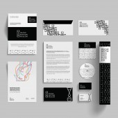
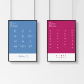
| DESIGN NAME: Grand Egyptian Museum PRIMARY FUNCTION: Corporate Identity INSPIRATION: The Grand Egyptian Museum hosts the most prominent collection of ancient Egyptian artifacts, dating back to various historical epochs. Developing a visual identity posed a great challenge; to represent the gravitas of the history while maintaining a modern and fresh look. The research and exploration process led to a rich identity inspired by the basic shapes of ancient Egyptian alphabets hieroglyphs. I incorporated hieroglyphs in the logotype and the signage system to invoke the ancient Egyptian culture and style. The viewer familiarizes with hieroglyphs without feeling foreign UNIQUE PROPERTIES / PROJECT DESCRIPTION: While maintaining the use of ancient Egyptian design aesthetics as an inspiration, a logo was created using five hieroglyphs that read Egypt. They were combined together to create this geometrical yet simple look and feel. The elongated rectangular shape is inspired by the cartouche; a frame indicating that the text enclosed is a royal name. Black is the primary color because ancient Egyptians referred to the banks of the Nile as the Black Land. The secondary colors were inspired by colorful ancient Egyptian jewelry designs. Lastly, an experimental signage system was developed OPERATION / FLOW / INTERACTION: It Creates a unique visual experience, where it also introduces people to ancient Egyptian hieroglyphs through a modern yet simple corporate identity. PROJECT DURATION AND LOCATION: 2015 German University in Cairo, 3 months During the pre-master in Graphic Design Degree. FITS BEST INTO CATEGORY: Graphics, Illustration and Visual Communication Design |
PRODUCTION / REALIZATION TECHNOLOGY: Exploring different visual languages to develop a logo and a signage system that is inspired from the hieroglyphs. SPECIFICATIONS / TECHNICAL PROPERTIES: The aspect ratio of the logo is 6:2.3. The letter 'E' form the logo was used as a measuring unit. Roboto was chosen as the main typeface as it is a very modern and simple font. To add to this it is somehow geometrical. the angles and the curves of the font are the same angles and curves of the logo type. This similarity creates harmony and consisitincy TAGS: Visual Identity, Logo, Branding, Typography, Signage system RESEARCH ABSTRACT: My research process depends entirely on the subject matter. Thus every project dictates the path I take to best understand the subject. The goal is not learn about an idea. Therefore the challenge lies in finding the purest, simplest meaning behind it. My research journey for this project had to begin with spending a lot of time with the curators of the original museum. A masterpiece in it's own right with a rich history beyond a century old. I also invested many hours of study with the resident Egyptologists, archaeologists and guides. People who dedicated their lives to becoming that history. They were the key as they helped me understand the ancient Egyptian hieroglyphs, their deeper meanings and even how to pronounce them. To know how a language sounded paints a mental image in itself. They taught me how to make sentences out of hieroglyphs. I then buttressed this new knowledge by doing my own readings, including 'Egyptian Grammar' by Sir Alan Gardiner. I took a deep dive into philology, literature, vocabulary, and translation. Only at the end of this exhausting yet exhilarating journey, did I start sketching and drawing until I reached to a simple clear iconography. CHALLENGE: Capturing the essence of the history with all it’s reverence was challenging enough. But the true Everest of this project was bridging the gap between the past and present. To bring that history with all its pretense into today’s world, required a deep dive into what is relatable. The research showed that most modern interpretations of ancient Egypt end up looking comical or simply a caricature. If I were to avoid that pitfall, the design had to be simple. This was a case of less is more. In order to be relatable in today’s world the answer had to be Simplicity. Tremendous time and effort went into carrying the complexity of the history within the folds of a simple modern design. Finding that common ground was at the heart of the creative/research challenge. ADDED DATE: 2020-02-22 20:22:35 TEAM MEMBERS (1) : none. IMAGE CREDITS: credits to: Shutterstock and bensound |
||||
| Visit the following page to learn more: https://bit.ly/3a2pYvc | |||||
| AWARD DETAILS | |
 |
Grand Egyptian Museum Corporate Identity by Rana Gaber is Winner in Graphics, Illustration and Visual Communication Design Category, 2019 - 2020.· Press Members: Login or Register to request an exclusive interview with Rana Gaber. · Click here to register inorder to view the profile and other works by Rana Gaber. |
| SOCIAL |
| + Add to Likes / Favorites | Send to My Email | Comment | Testimonials | View Press-Release | Press Kit |


