DESIGN NAME:
Xie Yan
PRIMARY FUNCTION:
Restaurant
INSPIRATION:
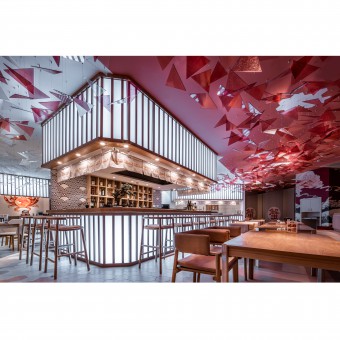
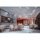
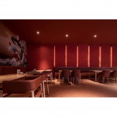
The layout of the restaurant is in the shape of a crab. In the middle of the restaurant is a slightly raised platform, which is made up of the shell. The robatayaki bar is cleverly embedded in it, which becomes the pattern on the crab shell. The two card seating areas become the eyes. The floor at the entrance is made of hexagonal tiles, which becomes its claws. The scattered seats near the wall and the ground parquet make up the rest of the feet.
UNIQUE PROPERTIES / PROJECT DESCRIPTION:
Using novel design ideas, profound aesthetic skills and unique material selection, the designer presents a catering design case close to space use, store name and diner's feelings. Its visual effect is unique and its spatial style is not restricted. It not only perfectly presents the theme of "Japanese crab cuisine", but also expands into a kind of Gourmet culture of the shop itself, expressing the business philosophy of the shopkeeper and the business value of IP itself.
OPERATION / FLOW / INTERACTION:
The design of the front door does not have too many redundant decorations, but the designer uses exquisite details to let customers feel the original intention and sincerity of the shop. The warm lighting and overall color are attracting people to push the door. The construction and presentation of all atmosphere are the best annotation of the word "sincerity";.
PROJECT DURATION AND LOCATION:
The project started in March 2019 in Kunming and finished in June 2019 in Kunming.
FITS BEST INTO CATEGORY:
Interior Space and Exhibition Design
|
PRODUCTION / REALIZATION TECHNOLOGY:
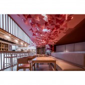
Compared with the gradual change from dark orange to light orange on the ceiling, the designer specially adjusts the color of the light acrylic sheet, blends the light pink into it, and designs it into a fine triangle, then intersperses the white and colorless into it. In this way, the flourishing acrylic films in the mid air are stacked like smoke and fog, and there is an artistic conception of cherry blossoms in full bloom.
SPECIFICATIONS / TECHNICAL PROPERTIES:
The project covers a total of 450 square meters. The unique design idea is out of the pattern of the traditional catering design, creating a completely different Japanese catering brand image, making the shop's personality expression earn enough attention.
TAGS:
Interior, Restaurant, Commercial, Modern, Simple, Japanese Cultural Characteristics, Japanese Cuisine, Sincerity
RESEARCH ABSTRACT:
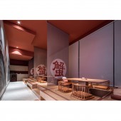
In order to emphasize the pure Japanese flavor of the restaurant, the designer separately plans a tatami dining area at the innermost side, and the screen printed with big crab characters separates the area one by one. The semi open design ensures the privacy of the dining, and also allows people to enjoy the most pure Japanese dining experience: taking off shoes and staying on the couch, sitting cross legged.
CHALLENGE:
After building the space atmosphere and theme cornerstone together with floor tile, platform, bar and dining table on the ground, the designer begins to focus on the upper space of the building. The acrylic art device suspended from the ceiling echoes the crab on the ground, sketching the shape of another crab in the mid air, which is equivalent to a crab on the ground and a crab in the mid air. The space becomes more complete and three-dimensional because of this idea.
ADDED DATE:
2020-02-22 03:11:42
TEAM MEMBERS (2) :
Yuchi Zhang and Beryl Lee
IMAGE CREDITS:
Image #1: Photographer Frank Keng, Xie Yan, 2019.
Image #2: Photographer Frank Keng, Xie Yan, 2019.
Image #3: Photographer Frank Keng, Xie Yan, 2019.
Image #4: Photographer Frank Keng, Xie Yan, 2019.
Image #5: Photographer Frank Keng, Xie Yan, 2019.
PATENTS/COPYRIGHTS:
Copyrights belong to Yuchi Zhang, 2019.
|


