| THE AWARD |
| CATEGORIES |
| REGISTRATION |
| SUBMIT YOUR WORK |
| ENTRY INSTRUCTIONS |
| TERMS & CONDITIONS |
| PUBLICATIONS |
| DATES & FEES |
| METHODOLOGY |
| CONTACT |
| WINNERS |
| PRESS ROOM |
| GET INVOLVED |
| DESIGN PRIZE |
| DESIGN STORE |
| THE AWARD | JURY | CATEGORIES | REGISTRATION | PRESS | WINNERS | PUBLICATIONS | ENTRY INSTRUCTIONS |
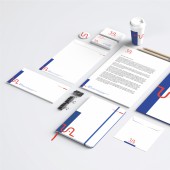
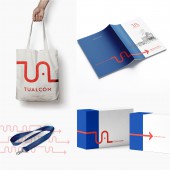
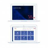
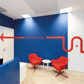
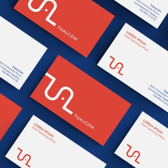
Tualcom Logo and Brand Identity by Kenarköse Creative |
Home > Winners > Design #97583 >Interview |
 |
|
FS: What is the main principle, idea and inspiration behind your design?
KC: The inspiration for the project comes from the notions of continuity and connectivity which directly refer to the fields of communication and RF Technologies, which TUALCOM operates in. The logomark is inspired by radiofrequency waves and it simply connects the letters T, U, A, and L. The resulting graphic language and the visual system instantly communicate with the broad audience in a compact and efficient way.
FS: What has been your main focus in designing this work? Especially what did you want to achieve?
KC: In this project, the main objective was to reflect the company values into a powerful logomark and branding. If you can refer the letters of the name of the company and the field at the same time, the logo functions well. In addition to that, simple and strong graphic language makes it a good design. Also, extensive research was made on both the existing logo and the visual identity as well as the graphic language of other companies in the field. The field research suggested that the new logo should be welcoming, young and unique, and simple but effective.
FS: How long did it take you to design this particular concept?
KC: When we got this job, we had a deadline of 2 to 3 weeks. Actually, as you see it affected us very well
FS: Why did you design this particular concept? Was this design commissioned or did you decide to pursuit an inspiration?
KC: We are commissioned but the client didn’t limit us or give ideas. But they were hesitant to make a radical shift in the logo and the branding due to a concern of not being able to be recognized by their current customers and not being separated from opponents. In order to balance out the powerful change in the logo, we preserve the previous color combination and replaced it with a better-calibrated version of them. Therefore, the existing visual system of the company was preserved to respect its past. The client was highly satisfied with the results.
FS: Is your design being produced or used by another company, or do you plan to sell or lease the production rights or do you intent to produce your work yourself?
KC: We were commissioned by TUALCOM to design this logo and branding.
FS: Who is the target customer for his design?
KC: Tualcom operates in the fields of communication and RF Technologies in the Defense Industry. So the target customer is Defense Industry.
FS: What sets this design apart from other similar or resembling concepts?
KC: Our design is successful because what generates the logomark and the branding is its reference to the field the company operates in and the letters of the company’s name. It has a context that makes it unique and powerful.
FS: Is your design influenced by data or analytical research in any way? What kind of research did you conduct for making this design?
KC: Starting the project, extensive research was made on both the existing logo and the visual identity as well as the graphic language of other companies in the field.
FS: What are some of the challenges you faced during the design/realization of your concept?
KC: The main challenge of the re-branding is to convince the customer to a radical shift. Generally companies are hesitant to make a radical shift in the logo and the branding due to a concern of not being able to be recognized by their current customers. That was the biggest challenge.
FS: How did you decide to submit your design to an international design competition?
KC: As a team, we knew that it was a powerful rebranding. Also even if you tried hard, inspiration doesn’t always come in a way like this. So we didn’t want to miss this chance.
FS: What did you learn or how did you improve yourself during the designing of this work?
KC: If it is a good design, no one sets against that:)
FS: Thank you for providing us with this opportunity to interview you.
A' Design Award and Competitions grants rights to press members and bloggers to use parts of this interview. This interview is provided as it is; DesignPRWire and A' Design Award and Competitions cannot be held responsible for the answers given by participating designers.
| SOCIAL |
| + Add to Likes / Favorites | Send to My Email | Comment | View Press-Release | Translations |
