| THE AWARD |
| CATEGORIES |
| REGISTRATION |
| SUBMIT YOUR WORK |
| ENTRY INSTRUCTIONS |
| TERMS & CONDITIONS |
| PUBLICATIONS |
| DATES & FEES |
| METHODOLOGY |
| CONTACT |
| WINNERS |
| PRESS ROOM |
| GET INVOLVED |
| DESIGN PRIZE |
| DESIGN STORE |
| THE AWARD | JURY | CATEGORIES | REGISTRATION | PRESS | WINNERS | PUBLICATIONS | ENTRY INSTRUCTIONS |
Black Crows Brand Identity by Yorgo Tloupas |
Home > Winners > Design #68748 >Interview |
 |
|
FS: What is the main principle, idea and inspiration behind your design?
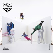
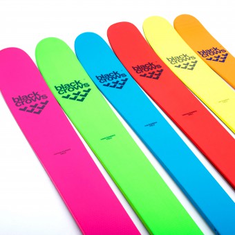
YT: Inspired by modern art, passing via urban culture, the black crows identity is expressed with a modern and exclusive design. Firstly the logo, created by Yorgo Tloupas is an association of chevrons which remind us of our childhood drawings and symbolizes the squadron of crows. Simple and geometric, it can be modified into infinity, creating a perspective close to illusion, within the line of optical art. Like this, black crows skis are recognizable to everybody. Yorgo wanted to build a brand with a strong principle: every single piece of design, from the skis to the poles, from the clothes to the architecture, would be created using only the chevron, from which the logo is built : six chevrons forming a squadron of birds, that that put upside down look as a mountain chain reminding the Mont Blanc in Chamonix.
FS: What has been your main focus in designing this work? Especially what did you want to achieve?
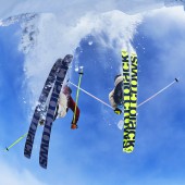
YT: Black Crows was founded in 2006 by professional skiers Camille Jaccoux and Bruno Compagnet, along with industry leader Christophe Villemin and art director Yorgo Tloupas. From the start we wanted to create a new ski brand completely apart from the traditional graphic codes of the skis industry. The main challenge for us has always been to follow the same path, using the same minimal principles, meanwhile innovating graphically every season. Avoiding to follow common graphic trends such as gradients, 3-D effects, trendy typefaces, has also been one of our brand guideline.
FS: Why did you design this particular concept? Was this design commissioned or did you decide to pursuit an inspiration?
YT: Black Crows was founded in 2006 by professional skiers Camille Jaccoux and Bruno Compagnet, along with industry leader Christophe Villemin and art director Yorgo Tloupas. The name, black crows, was dreamed up by Camille Jaccoux and alludes to the alpine chough, those black birds with yellow beaks and red claws which belong to the corvid family. Choughs are one of the few birds which can fly at an altitude of over 4000 meters, and provide a reassuring presence for skiers and mountaineers facing the solitude often felt in the high mountains. With a ski and a brand sorted, next up the friends needed to find the right look. It was up to camille to use his contacts in the art and graphics worlds to find the future black crows artistic director. One of Camille's contacts was Yorgo Tloupas, a well-reputed french designer living in London who was particularly passionate about snowboarding. It was thanks to the name black crows and the concept of a community of skiers that Yorgo developed the design base and the look for the first model. Using Camille Jaccoux words “one day, just as i'd started to lose all hope, Yorgo gave me a call and said 'i've got an idea'. He explained his thinking behind using chevrons and his commitment to having no gratuitous graphics on the skis”.
FS: Who is the target customer for his design?
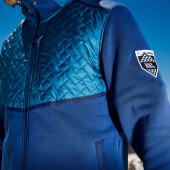
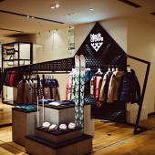
YT: Our products meet the demands of serious skiers, but also showcase with our first clothing range in the iconic Galeries Lafayette department store in Paris, and launch a high fashion ‘capsule collection’ with French designer Colette that appeared in Vogue.
FS: How did you come up with the name for this design? What does it mean?
YT: The name, black crows, was dreamed up by Camille Jaccoux and alludes to the alpine chough, those black birds with yellow beaks and red claws which belong to the corvid family. Choughs are one of the few birds which can fly at an altitude of over 4000 meters, and provide a reassuring presence for skiers and mountaineers facing the solitude often felt in the high mountains.
FS: Thank you for providing us with this opportunity to interview you.
A' Design Award and Competitions grants rights to press members and bloggers to use parts of this interview. This interview is provided as it is; DesignPRWire and A' Design Award and Competitions cannot be held responsible for the answers given by participating designers.
| SOCIAL |
| + Add to Likes / Favorites | Send to My Email | Comment | View Press-Release | Translations |
