| THE AWARD |
| CATEGORIES |
| REGISTRATION |
| SUBMIT YOUR WORK |
| ENTRY INSTRUCTIONS |
| TERMS & CONDITIONS |
| PUBLICATIONS |
| DATES & FEES |
| METHODOLOGY |
| CONTACT |
| WINNERS |
| PRESS ROOM |
| GET INVOLVED |
| DESIGN PRIZE |
| DESIGN STORE |
| THE AWARD | JURY | CATEGORIES | REGISTRATION | PRESS | WINNERS | PUBLICATIONS | ENTRY INSTRUCTIONS |
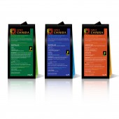
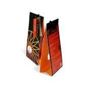
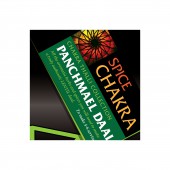
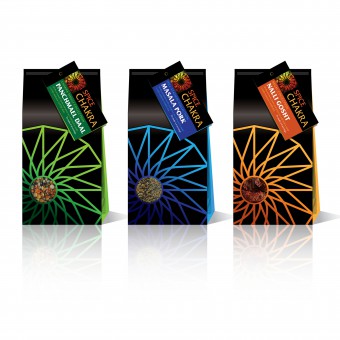
Spice Chakra Indian Recipe Pack Packaging to Display Spice Ingredients by Mark Turner |
Home > Winners > Design #67491 >Interview |
 |
|
FS: What is the main principle, idea and inspiration behind your design?
MT: I wanted a strong, colourful identity, echoed with a sophisticated, yet simplistic, iconic look and feel. My inspiration was the colours of the regions of India where the recipes came from, supported by the understanding of the religious ideology of the chakra and how the human body interrelates its complexity in its health and balance.
FS: What has been your main focus in designing this work? Especially what did you want to achieve?
MT: The main focus was to capture the true sense, colour and authentic feel of rural India. To bring pure Indian cuisine into your kitchen.
FS: What are your future plans for this award winning design?
MT: I hope to develop the range with my client and I know they want to increase their market share in the UK and possibly into Europe.
FS: How long did it take you to design this particular concept?
MT: In total 3 weeks for concepts.
FS: Why did you design this particular concept? Was this design commissioned or did you decide to pursuit an inspiration?
MT: Spice Chakra commissioned Kre8ive Partners and myself as Creative Director.
FS: Is your design being produced or used by another company, or do you plan to sell or lease the production rights or do you intent to produce your work yourself?
MT: The design is being used by Spice Chakra.
FS: What made you design this particular type of work?
MT: Packaging has, and will always be, my passion! There is something extra special to me, to be able to pick it up, rotate it, and study it. I love packaging that ticks all the boxes for all of your emotions.
FS: Where there any other designs and/or designers that helped the influence the design of your work?
MT: No there were no other designers involved with the creation of the Spice Chakra branding or the packaging.
FS: Who is the target customer for his design?
MT: The target customer is the novice, to accomplished cook, who wants to truly experience the authentic tastes from the far reaches of India. The cook who wants to enjoy creating exceptional meals with ease.
FS: What sets this design apart from other similar or resembling concepts?
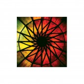
MT: The strength of colour, the iconic chakra eye and the striking matt and gloss varnish treatment gives this packaging the edge over the competition.
FS: How did you come up with the name for this design? What does it mean?
MT: Spice chakra is a combination of the product ‘Spice’ and the word chakra that means the seven centres of spiritual power in the human body.
FS: Which design tools did you use when you were working on this project?
MT: Pencil and paper is always the first way I start to look at a design concept. I am a traditional designer from the drawing board, so drawing scamps are very important to the design journey for me. To visualise the designs I used Adobe Illustrator, Photoshop and 3D Dimensions.
FS: What is the most unique aspect of your design?
MT: The unique aspect is it’s strong vibrant colours, simply style of construction and strong iconic branding, all coming together to create a dynamic brand.
FS: Who did you collaborate with for this design? Did you work with people with technical / specialized skills?
MT: No on this particular design there was no need for any particular collaboration with any specialists.
FS: What is the role of technology in this particular design?
MT: The role of technology in this design was in the visualisation of the final look of the design concepts.
FS: Is your design influenced by data or analytical research in any way? What kind of research did you conduct for making this design?
MT: The design is not influenced by data or analytical research but I certainly researched the different areas of India where the recipes came from. Also I researched the spiritual meaning of chakra and how it relates to the wellbeing of the human body.
FS: What are some of the challenges you faced during the design/realization of your concept?
MT: The challenges I faced, was how to capture the colourful country of India. To not only to produce a pack design to hold and support the product, but to create the packaging to open up and have the full recipe inside, and to use a striking tag to show how the recipe will look like once it has been created by the cook/chef.
FS: How did you decide to submit your design to an international design competition?
MT: I wanted to see if the Spice Chakra brand and packaging was worthy of the very prestigious A’Design Awards.
FS: What did you learn or how did you improve yourself during the designing of this work?
MT: I learnt that I love to create packaging with a real sense of purpose. This design is strong, vibrate, yet simplistic with a fun lively explosion of colour inside the packaging.
FS: Any other things you would like to cover that have not been covered in these questions?
MT: No I think all the questions were very thorough and informative.
FS: Thank you for providing us with this opportunity to interview you.
A' Design Award and Competitions grants rights to press members and bloggers to use parts of this interview. This interview is provided as it is; DesignPRWire and A' Design Award and Competitions cannot be held responsible for the answers given by participating designers.
| SOCIAL |
| + Add to Likes / Favorites | Send to My Email | Comment | View Press-Release |
