| THE AWARD |
| CATEGORIES |
| REGISTRATION |
| SUBMIT YOUR WORK |
| ENTRY INSTRUCTIONS |
| TERMS & CONDITIONS |
| PUBLICATIONS |
| DATES & FEES |
| METHODOLOGY |
| CONTACT |
| WINNERS |
| PRESS ROOM |
| GET INVOLVED |
| DESIGN PRIZE |
| DESIGN STORE |
| THE AWARD | JURY | CATEGORIES | REGISTRATION | PRESS | WINNERS | PUBLICATIONS | ENTRY INSTRUCTIONS |
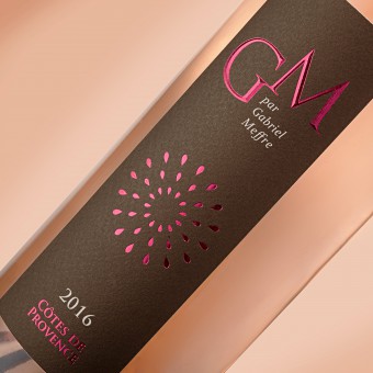
Gabriel Meffre Gm Collector Bottle by Delphine Goyon & Catherine Alamy |
Home > Winners > Design #65563 >Interview |
 |
|
FS: What is the main principle, idea and inspiration behind your design?
DG: The main idea was to symbolize the festive side of the rosé wine which is a wine tasted mainly in summer. The summer spirit in France is symbolized by the many fireworks that take place all summer in France.
FS: What has been your main focus in designing this work? Especially what did you want to achieve?
DG: The goal was to modernize the label that the customer had. The Rosé de Provence segment is particularly competitive, especially on the CHR circuit (Cafés, Hotels, Restaurants). The customer wanted to boost this product by providing an event-driven dimension.
FS: What are your future plans for this award winning design?
DG: We continue our collaboration with our client Gabriel Meffre. We have recently worked a new tender together for the Australian market.
FS: How long did it take you to design this particular concept?
DG: From briefing to printing, we worked about 2 months on the realization of this project.
FS: Why did you design this particular concept? Was this design commissioned or did you decide to pursuit an inspiration?
DG: This project is part of an order placed by our client Gabriel Meffre, with whom we have been collaborating for 5 years.
FS: Is your design being produced or used by another company, or do you plan to sell or lease the production rights or do you intent to produce your work yourself?
DG: Our design is used by the house Gabriel Meffre, located in Gigondas, in the South of France, in Provence.
FS: What made you design this particular type of work?
DG: We had to symbolize in a simple and percussive way the french touch, to boost the product and to stand out from other rosés. The idea of the fireworks came to us quite quickly.
FS: Where there any other designs and/or designers that helped the influence the design of your work?
DG: We are very inspired by the web to work on our creations, to be at the same time in the era of the time.
FS: Who is the target customer for his design?
DG: This rosé targets all consumers of rosé wine who want to enjoy a quality collector's cuvée.
FS: What sets this design apart from other similar or resembling concepts?
DG: This design is distinguished by its simple and impacting side. The printing effects accentuate the quality of the wine and the simplicity of the graphics.
FS: How did you come up with the name for this design? What does it mean?
DG: This coasts of Provence has been baptized GM, which are in fact the initials of the founder of the house Gabriel Meffre. A way to symbolize the house signature of this rosé wine.
FS: Which design tools did you use when you were working on this project?
DG: This project was entirely realized with Adobe Illustrator software.
FS: What is the most unique aspect of your design?
DG: The uniqueness of this design comes from the simplicity and strength of visual realization.
FS: Who did you collaborate with for this design? Did you work with people with technical / specialized skills?
DG: We worked in collaboration with our client Gabriel Meffre, as well as with the members of the Arome communication agency team.
FS: What is the role of technology in this particular design?
DG: The print quality and the different printing techniques give the project a qualitative and upscale dimension.
FS: Is your design influenced by data or analytical research in any way? What kind of research did you conduct for making this design?
DG: We have studied a lot the world of rosés in France and in the world, and more particularly the world of Provence rosés.
FS: What are some of the challenges you faced during the design/realization of your concept?
DG: The challenge was to work the axis of modernity, graphic and explosive in style other Provence while keeping the strong element of the product: GM by Gabriel Meffre
FS: How did you decide to submit your design to an international design competition?
DG: Our agency is adept of this kind of competition and more particularly this one. We even created us www.favourite-design.com 5 years ago.
FS: What did you learn or how did you improve yourself during the designing of this work?
DG: 212/5000 "Simplicity is not a goal in art, but we come to simplicity in spite of ourselves by approaching the real meaning of things." From Constantin Brancusi / Catalog of the New York Exhibition
FS: Any other things you would like to cover that have not been covered in these questions?
DG: We are very happy to have won 3 awards for A Design Award and we thank A Design Award for their work!
FS: Thank you for providing us with this opportunity to interview you.
A' Design Award and Competitions grants rights to press members and bloggers to use parts of this interview. This interview is provided as it is; DesignPRWire and A' Design Award and Competitions cannot be held responsible for the answers given by participating designers.
| SOCIAL |
| + Add to Likes / Favorites | Send to My Email | Comment | View Press-Release | Translations |


