| THE AWARD |
| CATEGORIES |
| REGISTRATION |
| SUBMIT YOUR WORK |
| ENTRY INSTRUCTIONS |
| TERMS & CONDITIONS |
| PUBLICATIONS |
| DATES & FEES |
| METHODOLOGY |
| CONTACT |
| WINNERS |
| PRESS ROOM |
| GET INVOLVED |
| DESIGN PRIZE |
| DESIGN STORE |
| THE AWARD | JURY | CATEGORIES | REGISTRATION | PRESS | WINNERS | PUBLICATIONS | ENTRY INSTRUCTIONS |
Wikiwiki Poke Shop Branding by Joel Derksen |
Home > Winners > Design #61701 >Interview |
 |
|
FS: What is the main principle, idea and inspiration behind your design?
JD: There were a few. First, the owner - Keith - was tired of Hawaiian themed Poke restaurants. Mainly that meant thinks with tiki torches and other visual cliches. He was looking for something with a bit of edge, a bit more big city, R&B, and inspired by jellyfish. I took those pieces and put them together, bringing inspiration from my home(s) - London and Amsterdam.
FS: What has been your main focus in designing this work? Especially what did you want to achieve?
JD: A lot of intensity of attitude. Something that won't apologise, is really flexible and dynamic, and instantly recognisable.
FS: What are your future plans for this award winning design?
JD: I'm hoping to work more with the owner (we're waiting on a mural to be installed) and continue to develop more pieces of the brand system.
FS: How long did it take you to design this particular concept?
JD: About two months.
FS: Why did you design this particular concept? Was this design commissioned or did you decide to pursuit an inspiration?
JD: Commissioned.
FS: Where there any other designs and/or designers that helped the influence the design of your work?
JD: A lot of R&B and jellyfish! And the attitude and energy of Shoreditch and London - to be weird and bold and energetic - were the big sources of inspiration.
FS: Who is the target customer for his design?
JD: A younger crowd, for a fast-casual lunch.
FS: What sets this design apart from other similar or resembling concepts?
JD: Keeping away from the Tiki-torch thing, or a farm-to-table look, which are really prevalent in restaurants right now.
FS: How did you come up with the name for this design? What does it mean?
JD: "Wiki Wiki" means "quick" in Hawaiian (or so I was told). It also sounds a bit like a record scratch.
FS: What is the most unique aspect of your design?
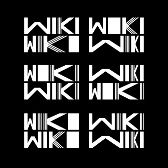
JD: I enjoy the modular logo: out of a typeface many of the Wikis can be combined and it's very simple to switch them in and out.
FS: What are some of the challenges you faced during the design/realization of your concept?
JD: Mainly there's been problem in roll-out - budget prioritisation and the mural was stolen the day it was meant to be installed! So there's been a few growing pains. ;)
FS: What did you learn or how did you improve yourself during the designing of this work?
JD: this is really my first time working with fully designing letterforms. I know they aren't fully perfect - a lot of the design also involved asking how the letter widths stack up in different groups and warped scenarios. But, hey, I took a chance!
FS: Thank you for providing us with this opportunity to interview you.
A' Design Award and Competitions grants rights to press members and bloggers to use parts of this interview. This interview is provided as it is; DesignPRWire and A' Design Award and Competitions cannot be held responsible for the answers given by participating designers.
| SOCIAL |
| + Add to Likes / Favorites | Send to My Email | Comment | View Press-Release |


