| THE AWARD |
| CATEGORIES |
| REGISTRATION |
| SUBMIT YOUR WORK |
| ENTRY INSTRUCTIONS |
| TERMS & CONDITIONS |
| PUBLICATIONS |
| DATES & FEES |
| METHODOLOGY |
| CONTACT |
| WINNERS |
| PRESS ROOM |
| GET INVOLVED |
| DESIGN PRIZE |
| DESIGN STORE |
| THE AWARD | JURY | CATEGORIES | REGISTRATION | PRESS | WINNERS | PUBLICATIONS | ENTRY INSTRUCTIONS |
Saristi Dry Tea Packaging by Antonia Skaraki |
Home > Winners > Design #61542 >Interview |
 |
|
FS: What is the main principle, idea and inspiration behind your design?
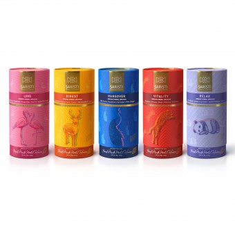
AS: The philosophy of Saristi infusions for life is to maintain both mental and physical health. This is reflected through the harmony and positive vibes of the cylindrical packaging. We wanted to explore visuals that could be bold and youthful, yet still carry the luxurious qualities associated with this premium tea series. Experience the botany of harmony. Experience the design of harmony.
FS: What has been your main focus in designing this work? Especially what did you want to achieve?
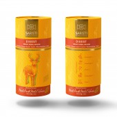
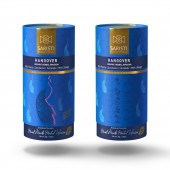
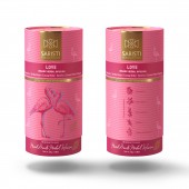
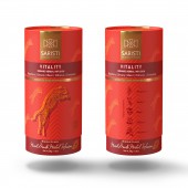
AS: What kind of packaging do the best herbal mixtures require? In the place where the notion of harmony was born (Greece), the design process for the packaging that should embrace the art of preparing special beverages (brand: SARISTI) had to follow the principles of balance and simplicity. This design demonstrate how a brand can use different colours and visuals on the products packaging - but still convey a cohesive and harmonious feel.
FS: Who is the target customer for his design?
AS: Anyone who wants to experience a unique and truly Beau-TEA-ful ritual. The challenge was to create modern and premium packaging that would attract all target-audiences (all ages and tastes), and would appeal to demanding consumers who appreciate sophisticated and elegant packaging.
FS: What sets this design apart from other similar or resembling concepts?
AS: Our quest to find a truly harmonious package led us to think outside the box. The bright, vivid colours and the unique, cylindrical shape of this vibrant packaging lead to a design that really grabs consumers’ attention.
FS: What is the most unique aspect of your design?
AS: Its concept. The artful, eye-catching packaging expresses the energetic vibe we wish people to achieve by enjoying the infusions. Each blend has its own lively, characteristic color and is represented by a different personality of the animal kingdom, conveying the desired effects of each blend and how we feel when savoring a cup. We would like to introduce you to the animals that capture the essence of each blend: a leopard for vitality, a peacock for strength after a hangover, a panda for relaxation, a flamingo for love and a deer to digest.
FS: Who did you collaborate with for this design? Did you work with people with technical / specialized skills?
AS: Working with people who have different perspectives or areas of expertise can result in better ideas and outcomes. That’s why a great team of designers and copywriters collaborated for this design.
FS: Is your design influenced by data or analytical research in any way? What kind of research did you conduct for making this design?
AS: Yes, the design has been influenced by studies on packaging design as a marketing tool, and researches about the impact that product packaging elements have on brand image and purchase intention.
FS: Thank you for providing us with this opportunity to interview you.
A' Design Award and Competitions grants rights to press members and bloggers to use parts of this interview. This interview is provided as it is; DesignPRWire and A' Design Award and Competitions cannot be held responsible for the answers given by participating designers.
| SOCIAL |
| + Add to Likes / Favorites | Send to My Email | Comment | View Press-Release | Translations |

