| THE AWARD |
| CATEGORIES |
| REGISTRATION |
| SUBMIT YOUR WORK |
| ENTRY INSTRUCTIONS |
| TERMS & CONDITIONS |
| PUBLICATIONS |
| DATES & FEES |
| METHODOLOGY |
| CONTACT |
| WINNERS |
| PRESS ROOM |
| GET INVOLVED |
| DESIGN PRIZE |
| DESIGN STORE |
| THE AWARD | JURY | CATEGORIES | REGISTRATION | PRESS | WINNERS | PUBLICATIONS | ENTRY INSTRUCTIONS |
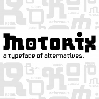
Motorix Typeface by Monica Maccaux |
Home > Winners > Design #59656 >Interview |
 |
|
FS: What is the main principle, idea and inspiration behind your design?
MM: I wanted to see how much I could push the way language looked, while still maintaining the basic rules of legibility. The goal was to stretch or push the boundaries of counter spaces, and work outside the traditional expectation of what typography looks like.
FS: What has been your main focus in designing this work? Especially what did you want to achieve?
MM: This was my first typeface, so my goal was to complete a family, and also create alternative letterforms to create a huge amount of variations within the typeface, to give the user more control over how it looked and how they used it.
FS: What are your future plans for this award winning design?
MM: I hope to keep selling it through PSY/OPS Type Foundry, and continue to raise awareness of it to others so it gets more use.
FS: How long did it take you to design this particular concept?
MM: From grad school to working with PSY/OPS, about 5 years.
FS: Why did you design this particular concept? Was this design commissioned or did you decide to pursuit an inspiration?
MM: It was based off of a type workshop in grad school, that evolved and changed over the course of the 5 years. It was self-driven, and a creative pursuit, for fun.
FS: Is your design being produced or used by another company, or do you plan to sell or lease the production rights or do you intent to produce your work yourself?
MM: The typeface is currently with PSY/OPS Type Foundry, for sale through their licensing.
FS: What made you design this particular type of work?
MM: I always wanted to design a typeface, so this was my first attempt at it. I also wanted to design something unexpected, and that broke some of the type rules.
FS: Where there any other designs and/or designers that helped the influence the design of your work?
MM: Sibylle Hagmann was my mentor for the Beta version of this typeface, and then I worked with Rod Cavazos at PSY/OPS to further develop it.
FS: Who is the target customer for his design?
MM: Designers who are looking for a futuristic, musical funky typeface.
FS: What sets this design apart from other similar or resembling concepts?
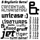
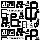
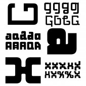
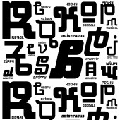
MM: The alternative letterforms. There are 5 different variations for each uppercase, lowercase, numeral, and punctuation in each weight, with pre-set stylistic sets which gives the user thousands of combinations to play with. There is a lot of versatility.
FS: How did you come up with the name for this design? What does it mean?
MM: The name was derived from trying to describe the typeface. This is the hardest part, and I had help from PSY/OPS to help come up with a name. It elicits electronic music, and humanistic forms.
FS: Which design tools did you use when you were working on this project?
MM: Pencils, paper, FontLab Studio, Adobe InDesign for testing.
FS: What is the most unique aspect of your design?
MM: The alternative letterforms and stylistic sets available for each weight.
FS: Who did you collaborate with for this design? Did you work with people with technical / specialized skills?
MM: Sibylle Hagmann in the beginning, and Rod Cavazos in the end. PSY/OPS helped with the production and finishing of the typeface, and some design help.
FS: What is the role of technology in this particular design?
MM: The type program (FontLab Studio) aided in designing and the final output and coding of the typeface.
FS: Is your design influenced by data or analytical research in any way? What kind of research did you conduct for making this design?
MM: I mostly looked at typefaces in existence, and wanted to design something different from those.
FS: What are some of the challenges you faced during the design/realization of your concept?
MM: It was a long process, and many rounds of changes and tweaks. It also took a while to find a foundry or 'home' for the typeface, and someone to collaborate with. Designing a typeface takes years, so patience and perseverance is key.
FS: How did you decide to submit your design to an international design competition?
MM: I was researching design competitions and the A'Design Award came up. I thought it would be great to compete in an international competition.
FS: What did you learn or how did you improve yourself during the designing of this work?
MM: My skills in the font program improved, along with the understanding of how long the process takes from sketch phase to release of a typeface.
FS: Thank you for providing us with this opportunity to interview you.
A' Design Award and Competitions grants rights to press members and bloggers to use parts of this interview. This interview is provided as it is; DesignPRWire and A' Design Award and Competitions cannot be held responsible for the answers given by participating designers.
| SOCIAL |
| + Add to Likes / Favorites | Send to My Email | Comment | View Press-Release | Translations |
