| THE AWARD |
| CATEGORIES |
| REGISTRATION |
| SUBMIT YOUR WORK |
| ENTRY INSTRUCTIONS |
| TERMS & CONDITIONS |
| PUBLICATIONS |
| DATES & FEES |
| METHODOLOGY |
| CONTACT |
| WINNERS |
| PRESS ROOM |
| GET INVOLVED |
| DESIGN PRIZE |
| DESIGN STORE |
| THE AWARD | JURY | CATEGORIES | REGISTRATION | PRESS | WINNERS | PUBLICATIONS | ENTRY INSTRUCTIONS |
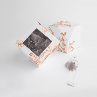
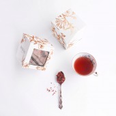
Notch Tea Packaging by Sofía Enríquez |
Home > Winners > Design #59396 >Interview |
 |
|
FS: What is the main principle, idea and inspiration behind your design?
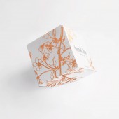
SE: I would say the main inspiration behind this design is japanese culture: cherry blossoms, minimalism and origami.
FS: What has been your main focus in designing this work? Especially what did you want to achieve?
SE: Achieving a differentiation among other products of the same nature in store's shelves, and also having a product that does not make a kitchen look untidy if it is not stowed away after its use.
FS: What are your future plans for this award winning design?
SE: I would really like for a tea company to use this design as their packaging.
FS: How long did it take you to design this particular concept?
SE: About one month.
FS: Why did you design this particular concept? Was this design commissioned or did you decide to pursuit an inspiration?
SE: It was back in 2015, I had a school project for Paper Technology course in which we needed to make a packaging with the only restriction of using cardboard as the only material.
FS: Is your design being produced or used by another company, or do you plan to sell or lease the production rights or do you intent to produce your work yourself?
SE: I plan to sell it.
FS: What made you design this particular type of work?
SE: At that time, I was really into drinking tea and I often noticed how boring and similar to one another were the boxes of tea. One day I saw a jar of tizana, I found it lovely how the small jar seemed to tilt toward the costumer, inviting it to smell its content. I wanted to pursuit something as inviting as that.
FS: Where there any other designs and/or designers that helped the influence the design of your work?
SE: I was in a really early stage of my studies when I made this design. I had in mind that I wanted to make something different for the tea industry, a packaging that would invite the customers to interact with it, but I was lacking packaging technical knowledge to make a complex design. So it was The Dieline book that helped me out - a lot.
FS: Who is the target customer for his design?
SE: I would say tea lovers. Probably mostly women because of the feminine aspect of the packaging.
FS: What sets this design apart from other similar or resembling concepts?
SE: I had not seen a similar design being used for tea, but I would say it is
FS: How did you come up with the name for this design? What does it mean?
SE: Notch: an angled or V-shaped cut in the edge or top of something.
FS: Which design tools did you use when you were working on this project?
SE: Illustrator, Photoshop, Dielines
FS: What is the most unique aspect of your design?
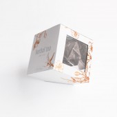
SE: The duality of how it can be displayed. The fact that it is a cube makes it easy to be transported in boxes to stores - saving space and money - but its triangular face at the bottom allows the product to be displayed in a way that draws the attention of customers.
FS: Who did you collaborate with for this design? Did you work with people with technical / specialized skills?
SE: I did not collaborate with anyone.
FS: What is the role of technology in this particular design?
SE: I used Illustrator and Photoshop to make the graphic design of the packaging.
FS: Is your design influenced by data or analytical research in any way? What kind of research did you conduct for making this design?
SE: No, I did not make any research to make this design.
FS: What are some of the challenges you faced during the design/realization of your concept?
SE: The main challenge was the modification of the faces, flaps and folding lines in order to achieve the final result.
FS: How did you decide to submit your design to an international design competition?
SE: I received an email from A'Design Award staff inviting me to participate, because they had seen my packaging in Favourite Design annuary.
FS: What did you learn or how did you improve yourself during the designing of this work?
SE: I learned about opening my mind to criticism, being patient and taking challenges.
FS: Any other things you would like to cover that have not been covered in these questions?
SE: The original graphic design of the packaging is not the same as the one I submitted to the contest, it initially had watercolor flowers but it was with a friend of mine that I discussed different ideas until I came up with this final design.
FS: Thank you for providing us with this opportunity to interview you.
A' Design Award and Competitions grants rights to press members and bloggers to use parts of this interview. This interview is provided as it is; DesignPRWire and A' Design Award and Competitions cannot be held responsible for the answers given by participating designers.
| SOCIAL |
| + Add to Likes / Favorites | Send to My Email | Comment | View Press-Release |


