| THE AWARD |
| CATEGORIES |
| REGISTRATION |
| SUBMIT YOUR WORK |
| ENTRY INSTRUCTIONS |
| TERMS & CONDITIONS |
| PUBLICATIONS |
| DATES & FEES |
| METHODOLOGY |
| CONTACT |
| WINNERS |
| PRESS ROOM |
| GET INVOLVED |
| DESIGN PRIZE |
| DESIGN STORE |
| THE AWARD | JURY | CATEGORIES | REGISTRATION | PRESS | WINNERS | PUBLICATIONS | ENTRY INSTRUCTIONS |
Optics and Chromatics Exhibition Poster by Andorka Timea |
Home > Winners > Design #58492 >Interview |
 |
|
FS: What is the main principle, idea and inspiration behind your design?
TA: The title of poster Optics and Chromatics refers to a place where Goethe points out that unlike Newton he is not so much interested in the science of sight (Optics) but rather in the theory of colours (Chromatics). He wants to demonstrate the way we actually experience colours, and not the way we are supposed to experience them according to the laws of mathematics.
FS: What has been your main focus in designing this work? Especially what did you want to achieve?
TA: I consider Goethe’s ’Theory of Colours’ as one of the basic pieces of work when studying colour experience: it highlights the fact that the colour vision is a greatly changeful, resilient and impressionistic factor, thus not possible to give a description by some exact mathematical formulas – at least not in an adequate manner. The poster enters this several-century-long scientific debate with the resources of contemporary experimental typography.
FS: Why did you design this particular concept? Was this design commissioned or did you decide to pursuit an inspiration?
TA: Goethe's Theory of Colours appeared in 1810. On the occasion of the bicentennial anniversary of the book the Society of Hungarian Graphic Designers and Typographers (MATT) announces an international design competition entitled Goetheorie.
FS: Is your design being produced or used by another company, or do you plan to sell or lease the production rights or do you intent to produce your work yourself?
TA: In 2014 this design served as the cover for Pantone Plus Series Limited-edition Artist Covers. The Pantone Formula Guide and Pantone Solid Chips feature covers showcasing works of art from my project, Optics and Chromatics. (creative manager and designer at Pantone by Timothy Heyer, director of creative marketing at Pantone by Karen Lantelme)
FS: Which design tools did you use when you were working on this project?
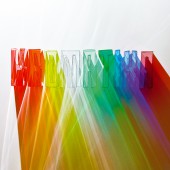
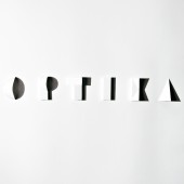
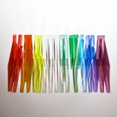
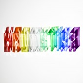
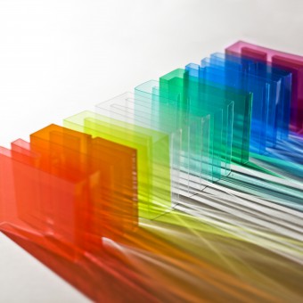
TA: Two new font-designs had to be invented to express the nature of the polemy on colour theory. The two types of letter consist of different materials and form: one is made of paper and shadow, the other is of coloured foil and light. The symmetrical, geometric shapes of the white paper and the sharp shadows in the hard light make the word ’optics’ legible. The word ’cromatics’ is built from coloured foil sheets that create colourful, intertangled beams in different angles of light.
FS: What is the most unique aspect of your design?
TA: That the two letterforms I designed for this poster do not exist anymore in the shape and form we can see here. As the letters are partly formed by beams of light and shadows, it is not possible to interpret them by themselves. The compositions were pieced together only for moments, and at the end of the experiment the letters disappeared. The two highlighted images document the experimental process and at the same time show the difference between the two theories of color.
FS: Is your design influenced by data or analytical research in any way? What kind of research did you conduct for making this design?
TA: Besides studying Newton’s and Goethe’s theories of color, I also looked for artistic approaches that accentuate the observation of the color spectrum or the light-shadow effects (e. g. Tim Noble’s and Sue Webster’s shadow sculptures, Gabriel Dave’s installations or Jen Stark’s paper sculptures).
FS: What are some of the challenges you faced during the design/realization of your concept?
TA: Numerous photos have been taken of the two letterform compositions for the project. Changing the perspective and the light conditions meant plenty of possibilities for the visualization. The two pictures that were finally chosen for the poster are the ones which – complementing each other – accentuate the most the difference between the two colour theories.
FS: How did you decide to submit your design to an international design competition?
TA: The poster has been presented at several exhibitions worldwide, even a Pantone cover was made of it, but I have never entered any competitions with it. It was high time to give it a go!
FS: What did you learn or how did you improve yourself during the designing of this work?
TA: The pleasure I found in the workflow and the poster’s success convinced me to include manuality in computer-based graphic design as often as possible. I have been following my conviction since then and included hand-made elements in my designs henceforth.
FS: Thank you for providing us with this opportunity to interview you.
A' Design Award and Competitions grants rights to press members and bloggers to use parts of this interview. This interview is provided as it is; DesignPRWire and A' Design Award and Competitions cannot be held responsible for the answers given by participating designers.
| SOCIAL |
| + Add to Likes / Favorites | Send to My Email | Comment | View Press-Release | Translations |

