| THE AWARD |
| CATEGORIES |
| REGISTRATION |
| SUBMIT YOUR WORK |
| ENTRY INSTRUCTIONS |
| TERMS & CONDITIONS |
| PUBLICATIONS |
| DATES & FEES |
| METHODOLOGY |
| CONTACT |
| WINNERS |
| PRESS ROOM |
| GET INVOLVED |
| DESIGN PRIZE |
| DESIGN STORE |
| THE AWARD | JURY | CATEGORIES | REGISTRATION | PRESS | WINNERS | PUBLICATIONS | ENTRY INSTRUCTIONS |
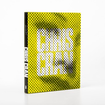
Chris Cran, Book & Cover Design Exhibition Catalogue by Stefan Canuel |
Home > Winners > Design #57260 >Interview |
 |
|
FS: What is the main principle, idea and inspiration behind your design?
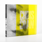
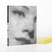
SC: My first personal encounter with Chris Cran’s work was during the 1990s when I was still studying at University. At the time his halftone paintings really grabbed my attention. I decided to use the idea of the halftone dot as an approach for the cover as this technique has been one constant in the artist’s multifaceted career. The color sleeve was incorporated as a way to reference the many layers in the artist’s practice, and the use of one of the Chorus faces on the cover was a humorous nod to the visitor experience.
FS: What has been your main focus in designing this work? Especially what did you want to achieve?
SC: It was essential that the design of this catalogue be sympathetic to the work of this contemporary artist. To have a book that could play with people’s perceptions.
FS: What are your future plans for this award winning design?
SC: At the moment I don’t have any future plans, I know the design is up for other nominations this year and I am hoping for the best.
FS: How long did it take you to design this particular concept?
SC: I usually work out several ideas before settling on the right one but in this case it was so evident to go with the halftone dot. I then had to find a way to alter the look of the book and incorporated the idea of the color sleeve and it really worked out well.
FS: Why did you design this particular concept? Was this design commissioned or did you decide to pursuit an inspiration?
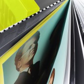
SC: Trying to achieve something different using other non-traditional printing medium in my concept, that something I really enjoy doing. The halftone image was a good start and I had to go further and chose the thick UV and the polypropylene sleeve. The use of different materials is important to my work and makes me love what I do.
FS: What made you design this particular type of work?
SC: I have a soft spot for publication design.
FS: Where there any other designs and/or designers that helped the influence the design of your work?
SC: Yes, I used to share an office with a colleague of mine at the time. We would often brainstorm ideas to make our projects better.
FS: Who is the target customer for his design?
SC: It is for supporters of the artist Chris Cran but I think this book is for everyone that has a love for contemporary art or print design. It is also a tool to promote the artist’s work.
FS: What sets this design apart from other similar or resembling concepts?
SC: To be able to have more then just another nice book. This book reflects the way the artist plays with perception, how he turns something into something else with visual tricks including trompe l’oeil and the incorporation of printing and photographic techniques in his paintings.
FS: Which design tools did you use when you were working on this project?
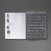
SC: The full layout was done in Adobe InDesign and other component like the endpapers was produced in Adobe Photoshop. Adobe Illustrator was also used to turn the halftone images into vector format for the black ink on the cover and UV plate.
FS: What is the most unique aspect of your design?
SC: When the book sleeve is on it shows a yellow halftone print of a woman with knockoff type. When the sleeve is removed the halftone photo is only black and white and the type is not present. Together these two states represent the many layers in this artist’s practice.
FS: Who did you collaborate with for this design? Did you work with people with technical / specialized skills?
SC: The collaboration with the artist was crucial. The curator of the exhibition, the In-house editors and the production manager were also part of the team that made this project happen. Also the print house was very helpful with their expertise.
FS: What is the role of technology in this particular design?
SC: As I mentioned earlier, I really enjoy pushing the limits and using different print techniques . The polypropylene sleeve was also a bit of a challenge. We needed to have something not too expensive and that could be realized in a short time-frame.
FS: Is your design influenced by data or analytical research in any way? What kind of research did you conduct for making this design?
SC: Looking back at the artist’s background, the artist’s past catalogues, market trends for contemporary art books, the artist’s current production, and the future of the publication as well. When trying to convey a design idea I will often use mood boards to articulate my ideas.
FS: What are some of the challenges you faced during the design/realization of your concept?
SC: It was crucial that the artist’s work was respected, yet at the same time it was important to add another dimension to give depth and autonomy to the final product. Because the image on the front cover of this catalogue is an altered version of the original artwork, I had to reassure the artist that this would be the best approach. It was important to explain to him the value in making a book that would be an object in its own right. Altering, cropping and overlapping text is always a potential issue when working on art publications.
FS: How did you decide to submit your design to an international design competition?
SC: I heard of this prestigious competition in the past and after getting rewarded nationally with this book design I thought I should apply.
FS: What did you learn or how did you improve yourself during the designing of this work?
SC: When people are on board with your design this could go a long way.
FS: Any other things you would like to cover that have not been covered in these questions?
SC: The artist and curator were overjoyed with the final result and the catalogue’s reception has been outstanding. Because of the strength of the image used for the cover of the catalogue, the exhibition design and all marketing materials were also based on the look of the publication.
FS: Thank you for providing us with this opportunity to interview you.
A' Design Award and Competitions grants rights to press members and bloggers to use parts of this interview. This interview is provided as it is; DesignPRWire and A' Design Award and Competitions cannot be held responsible for the answers given by participating designers.
| SOCIAL |
| + Add to Likes / Favorites | Send to My Email | Comment | View Press-Release |
