| THE AWARD |
| CATEGORIES |
| REGISTRATION |
| SUBMIT YOUR WORK |
| ENTRY INSTRUCTIONS |
| TERMS & CONDITIONS |
| PUBLICATIONS |
| DATES & FEES |
| METHODOLOGY |
| CONTACT |
| WINNERS |
| PRESS ROOM |
| GET INVOLVED |
| DESIGN PRIZE |
| DESIGN STORE |
| THE AWARD | JURY | CATEGORIES | REGISTRATION | PRESS | WINNERS | PUBLICATIONS | ENTRY INSTRUCTIONS |
The Cutting Edge Dispensing Pharmacy by Tetsuya Matsumoto |
Home > Winners > Design #54736 >Interview |
 |
|
FS: What is the main principle, idea and inspiration behind your design?
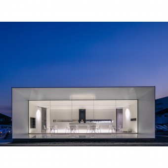
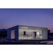
TM: This dispensing pharmacy is related to a nearby general hospital which is in the process of renewing its image. Why should a customer choose a pharmacy/hospital instead of another? The answer is on the quality of service and the trust on modern medicine. The idea was to display a high tech sharp image of a building that goes along with the cutting edge medical technology.
FS: What has been your main focus in designing this work? Especially what did you want to achieve?
TM: We wanted to design a pharmacy that has sharp and simple lines with a futuristic look but which is fully functional.
FS: What are your future plans for this award winning design?
TM: We want to promote our work and step forward with our design practice.
FS: How long did it take you to design this particular concept?
TM: It took almost 9 months to design, 3 months to construct.
FS: Why did you design this particular concept? Was this design commissioned or did you decide to pursuit an inspiration?
TM: This design was commissioned by the hospital CEO.
FS: Is your design being produced or used by another company, or do you plan to sell or lease the production rights or do you intent to produce your work yourself?
TM: This architectural design has been built and now in use.
FS: What made you design this particular type of work?
TM: We are specialized in commercial space design.
FS: Where there any other designs and/or designers that helped the influence the design of your work?
TM: I worked together with my team in my design practice: KTX archiLAB.
FS: Who is the target customer for his design?
TM: The users of the pharmacy/Hospital.
FS: What sets this design apart from other similar or resembling concepts?
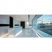
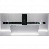
TM: The minimalism and sharpness of lines makes it different in the aesthetic way, but functionally what makes this pharmacy different is the operating system, where the client presents its prescription to the pharmacist in the counter, then wait for his medicines to be prepared in the backyard while sitting in the waiting room furnished by tables and chairs, once the preparation is done the pharmacist joins the patient on the table to explain him about the medicines.
FS: How did you come up with the name for this design? What does it mean?
TM: Literally the shape engendered the name.
FS: Which design tools did you use when you were working on this project?
TM: Of course hand sketching, followed by plan drawing and designing on Vectorworks balancing between 3D and 2D design and verification.
FS: What is the most unique aspect of your design?
TM: Its sharp lines and minimalism in this kind of buildings (pharmacies) which are usually extremely cacophonous.
FS: Who did you collaborate with for this design? Did you work with people with technical / specialized skills?
TM: I worked with my small team of architects and designers at KTX archiLAB.
FS: What is the role of technology in this particular design?
TM: We used ordinary construction techniques.
FS: Is your design influenced by data or analytical research in any way? What kind of research did you conduct for making this design?
TM: This project didn’t use any special data, the only research we conduct is thinking about how can a pharmacy give a new image to the neighboring hospital.
FS: What are some of the challenges you faced during the design/realization of your concept?
TM: How to produce the sharp lines, and then how to construct this futuristic image with an extremely limited budget.
FS: How did you decide to submit your design to an international design competition?
TM: We have already won several international competitions including A’ Design. so it is in the spirit of continuity that we applied to this edition of A’ Design awards.
FS: What did you learn or how did you improve yourself during the designing of this work?
TM: We have gained many technical skills during the design of this work together with how to make a good looking project with a limited budget.
FS: Any other things you would like to cover that have not been covered in these questions?
TM: Nothing
FS: Thank you for providing us with this opportunity to interview you.
A' Design Award and Competitions grants rights to press members and bloggers to use parts of this interview. This interview is provided as it is; DesignPRWire and A' Design Award and Competitions cannot be held responsible for the answers given by participating designers.
| SOCIAL |
| + Add to Likes / Favorites | Send to My Email | Comment | View Press-Release | Translations |


