| THE AWARD |
| CATEGORIES |
| REGISTRATION |
| SUBMIT YOUR WORK |
| ENTRY INSTRUCTIONS |
| TERMS & CONDITIONS |
| PUBLICATIONS |
| DATES & FEES |
| METHODOLOGY |
| CONTACT |
| WINNERS |
| PRESS ROOM |
| GET INVOLVED |
| DESIGN PRIZE |
| DESIGN STORE |
| THE AWARD | JURY | CATEGORIES | REGISTRATION | PRESS | WINNERS | PUBLICATIONS | ENTRY INSTRUCTIONS |
Ryft Industry Awareness by Creative Tonic |
Home > Winners > Design #43280 >Interview |
 |
|
FS: What is the main principle, idea and inspiration behind your design?
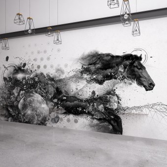
MH: The inspiration for the Ryft horse came from their technology and the idea of harnessing massive streams of complex data to find critical business insights. It was representing the possibility of creating order from chaos and taking a continuous, overwhelming flow of data and turning into something you can control and leverage.
FS: What has been your main focus in designing this work? Especially what did you want to achieve?
MH: For Ryft, we had two main goals. First was to give people a visual representation of what Ryft’s innovative technology does in allowing users to gain actionable insights from complex data streams to make their platform more accessible to prospective customers. The second goal was to create a splash in market to capture attention and differentiate from the prevailing themes of the big data industry. As a new name in the industry, and with a revolutionary technological platform, it was imperative the Ryft brand set a new standard for the space.
FS: What are your future plans for this award winning design?
MH: We continue to work closely with our clients at Ryft, finding new ways to leverage the brand and visual language to adapt to the evolving challenges their business is facing. The horse has been the focal point of several recent trade show exhibitions, and we continue to add new elements and concepts to the overall brand experience.
FS: How long did it take you to design this particular concept?
MH: The design process for this project was very intense. Once we settled on the conceptual direction, it took several days of round-the-clock design work to pull together the 40-plus different stock images and assets to create the core of the horse image. That image was the first of several custom assets that were created for the brand and, despite establishing some rules and guidelines throughout the process, each image took a similar amount of time to compose and build.
FS: Why did you design this particular concept? Was this design commissioned or did you decide to pursuit an inspiration?
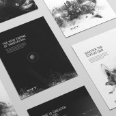
MH: The concept came out of our exploration of the competitive landscape and identifying an opportunity to bring to life the product benefit while also breaking new ground for the category. The big data market was predominantly using bright colors and slick iconography, so we pushed to create a striking black and white photo-realistic style and bold tone to stand out.
FS: Is your design being produced or used by another company, or do you plan to sell or lease the production rights or do you intent to produce your work yourself?
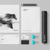
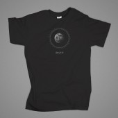
MH: The design is exclusively in use by Ryft throughout a variety of touchpoints and executions for the brand.
FS: What made you design this particular type of work?
MH: The desire to create something that would stand out from the crowd and opportunity to explore a photo-realistic style to demonstrate the product benefit in an innovative, but accessible way.
FS: Where there any other designs and/or designers that helped the influence the design of your work?
MH: While ultimately one person was at the computer creating this distinct visual style, the entire studio played a part in helping bring the concept to life from the strategic foundation to the initial execution and now multitude of ways it has been used for the brand.
FS: Who is the target customer for his design?
MH: The target for the Ryft brand centers around the decision makers in the IT world, from the CIO to the business analyst. While unique in the issues they face on a day-to-day basis, they are all trying to address the challenge of how to leverage to overwhelming amount of data being collected to improve their business intelligence and make smarter, better informed decisions.
FS: What sets this design apart from other similar or resembling concepts?
MH: What really sets this concept apart is the combination of artistic freedom and strategic insight. Each visual that was created for the brand can stand independently as a piece of digital art. But, when combined with the brand’s messaging and actual benefit of their product, it delivers a product that is both beautiful and smart.
FS: How did you come up with the name for this design? What does it mean?
MH: N/A
FS: Which design tools did you use when you were working on this project?
MH: All of the image asset creation was done in Photoshop and Illustrator.
FS: What is the most unique aspect of your design?
MH: Each of the brand image assets, such as the main horse image, were created from a collage of over 40 royalty free stock images.
FS: Who did you collaborate with for this design? Did you work with people with technical / specialized skills?
MH: N/A
FS: What is the role of technology in this particular design?
MH: This design is a representation of how technology enables us to create outside the limits of reality as everything that was created for the Ryft brand is made entirely of digital images and assets. In representing the technical details and benefits of data processing, the design sought to give familiar form to an abstract concept.
FS: Is your design influenced by data or analytical research in any way? What kind of research did you conduct for making this design?
MH: The design was influenced heavily by research into the big data industry and the identification of themes and design concepts that were being used heavily in that space. Seeking to stand out, it gave us an indication of visual styles and messaging opportunities to explore to differentiate from the crowd. We also conducted extensive target audience research and persona development to understand the challenges our desired customers were facing and ensure the brand was rising to meet their goals and expectations.
FS: What are some of the challenges you faced during the design/realization of your concept?
MH: Creating such intricate, detailed art while trying to retain versatility in terms of where and how it could be used presented a big challenge.
FS: How did you decide to submit your design to an international design competition?
MH: We are very proud of the work and how it has helped our client stand out in the big data space. Going into the design we wanted to push outside the boundaries of the industry and more traditional technology approaches to create more of a high design with global appeal. This competition offers an opportunity for us to measure our work against a global design perspective to see how it stands up against the best in the world.
FS: What did you learn or how did you improve yourself during the designing of this work?
MH: This project supports our longstanding position that business-to-business doesn’t have to mean boring. With Ryft, we pushed the boundaries further than we had previously gone with other clients and, in the process, affirmed that the industry and business in general welcomes different, challenging and beautiful design.
FS: Any other things you would like to cover that have not been covered in these questions?
MH: No.
FS: Thank you for providing us with this opportunity to interview you.
A' Design Award and Competitions grants rights to press members and bloggers to use parts of this interview. This interview is provided as it is; DesignPRWire and A' Design Award and Competitions cannot be held responsible for the answers given by participating designers.
| SOCIAL |
| + Add to Likes / Favorites | Send to My Email | Comment | View Press-Release |


