| THE AWARD |
| CATEGORIES |
| REGISTRATION |
| SUBMIT YOUR WORK |
| ENTRY INSTRUCTIONS |
| TERMS & CONDITIONS |
| PUBLICATIONS |
| DATES & FEES |
| METHODOLOGY |
| CONTACT |
| WINNERS |
| PRESS ROOM |
| GET INVOLVED |
| DESIGN PRIZE |
| DESIGN STORE |
| THE AWARD | JURY | CATEGORIES | REGISTRATION | PRESS | WINNERS | PUBLICATIONS | ENTRY INSTRUCTIONS |
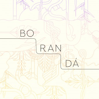
Boranda Visual Identity by Gabriela Namie and Jun Ioneda |
Home > Winners > Design #42916 >Interview |
 |
|
FS: What is the main principle, idea and inspiration behind your design?
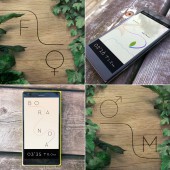
GK: The main principle and inspiration for Boranda's visual identity is the trail as an element of connection between people and nature, a personal search, our own path. Trail line is the central piece that draws logo, illustrations and layout in this graphic system. We went several times to conservation units to get inspired by nature.
FS: What has been your main focus in designing this work? Especially what did you want to achieve?
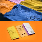
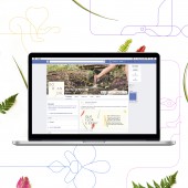
GK: The main focus in designing this work was to promote Brazilian Rainforest's conservation units in big cities, such as São Paulo and Rio de Janeiro. Conservation units are often very close to urban centres but sometimes forgotten as an entertainment option. In order to connect the urban audience with units it was key to speak in a visual language that combined a contemporary feeling but also brought nature's wildness and strength. So basically we wanted our graphic work to create a connection between people who are not used to going to the units and the Atlantic Rainforest.
FS: What are your future plans for this award winning design?
GK: We hope that Boranda movement draws attention to the Rainforest situation in Brazil and that society in big cities can enjoy a good day in the conservation units. The next step in the project is to create a visual identity for a trail that will cover the forest through four states and will be called Caminho da Mata Atlântica. It will have a visual connection with the identity of the movement and hopefully will raise tourism in the country and will raise awareness around the issue.
FS: How long did it take you to design this particular concept?
GK: Around four weeks with many interactions with WWF and Together teams. Along those weeks we were able to study audience and context, but also to visit some conservation units to get inspiration from the real source.
FS: Why did you design this particular concept? Was this design commissioned or did you decide to pursuit an inspiration?
GK: We were commissioned by WWF Brazil to create this particular project.
FS: Is your design being produced or used by another company, or do you plan to sell or lease the production rights or do you intent to produce your work yourself?
GK: Rollout materials of the identity will be produced by WWF Brazil.
FS: What made you design this particular type of work?
GK: Barca is a graphic design studio focused on visual identity, illustration and editorial projects. We have always worked on projects like this and look forward for more challenges and opportunities to develop interesting concepts with interesting people.
FS: Where there any other designs and/or designers that helped the influence the design of your work?
GK: Not for this particular project but we do have our main influences, such as Karel Martens, Stefan Kanchev, Charley Harper, Paul Rand and Michael Bierut. I guess we like bold shapes in good color combinations.
FS: Who is the target customer for his design?
GK: Urban audience from São Paulo and Rio de Janeiro that are not used to visit conservation units.
FS: What sets this design apart from other similar or resembling concepts?
GK: Visual identity for trails usually focus in an audience that is already used to visit them of course. Since it's a movement that aims to dialogue with that other part of society – those who are not used to visit conservation units – it was important to talk with different visual codes. I think it feels more urban and clean than the usual visual identities for trails and nature-related issues.
FS: How did you come up with the name for this design? What does it mean?
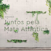
GK: The name Boranda is a contraction between the words "bora", which is an informal expression for "let's", and "walk". Together they sound like an indigenous word but also call audience to action.
FS: Which design tools did you use when you were working on this project?
GK: Illustration CC, Photoshop CC and stencil papers to test trail signage.
FS: What is the most unique aspect of your design?
GK: Probably the line that makes it possible to create the most diverse logos.
FS: Who did you collaborate with for this design? Did you work with people with technical / specialized skills?
GK: Barca developed naming and visual identity. That means Gabriela Namie and Jun Ioneda developed visual identity and logo. Teo Garfunkel worked on naming. Together Agency developed studies around the main audience and the development of the movement.
FS: What is the role of technology in this particular design?
GK: We used Adobe's technology in the development of the identity but when creating signage for trail we had no other technology besides a simple stencil on rocks and trees, which is very unusual but created very interesting process and results.
FS: Is your design influenced by data or analytical research in any way? What kind of research did you conduct for making this design?
GK: Together agency provided a very detailed study about audience and context. They also worked on the development of the movement. We also did field research going to the conservation units, interviewed WWF team and talked to trail administrators.
FS: What are some of the challenges you faced during the design/realization of your concept?
GK: The main challenge was to create an identity that combined nature's wildness and strength with an urban and contemporary feel. I think clients were a bit impressed and also frightened that the identity didn't look like what they were used to in this particular field. But I think that's what makes a great invitation to a wider audience to visit conservation units.
FS: How did you decide to submit your design to an international design competition?
GK: WWF, Together and Barca were very proud of this particular project. We have never submitted a work to an international award. And even nationally, we have done this only once. But after the meeting, one of the clients said we should do it. We saw it as an opportunity to learn more about our own work and to share our results with other people with other views. It was an amazing experience and we are very happy to be part of such an important award. It was not only great for us as a studio, but we think it is important to promote the movement itself. Also we got to meet a lot of great designers in the competition and we are coming back to work feeling empowered and inspired.
FS: What did you learn or how did you improve yourself during the designing of this work?
GK: We learned a lot from this project as we usually do in all projects. Not only refining graphic elements to their best but also because all trail administrators, Together and WWF team had to approve it. We had meetings with more than 30 people to get feedback and make sure the identity fulfilled all requirements. That could be seen as a chaotic experience but it was an enriching process with interesting people.
FS: Any other things you would like to cover that have not been covered in these questions?
GK: We would like to thank WWF, Together and all A'Award team.
FS: Thank you for providing us with this opportunity to interview you.
A' Design Award and Competitions grants rights to press members and bloggers to use parts of this interview. This interview is provided as it is; DesignPRWire and A' Design Award and Competitions cannot be held responsible for the answers given by participating designers.
| SOCIAL |
| + Add to Likes / Favorites | Send to My Email | Comment | View Press-Release |

