| THE AWARD |
| CATEGORIES |
| REGISTRATION |
| SUBMIT YOUR WORK |
| ENTRY INSTRUCTIONS |
| TERMS & CONDITIONS |
| PUBLICATIONS |
| DATES & FEES |
| METHODOLOGY |
| CONTACT |
| WINNERS |
| PRESS ROOM |
| GET INVOLVED |
| DESIGN PRIZE |
| DESIGN STORE |
| THE AWARD | JURY | CATEGORIES | REGISTRATION | PRESS | WINNERS | PUBLICATIONS | ENTRY INSTRUCTIONS |
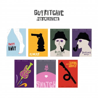
Guy Ritchie Film Collection by Ali Metehan Erdem |
Home > Winners > Design #41858 >Interview |
 |
|
FS: What has been your main focus in designing this work? Especially what did you want to achieve?
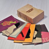
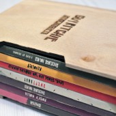
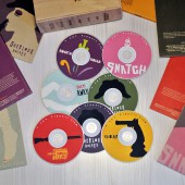
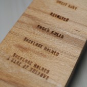
AE: The focus of this poster series is not on actors or actresses, nor on characteristic scenes is that Guy Ritchie famous for. Rather, the posters explore the sources of his inspiration. They also emphasize discourses and styles. All illustrations aim to convey a message through a careful choice of colors and styles.
FS: How long did it take you to design this particular concept?
AE: Almost four months from planning to execution.
FS: Why did you design this particular concept? Was this design commissioned or did you decide to pursuit an inspiration?
AE: I chose to design Guy Ritchie’s film posters as a senior graduate project. I like Ritchie's Dark Comedy, and I just wanted to use it in my designs. Also, the Polish illustration style was an excellent way to narrate Ritchie’s metaphors.
FS: Which design tools did you use when you were working on this project?
AE: I used old methods like charcoal and paper cut-out, instead of popular computer techniques to distance myself from the usual popular culture style of Hollywood.
FS: What is the most unique aspect of your design?
AE: It is primitive yet refined. Like Guy Ritchie’s movies themselves.
FS: Who did you collaborate with for this design? Did you work with people with technical / specialized skills?
AE: One of the greatest Polish illustrators, Adam Pękalski was my instructor while designing this project. He helped me figure out the characteristic features of Polish illustration style with his great passion and creative direction. My other instructor, Birsu Çeltek also gave an enormous support throughout the research and design process.
FS: What are some of the challenges you faced during the design/realization of your concept?
AE: The stimulating challenge of this work was to show deep ironies, typical for Ritchie’s work, through posters. For instance, it was challenging not to focus on actress Madonna for the poster for the Swept Away, but to present a criticism of gender perceptions.
FS: What did you learn or how did you improve yourself during the designing of this work?
AE: Using the sources in a short-period was a challenging situation for me. I researched about both his film’s visual elements and ironies. Although I use digital software to design a poster, that design has taught me a lot about primitive methods to design something.
FS: Thank you for providing us with this opportunity to interview you.
A' Design Award and Competitions grants rights to press members and bloggers to use parts of this interview. This interview is provided as it is; DesignPRWire and A' Design Award and Competitions cannot be held responsible for the answers given by participating designers.
| SOCIAL |
| + Add to Likes / Favorites | Send to My Email | Comment | View Press-Release |
