| THE AWARD |
| CATEGORIES |
| REGISTRATION |
| SUBMIT YOUR WORK |
| ENTRY INSTRUCTIONS |
| TERMS & CONDITIONS |
| PUBLICATIONS |
| DATES & FEES |
| METHODOLOGY |
| CONTACT |
| WINNERS |
| PRESS ROOM |
| GET INVOLVED |
| DESIGN PRIZE |
| DESIGN STORE |
| THE AWARD | JURY | CATEGORIES | REGISTRATION | PRESS | WINNERS | PUBLICATIONS | ENTRY INSTRUCTIONS |
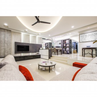
Monochromatic Space Residential House by Summerhaus D'zign Pte Ltd |
Home > Winners > Design #41632 >Interview |
 |
|
FS: What is the main principle, idea and inspiration behind your design?
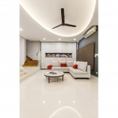
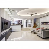
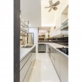
LL: It's all about understanding the homeowners' lifestyle, their current and future anticipated needs and preferences. We worked with the concept of having wide open spaces, providing an everlasting and timeless design style coupled with the different usage of linear lines, shapes and colour. Therefore, the main idea was to use a single shape (i.e. rectangle) in various forms e.g. single directional angled panels, vertical/horizontal applications, different angle vertical application. Following the use of a single main shape, we employed a main colour scheme, Grey - to use different shapes and textures of grey.
FS: What has been your main focus in designing this work? Especially what did you want to achieve?
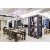
LL: We wanted to create a home that is not just aesthetically pleasing and timeless, it has to serve the home owners functionally for their daily use as well. One of the main focus was to amalgamate having ample storage cabinets and masking them cleverly in a visually pleasing manner.
FS: What are your future plans for this award winning design?
LL: We would like to build on the principles of this designs, improve it and utilize it for our upcoming projects.
FS: How long did it take you to design this particular concept?
LL: Around 3 months
FS: Is your design being produced or used by another company, or do you plan to sell or lease the production rights or do you intent to produce your work yourself?
LL: This design was constructed and built by our contractors.
FS: What made you design this particular type of work?
LL: Contemporary designs with vast open spaces and cleverly hidden inconspicuous storage areas have always been apart of our belief when designing a home for our clients. Bringing them to life in different perspectives and ways is always in our agenda in every project we take on.
FS: Who is the target customer for his design?
LL: It was specifically customized for our client according to his lifestyle and needs.
FS: How did you come up with the name for this design? What does it mean?
LL: The name represents our colour scheme. We took on a monochromatic colour palette for the entire living space.
FS: Which design tools did you use when you were working on this project?
LL: Autodesk Autocad and 3D Max
FS: What is the most unique aspect of your design?
LL: The vertical slanted, angled panels behind the TV panel brings additional depth and dimensions to what could be otherwise a flat and understated design.
FS: What are some of the challenges you faced during the design/realization of your concept?
LL: The carpenters had to source specific hinges that were able to accommodate specific angles. However, due to the limitations of available door hinges and hardware, we had to tweak the degree of slant for the cabinets.
FS: How did you decide to submit your design to an international design competition?
LL: The A'Design Award is an internationally recognised design competition. Being able to be a part of it has always been a recognition any designer need.
FS: Thank you for providing us with this opportunity to interview you.
A' Design Award and Competitions grants rights to press members and bloggers to use parts of this interview. This interview is provided as it is; DesignPRWire and A' Design Award and Competitions cannot be held responsible for the answers given by participating designers.
| SOCIAL |
| + Add to Likes / Favorites | Send to My Email | Comment | View Press-Release | Translations |
