| THE AWARD |
| CATEGORIES |
| REGISTRATION |
| SUBMIT YOUR WORK |
| ENTRY INSTRUCTIONS |
| TERMS & CONDITIONS |
| PUBLICATIONS |
| DATES & FEES |
| METHODOLOGY |
| CONTACT |
| WINNERS |
| PRESS ROOM |
| GET INVOLVED |
| DESIGN PRIZE |
| DESIGN STORE |
| THE AWARD | JURY | CATEGORIES | REGISTRATION | PRESS | WINNERS | PUBLICATIONS | ENTRY INSTRUCTIONS |
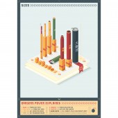
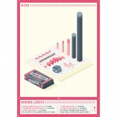
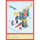
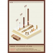
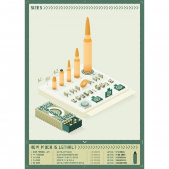
Sizes Poster by Matteo Ruisi |
Home > Winners > Design #37429 >Interview |
 |
|
FS: What is the main principle, idea and inspiration behind your design?
MR: I found the inspiration watching a video called "Stars size comparison" that shows the huge difference between the sun and the biggest star of the known universe. I was impressed by this video and I decide to make my own comparison between the same kind of items to show the difference between objects that people can be curious of.
FS: What has been your main focus in designing this work? Especially what did you want to achieve?
MR: I designed these posters to put together all my competence and skills I achieved with my job: idea driven concepts, research, attention to details, colour choice, isometric design, typography, graphic and packaging design, illustration and copywriting.
FS: What are your future plans for this award winning design?
MR: My future plan is to develop new series of poster in order to make a personal exhibition.
FS: How long did it take you to design this particular concept?
MR: The longest part was the research, because I had to be sure about the accuracy of the informations. Every poster has taken about 10 hours each to be designed and other time to be finalised.
FS: Why did you design this particular concept? Was this design commissioned or did you decide to pursuit an inspiration?
MR: I decided to design this concept because I saw the opportunity to put together all my skills.
FS: Is your design being produced or used by another company, or do you plan to sell or lease the production rights or do you intent to produce your work yourself?
MR: The purpose of these poster is a personal exhibition and winning a Silver A'Design Award gave me the confidence to go ahead with this style.
FS: What made you design this particular type of work?
MR: I love isometric and infographic works and I thought to create a work that could stand out and be inspirational for other designers.
FS: Where there any other designs and/or designers that helped the influence the design of your work?
MR: I love the work of a designer I met on Behance website, his name is Rod Hunt and he is a british illustrator. His work is really inspiring.
FS: Who is the target customer for his design?
MR: The target is actually other designers and design agencies.
FS: What sets this design apart from other similar or resembling concepts?
MR: I think the sense of humour is the key of this design. Other infographics are generally boring due to the serious topics, but information have a great component of humour that can be used.
FS: How did you come up with the name for this design? What does it mean?
MR: "Sizes - When size matters" is the paraphrases of the famous line "Size doesn't matter". I decided to give to my work this title because represent very well the intent.
FS: Which design tools did you use when you were working on this project?
MR: I used Adobe Illustrator for all the designs.
FS: What is the most unique aspect of your design?
MR: The most unique aspect of my design is my personal sense of humour, that is the think I try to put in every work. As I usually say: "A world without humour is not fun at all."
FS: Who did you collaborate with for this design? Did you work with people with technical / specialized skills?
MR: I've worked by myself on every poster.
FS: What is the role of technology in this particular design?
MR: The role of a design software is to increase the cleanness of colors and shapes.
FS: Is your design influenced by data or analytical research in any way? What kind of research did you conduct for making this design?
MR: I searched all the informations across the web and asking to one expert in some case. All the informations were compared to find out which was the correct one, because in some case I found contrasting informations.
FS: What are some of the challenges you faced during the design/realization of your concept?
MR: The biggest challenge was to satisfy myself, I redesigned the posters a lot of time, usually deleting everything to start again from the scratch. I think this is the secret for a good work.
FS: How did you decide to submit your design to an international design competition?
MR: I believe in this work and I think I gave the best of myself, so I thought was a good idea to submit it to an international jury, to find out whether my work was good enough.
FS: What did you learn or how did you improve yourself during the designing of this work?
MR: I improved my illustration skills, my attention to informations and most of all, I learned the importance of being severe with myself to reach the greatest goals.
FS: Any other things you would like to cover that have not been covered in these questions?
MR: I'm available as illustrator freelance.
FS: Thank you for providing us with this opportunity to interview you.
A' Design Award and Competitions grants rights to press members and bloggers to use parts of this interview. This interview is provided as it is; DesignPRWire and A' Design Award and Competitions cannot be held responsible for the answers given by participating designers.
| SOCIAL |
| + Add to Likes / Favorites | Send to My Email | Comment | View Press-Release |
