| THE AWARD |
| CATEGORIES |
| REGISTRATION |
| SUBMIT YOUR WORK |
| ENTRY INSTRUCTIONS |
| TERMS & CONDITIONS |
| PUBLICATIONS |
| DATES & FEES |
| METHODOLOGY |
| CONTACT |
| WINNERS |
| PRESS ROOM |
| GET INVOLVED |
| DESIGN PRIZE |
| DESIGN STORE |
| THE AWARD | JURY | CATEGORIES | REGISTRATION | PRESS | WINNERS | PUBLICATIONS | ENTRY INSTRUCTIONS |
Samadara Ginige Personal Identity Logo by Samadara Ginige |
Home > Winners > Design #31461 >Interview |
 |
|
FS: What is the main principle, idea and inspiration behind your design?
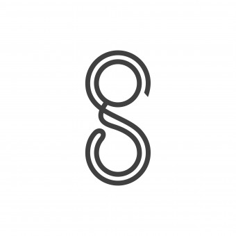
SG: Idea was to design a logo for a Designer & Developer who have been working in this sector for 10 years. She is a designer who appreciate simplicity and has achieved it in most of her designs.
FS: What has been your main focus in designing this work? Especially what did you want to achieve?
SG: My focus was to design a logo which is aesthetically appealing while being unique as it was designed for a designer. It needed to be clever as well as clean.
FS: What are your future plans for this award winning design?
SG: It will be used as my logo/identity and will be the identity for my future design studio.
FS: How long did it take you to design this particular concept?
SG: About 3 weeks.
FS: Why did you design this particular concept? Was this design commissioned or did you decide to pursuit an inspiration?
SG: This design was my own idea and it is not a commission. In my research I found plenty of logos that represent designers and the symbols such as pencil, pen, brush, etc are overused. And I found many versions of sg monogram as well. It was not easy to design an acceptable sg monogram which is professional, elegant, clean and clever.
FS: Is your design being produced or used by another company, or do you plan to sell or lease the production rights or do you intent to produce your work yourself?
SG: I intend to use my work myself.
FS: What made you design this particular type of work?
SG: As a designer and a developer who have been working for more than 10 years in graphics/web fields, I felt it is time to get an identity designed for myself.
FS: Where there any other designs and/or designers that helped the influence the design of your work?
SG: No, this is my own work.
FS: Who is the target customer for his design?
SG: Start-ups, Small|Medium|Large sized businesses and freelancers who seek logo/corporate identity/graphics/web design and development services.
FS: What sets this design apart from other similar or resembling concepts?
SG: In my research I found plenty of logos which represent designers and the symbols such as pencil, pen, brush, etc are overused. And I found many versions of sg monogram. So I wanted to design a unique sg monogram which is professional, elegant, clean and clever which will capture the audience for it's simplicity and uniqueness.
FS: How did you come up with the name for this design? What does it mean?
SG: sg are the two initials of my name Samadara Ginige.
FS: Which design tools did you use when you were working on this project?
SG: I used pencil and paper to sketch. Then I scanned my sketches and made the vector version using Adobe Illustrator CS6 and made the presentation using Adobe Photoshop CS6.
FS: What is the most unique aspect of your design?
SG: It's two letters which are connected, and creating an infinity loop. It represents me as a designer as well as a developer.
FS: Who did you collaborate with for this design? Did you work with people with technical / specialized skills?
SG: I worked alone on this project.
FS: Is your design influenced by data or analytical research in any way? What kind of research did you conduct for making this design?
SG: Researching was completely based on internet. I searched how I should present myself uniquely while not using the same symbols and icons which other designers have used to represent themselves. And I referred to many logo/identity galleries and design communities as well.
FS: What are some of the challenges you faced during the design/realization of your concept?
SG: There are plenty of logos represent designers and the symbols such as pencil, pen, brust, etc are overused. And I found many versions of sg monogram. It was not easy to design an acceptable sg monogram which is professional, elegant, clean and clever.
FS: How did you decide to submit your design to an international design competition?
SG: I received an email from news@design-pr.org regarding this competition. I think it's high time to prove my skills. My work have received many articles/blog features, book includes and galleries features. I think this is the best way to earn the recognition for my work and compliment myself for the hard work I've put through to get to this point.
FS: What did you learn or how did you improve yourself during the designing of this work?
SG: I had to go through a few revisions to make it pixel perfect.
FS: Thank you for providing us with this opportunity to interview you.
A' Design Award and Competitions grants rights to press members and bloggers to use parts of this interview. This interview is provided as it is; DesignPRWire and A' Design Award and Competitions cannot be held responsible for the answers given by participating designers.
| SOCIAL |
| + Add to Likes / Favorites | Send to My Email | Comment | View Press-Release | Translations |


