| THE AWARD |
| CATEGORIES |
| REGISTRATION |
| SUBMIT YOUR WORK |
| ENTRY INSTRUCTIONS |
| TERMS & CONDITIONS |
| PUBLICATIONS |
| DATES & FEES |
| METHODOLOGY |
| CONTACT |
| WINNERS |
| PRESS ROOM |
| GET INVOLVED |
| DESIGN PRIZE |
| DESIGN STORE |
| THE AWARD | JURY | CATEGORIES | REGISTRATION | PRESS | WINNERS | PUBLICATIONS | ENTRY INSTRUCTIONS |
Door Stops Seating For Transit Riders by Craig L. Wilkins |
Home > Winners > Design #30828 >Interview |
 |
|
FS: What is the main principle, idea and inspiration behind your design?
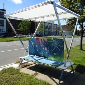
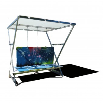
CW: Door Stops is a collaboration between designers, artists, riders and community residents to fill neglected public spaces, like transit stops and vacant lots, with seating opportunities to make the city a more pleasant place to be. Designed to provide a safer and aesthetically pleasing alternative to that which currently exists, the units are infused with large displays of public art commissioned from local artists, making for an easily identifiable, safe and pleasant waiting area for riders.
FS: What has been your main focus in designing this work? Especially what did you want to achieve?
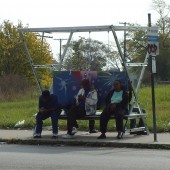
CW: Bus stops advertise the transit system to the public. A stop that looks dirty or neglected, or whose waiting passengers look hot, cold, wet, confused or vulnerable sends a devastating message: you’re lucky you don’t have to ride the bus. The use of public transportation is typically read as being without means; that the people, place and service of public transportation are at best, secondary considerations in the economic and environmental operations of the city. We wanted to change that.
FS: What are your future plans for this award winning design?
CW: This project aims to bring the citizen back into a position of prominence in the decision- and place-making process with respect to the city’s collective spatial conditions by giving s/he the tools to make desires visible. A very small tool, yes, but one that addresses a number of immediate and long-term, tangible and intangible concerns. It begins small but has the ability to aggregate into a larger, cumulative impact.
FS: How long did it take you to design this particular concept?
CW: A couple weeks, actually.
FS: Why did you design this particular concept? Was this design commissioned or did you decide to pursuit an inspiration?
CW: As functional architecture, these structures must offer tangible benefits to riders of weather protection, boarding identification and rest area. As pieces of art, they must offer constantly changing public art and opportunities for local artists to ply their trade and talents. Together, they have to provide an opportunity for riders and residents to create a space of their own making; a choice that will ultimately comment on the state of transportation and the quality of the public realm.
FS: Is your design being produced or used by another company, or do you plan to sell or lease the production rights or do you intent to produce your work yourself?
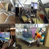
CW: Our partner artists create the murals, my partner and I do the fabrication and installation.
FS: What made you design this particular type of work?
CW: the primary objective of the Center is to work in distressed areas of the city and with organizations and individuals who live and work in these communities. this project allowed us to continue fulfilling our mission.
FS: Who is the target customer for his design?
CW: The residents of the City of Detroit, especially those who use the public transit system.
FS: What sets this design apart from other similar or resembling concepts?
CW: The fact that it is almost entirely of salvaged and repurposed materials found in the very spaces where we plan to install the finished products
FS: How did you come up with the name for this design? What does it mean?
CW: Door Stops is a play on the term Bus Stops, which is one of the primary locations for seating installation.
FS: Which design tools did you use when you were working on this project?
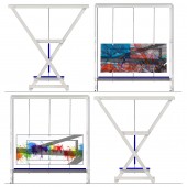
CW: SketchUP, AutoCAD and good old fashioned trace paper
FS: What is the most unique aspect of your design?
CW: The fact that it is almost entirely of salvaged and repurposed materials found in the very spaces where we plan to install the finished products
FS: Who did you collaborate with for this design? Did you work with people with technical / specialized skills?
CW: besides my primary design partner Damon Dickerson, our artist collaborators were Erik Howard, Chazz Miller, Jessica Harris, Mollie Decker, Rosa Mariá Zamarrón, Michael Sklenka, Gordon Soderberg, Molly Landis, Dennis Thom, Paul Mungar, Ryon P. Gonzalez, William Wey, Nicole Lapointe, Jessica Rowland, Bree Hietala, Kevin Boyd, Vanessa Cronan, Bradley Bailey and Young Detroit / The Alley Project Collaborative
FS: What is the role of technology in this particular design?
CW: almost nill. we wanted to create a product that was easily replicable by any interested party in the city without the need to access specialized equipment. the entire project can be produced with commonly -held tools available at any hardware store
FS: Is your design influenced by data or analytical research in any way? What kind of research did you conduct for making this design?
CW: observation, conversation, culling of numerous newspaper, journal and articles on the subject, as well as analyzing of numerous local, regional and nation transportation trends, studies, statistics, reports and projections
FS: What are some of the challenges you faced during the design/realization of your concept?
CW: funding, transportation and installation were the primary challenges. for various reasons ranging from metal scrapping to collection of artwork, our units were being removed almost as soon as they were installed
FS: How did you decide to submit your design to an international design competition?
CW: it was one of the few we knew would consider a socially specific design process such as ours.
FS: What did you learn or how did you improve yourself during the designing of this work?
CW: we are looking to incorporate solar lighting, a GPS marker and a more effective wind break in out next phase, in addition, Phase II designs will be designed to be mobile; to move from location to location as determined by riders and residents. Should there arise a need for seating at different locations due to change in service or traffic patterns, the seats can be relocated accordingly with little effort. In this, each piece can more quickly respond to the needs as determined by its residents than the bureaucracy of the city can allow.
FS: Thank you for providing us with this opportunity to interview you.
A' Design Award and Competitions grants rights to press members and bloggers to use parts of this interview. This interview is provided as it is; DesignPRWire and A' Design Award and Competitions cannot be held responsible for the answers given by participating designers.
| SOCIAL |
| + Add to Likes / Favorites | Send to My Email | Comment | View Press-Release | Translations |
