| THE AWARD |
| CATEGORIES |
| REGISTRATION |
| SUBMIT YOUR WORK |
| ENTRY INSTRUCTIONS |
| TERMS & CONDITIONS |
| PUBLICATIONS |
| DATES & FEES |
| METHODOLOGY |
| CONTACT |
| WINNERS |
| PRESS ROOM |
| GET INVOLVED |
| DESIGN PRIZE |
| DESIGN STORE |
| THE AWARD | JURY | CATEGORIES | REGISTRATION | PRESS | WINNERS | PUBLICATIONS | ENTRY INSTRUCTIONS |
Talbica Interactive Periodic Table by Andrew Marcus |
Home > Winners > Design #147631 >Interview |
 |
|
FS: What is the main principle, idea and inspiration behind your design?
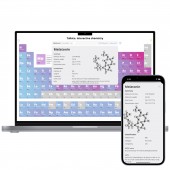
AM: The periodic table is a paradise for data visualization. Every element has dozens of properties that can be represented in so many different forms. I decided to create an interactive chemistry toolset built around the periodic table that would visualize the laws of chemistry in an attractive form. I wanted to introduce an educational tool that could immerse you into chemistry with its outstanding design. The main principle is the extreme simplicity of the interface. You see the periodic table, plain and clean. If you click on an element, it opens an information card. You type a formula and see a reaction with it. What could be easier? The interface looks obvious and one may not see a designer's work at all. That's what I tried to achieve, actually.
FS: What has been your main focus in designing this work? Especially what did you want to achieve?
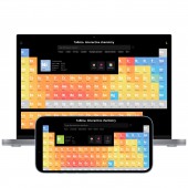
AM: I started with creating a fully adaptive periodic table. If you resize the window, the table will immediately adapt to the new width. In the mobile version, it switches to a special vertical version. This is my know-how. Originally, the periodic table is so wide you cannot fit it on a vertical screen. I changed its layout but preserved the periods' structure. If you rotate the phone horizontally, you'll see the original table. Then I developed a navigation system with the keyboard. You can navigate through the table with arrows. That was easy. What was more complex is to develop the smart field, which you can see above the table. If you type a chemical formula there, Talbica will automatically capitalize it: naoh will become NaOH. Sounds easy, but what if I type kco3, should it be KCO3 (Potassium Carbon Oxygen) or KCo3 (Potassium Cobalt)? Talbica has an intelligent input that recognizes formulas. Overall, the main focus was to create a chemistry toolset that doesn't make users think about those annoying things. Nobody wants to manually capitalize each element, and Talbica does this for you. If you use it as a chemist, you'll see that you don't think about how it works. It simply works.
FS: What are your future plans for this award winning design?
AM: I have plenty of plans. For example, I'm thinking about implementing an interactive nuclear synthesis. I'm also considering connecting a larger database of compounds and reactions, and proofreading it. I believe someday I'll release a paid professional version for students and laboratories.
FS: How long did it take you to design this particular concept?
AM: The original concept was born 15 years ago with the first version of Talbica, when I was in school. I don't remember spending much time thinking about it. It seemed just obvious: you click an element, you see all its data. To my surprise, not every competitor has this obvious mechanic. For some reason, they try to open a sidebar or put all data on the element card. Speaking about the current version, with its colors, adaptiveness, and seamless navigation, I think it took a month or two to conceive all these concepts and turn them into a working model.
FS: Why did you design this particular concept? Was this design commissioned or did you decide to pursuit an inspiration?
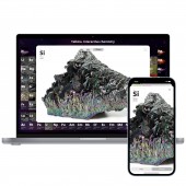
AM: The decision to resurrect Talbica was made when I studied UX Research and Design at the University of Michigan. I needed a project for my graduation work, and I chose my old school project for this role. That version was different from the current one, released in 2022. It lacked the element properties infographic and formula suggestions. It also didn't have element photos and the Photo mode itself. I added all these features to make Talbica less dry and more fun to learn. This is my own project, so I pursued my personal inspiration and wish to create the best chemistry toolkit.
FS: Is your design being produced or used by another company, or do you plan to sell or lease the production rights or do you intent to produce your work yourself?
AM: I'm the sole owner of the product. I don't think I'll ever sell it or even share it with anybody. I have another one for that purpose. However, I'm considering monetizing Talbica by adding a paid subscription for the pro version.
FS: What made you design this particular type of work?
AM: I invented Talbica 15 years ago when I was in school. Back then, I loved chemistry, and I was really good at it. But I struggled in computer classes. To help me improve, my parents bought me my first computer. It wasn't very powerful, so I couldn't play many games on it. That's when I started learning programming. Within a year, everything changed. I fell in love with computer classes, while I found organic chemistry more difficult to understand. I wanted to find a way to combine my knowledge of chemistry with my new programming skills. I came across an encyclopedia of computer software that had a computer version of the Periodic Table. I thought it was a great idea, but the program had a bad design. I believed I could create something much better. So, after a year, I released the first version of Talbica.
FS: Where there any other designs and/or designers that helped the influence the design of your work?
AM: Yes, of course. There are many different Periodic tables out there. The concept of opening an element card with detailed information is my own original idea. I borrowed the concept of a smart field from Google, for sure. And the original layout of the table was created by Mr. Mendeleev.
FS: Who is the target customer for his design?
AM: I target school and university students with Talbica. In schools, students require access to extensive information about elements for solving examples in both chemistry and physics. For instance, they often need data like melting point and resistivity for calculations. They also engage in reaction-solving activities. For university students and laboratory workers, Talbica serves as a valuable reference book for reactions. They can enter a compound they need to synthesize and find out the required reactants.
FS: What sets this design apart from other similar or resembling concepts?
AM: Adaptivity: Talbica works flawlessly on all widths, be it a large screen or a mobile phone. Visualization: nobody has Heat maps, infographics, and 3D models of compounds. Functionality: no other Periodic table can solve reactions.
FS: How did you come up with the name for this design? What does it mean?
AM: It's a play on words. There was an old Soviet movie where a magician always messed up everything. For instance, he used to say "talbet" instead of "tablet". I laughed out loud at this and swapped two letters in the word "Tablica", which means table in Slavic languages.
FS: Which design tools did you use when you were working on this project?
AM: Believe it or not, I didn't do any design at all. I work as both a designer and a developer, which gives me a significant advantage. I can skip the design phase and start programming the interface directly. However, for the competition, I had to submit some well-prepared screenshots. To accomplish this, I used Figma and recreated the interface based on the already functional product.
FS: What is the most unique aspect of your design?
AM: Outstanding infographics. I introduced a feature called "Heat maps," which I invented. By default, the elements of the table are colored based on their type, which is a standard but not very informative approach. However, I had the idea to paint them with a gradient of colors based on their physical properties. For example, you can overlay the table with element melting temperatures, resulting in an orange-blue gradient. This allows you to instantly visualize how the temperatures are distributed along the periodic table and its groups. You can apply this concept to other properties such as atomic radius, density, and more. These heat maps are visually stunning! I have never seen this feature anywhere before. Imagine how exciting it is to study chemistry with a tool like this.
FS: Who did you collaborate with for this design? Did you work with people with technical / specialized skills?
AM: The project is created solely by me. I requested my friends to evaluate and test the interface, and I also have a friend who is a professional chemist. He advised me to include a reactions database into the tool.
FS: What is the role of technology in this particular design?
AM: I attempted to create Talbica 3 several years ago. I saw it as a desktop software for Windows and even developed a demo version using .NET technology. However, I dismissed the project because it was too hard to implement all of my ideas. Software development was much more complex during that time. It was only around 5 years ago that web browsers evolved to a level that allowed for the relatively easy creation of products with the level of interactivity I desired. The role of technology is crucial in this regard. It had previously hindered me from bringing this design to life for many years.
FS: Is your design influenced by data or analytical research in any way? What kind of research did you conduct for making this design?
AM: Sure, I conducted UX research as well. It was a part of my graduation work too. I performed competitive analysis, used personas, collected a moodboard, and created a prototype. Then, my friend, who is a professional chemist, provided valuable insights. He highlighted the fact that chemists still rely on printed books to find reactions. He assured me that if I were to implement an electronic version of it, it would be successful. So, we can consider it a form of market research!
FS: What are some of the challenges you faced during the design/realization of your concept?
AM: The first challenge was technical. I had to collect large amounts of data, parse it, check for mistakes, and prepare it for use. The second challenge is the amount of user scenarios I had to implement as a designer.
FS: How did you decide to submit your design to an international design competition?
AM: It was spontaneous. I had never thought about participating in a competition before. It requires a lot of time and energy. However, one day I said to myself, "Hey, this design is outstanding, the world must see it!"
FS: What did you learn or how did you improve yourself during the designing of this work?
AM: I stopped being a perfectionist. I had too many ideas to incorporate into this project. Realizing all of them from the start was impossible, so I decided to focus on the major features. The remaining ones will be here soon, I hope!
FS: Any other things you would like to cover that have not been covered in these questions?
AM: Yes. I've been to 75 countries and always repeat to all designer: travel, and travel a lot. This helps to become a great designer much more than reading books. You need to see the world and understand how it works to grow up to mastery.
FS: Thank you for providing us with this opportunity to interview you.
A' Design Award and Competitions grants rights to press members and bloggers to use parts of this interview. This interview is provided as it is; DesignPRWire and A' Design Award and Competitions cannot be held responsible for the answers given by participating designers.
| SOCIAL |
| + Add to Likes / Favorites | Send to My Email | Comment | View Press-Release | Translations |


