| THE AWARD |
| CATEGORIES |
| REGISTRATION |
| SUBMIT YOUR WORK |
| ENTRY INSTRUCTIONS |
| TERMS & CONDITIONS |
| PUBLICATIONS |
| DATES & FEES |
| METHODOLOGY |
| CONTACT |
| WINNERS |
| PRESS ROOM |
| GET INVOLVED |
| DESIGN PRIZE |
| DESIGN STORE |
| THE AWARD | JURY | CATEGORIES | REGISTRATION | PRESS | WINNERS | PUBLICATIONS | ENTRY INSTRUCTIONS |
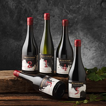
Montgras Handcrafted Wine Packaging by Ximena Ureta |
Home > Winners > Design #129606 >Interview |
 |
|
FS: What is the main principle, idea and inspiration behind your design?
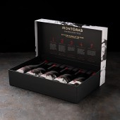
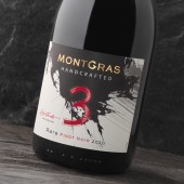
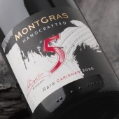
XU: Montgras Handcrafted is the consequence of a constant search to create distinctive and handmade products with a sense of origin. It is a line of unique wines, where five prestigious Chilean winemakers have chosen five different valleys to create wines from rare grape varieties, uncommon and different from conventional Chilean wines to surprise the drinker with innovative undertones. They are expressive, creative and are the winemaker’s answer to the passion for wine. MontGras Handcrafted is a range of very unique wines, worked on a small scale and with important axes of differentiation from other Chilean wine products. The strains, valleys and winemakers are presented as follows: White Wines: -Riesling, D.O. Mulchén, Bío-Bío Valley – Santiago Margozzini Red Wines: -Pinot Noir, Amaral Vineyard, D.O. Leyda Valley – Adolfo Hurtado -Cinsault, D.O. Guarilihue, Itata Valley – Alberto Antonini -Carignan, D.O. Crucesillas, Cauquenes Valley – Carla Dosque -Cabernet Franc, Intriga Vineyard, D.O. Linderos, Maipo Valley – Cristián Correa
FS: What has been your main focus in designing this work? Especially what did you want to achieve?
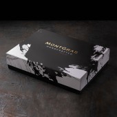
XU: It was to artistically represent the daring winemaking commitment of different Chilean winemakers, who have looked for and found rare strains, to create different, expressive, and sophisticated wines. This project is a tailor-made proposal that interprets the passionate and vehement spirit of this project. Each wine, that is to say, each winemaker has a different duo of arts. It's a series in which no bottle is the same because all arts are different. Also, the numerical fonts are all different in each wine. The challenge was to be able to create five different labels, but in such a way that they would form a unifying graphic line among them. Two arts were merged in each wine, performing ten arts in total, with five different font games in each issue, using types with serif, without serif and italics. The five different winemaking companies were also part of the change complexity in this project. All labels are highly expressive and have an individual personality. The requirement was to create a line with a restless, changing, and impetuous graphic, for wines with rare strains, from valleys located in distant parts of Chile and all harvested in 2020.
FS: What are your future plans for this award winning design?
XU: My advice for this packaging has satisfactorily met all its design and production stages. Oenologically, it has obtained several recognitions and I feel that visually it has achieved a differentiation that has met the expectations of all its creators. This packaging is currently sold in Chile and is planned for sale in the most important MontGras markets, focused on Asia (China, Korea, and Japan). But also Brazil, the UK, Taiwan, Hong Kong, Vietnam, Denmark, Holland, Germany, Mexico and Paraguay.
FS: How long did it take you to design this particular concept?
XU: It took about seven months to design the labels considering previous printing tests and three months to develop the container box.
FS: Why did you design this particular concept? Was this design commissioned or did you decide to pursuit an inspiration?
XU: This work was requested by MontGras. The oenological project was very interesting because of the freedom to interpret each product. It is not common to bring together five winemakers who search for rare vine strains in different valleys. It is the kind of project that when it comes, it poses a challenge so it become very absorbing, but at the same time a very rewarding job.
FS: Is your design being produced or used by another company, or do you plan to sell or lease the production rights or do you intent to produce your work yourself?
XU: This work belongs to MontGras, it was requested by them and they have the reproduction rights of the five strains.
FS: What made you design this particular type of work?
XU: My relationship with painting has always been present in my work as a designer. There are several design projects that have been complemented by art. Oenology is an art that involves different senses.
FS: Where there any other designs and/or designers that helped the influence the design of your work?
XU: In this particular project I have looked at many artists who, without having a similar style, have inspired me in my work, as is the case of Emma Larsson, who always surprises me with her watercolors.
FS: Who is the target customer for his design?
XU: Consumers from all over the world who want to expand and sophisticate their relationship with wine.
FS: What sets this design apart from other similar or resembling concepts?
XU: I don’t know of another project in Chile with five strange strains, five winemakers and five valleys to innovate oenologically, aimed at a more demanding public.
FS: How did you come up with the name for this design? What does it mean?
XU: MontGras Handcrafted was the name that MontGras created for this packaging, as well as the fact that each strain was accompanied by the word "rare". It was this name that gave this project the possibility of exploring paintings.
FS: Which design tools did you use when you were working on this project?
XU: I have worked with Adobe Photoshop and Adobe illustration.
FS: What is the most unique aspect of your design?
XU: To be able to incorporate my paintings into the packaging design - that is what makes it doubly interesting for me. Considering my physical space as a place of artistic exploration gives me a lot of pleasure and makes the selection of my work tools wider. To try different papers, brushes and techniques is always a pleasure. This work is the result of this multidisciplinary experience that I have been enriching for so many years. My physical and personal workspace is not a conventional office like when I was a young designer, today it is an experimental workshop.
FS: Who did you collaborate with for this design? Did you work with people with technical / specialized skills?
XU: Yes, I consulted technical specialists in the choice of the final printing finishes and they assisted me in the choice of resources to visually enhance the five labels and each of their changes in the arts.
FS: What is the role of technology in this particular design?
XU: This work was printed by Artica Impresores with a magnificent digital execution. With an HP Indigo 6900 machine and its termination applications in a Digimon. Mechanical relief. Silkscreen varnish with relief. The results met my expectations las well as those of MontGras. Artica is one of the printers that leads packaging printing in Chile.
FS: Is your design influenced by data or analytical research in any way? What kind of research did you conduct for making this design?
XU: There was a lot of visual research, both in artistic experimentation and in graphic exploration. Countless arts were created, as well as a considerable number of paintings that needed a proper fusion to generate tension and movement in each wine label. Each pair of arts had to make sure that the design with variable information of the label (winemakers, strains, and valleys) was kept in the same place. All typographic sets of numbers had to be different in a differentiated and integrative way.
FS: What are some of the challenges you faced during the design/realization of your concept?
XU: I had never designed five labels for the same packaging, I really liked all the work of creative experimentation. I am glad to know that my painting is equally well-considered just like my design work.
FS: How did you decide to submit your design to an international design competition?
XU: In recent years I’ve tended to choose my two or three best works and submit them to A' Design Award & Competition. My clients take great pride in their packaging when they are recognized by you.
FS: What did you learn or how did you improve yourself during the designing of this work?
XU: I have made labels with changes in format and color depending on the strain, for burgundy and borgoña bottles for the same design. This is the usual thing, here everything was more complex, the packaging needed different arts, which led to this work on a different scale in all aspects. The difficulty of managing the differences to achieve a unified packaging was very interesting.
FS: Any other things you would like to cover that have not been covered in these questions?
XU: Maybe just indicate how different my jobs are and that with each of them I feel fully satisfied. I like to enjoy the spontaneity of painting but also the precision and mathematics of my designs. I would like to thank you for recognizing my work, for making it visible, it is very interesting all the creative capital shown every year from so many places in the world is really interesting. It's admirable. Thanks a lot.
FS: Thank you for providing us with this opportunity to interview you.
A' Design Award and Competitions grants rights to press members and bloggers to use parts of this interview. This interview is provided as it is; DesignPRWire and A' Design Award and Competitions cannot be held responsible for the answers given by participating designers.
| SOCIAL |
| + Add to Likes / Favorites | Send to My Email | Comment | View Press-Release |
