| THE AWARD |
| CATEGORIES |
| REGISTRATION |
| SUBMIT YOUR WORK |
| ENTRY INSTRUCTIONS |
| TERMS & CONDITIONS |
| PUBLICATIONS |
| DATES & FEES |
| METHODOLOGY |
| CONTACT |
| WINNERS |
| PRESS ROOM |
| GET INVOLVED |
| DESIGN PRIZE |
| DESIGN STORE |
| THE AWARD | JURY | CATEGORIES | REGISTRATION | PRESS | WINNERS | PUBLICATIONS | ENTRY INSTRUCTIONS |
Uzidata Dashboard by Yen Kai Huang |
Home > Winners > Design #101262 >Interview |
 |
|
FS: What is the main principle, idea and inspiration behind your design?
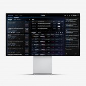
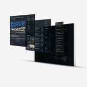
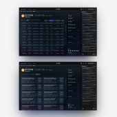
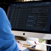
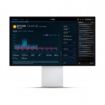
YH: My client came to me and ask me if I can design a high-tech feeling of a dashboard for them. So I took a lot of reference from the stock-trading software and HUD designs in the sci-fi movies. The tone is dark with the combination of blue and purple, suggesting a mysterious feeling of the future. In terms of user experience, we want to make sure that the usability and clarity are good. So there is only one main page for the product, the rest of the features like news, trading, currency details, wallets are in the form of popup. Besides, this product has a function for social networking. So we put a chat room on the right part of the dashboard. Users can always reach to the chatroom and exchange their ideas with other users in the community.
FS: What has been your main focus in designing this work? Especially what did you want to achieve?
YH: Consider the scenario that tons of information will be displayed to the users. Clarity and layout efficiency is our main concern. First, we decided to use a dark theme for our color scheme. This can increase readability for users. Also, a dark background relieves eye pressure from users and is more user-friendly for someone staring at the screen all day long. Second, we try our best to pack as much information as we can in a limited space without sacrificing usability. We use mono-type for typography so that users can still read the copy when it is small. In terms of tables and charts, we took a lot of effort to make sure that it is easy to read. Another challenge is to make everything responsive. To do that, we carefully calculate the margin between each section and determine which width of the column is flexible, which one is not. For the visual style, our client specifically asked us to adapt the tone of "techy" and "SciFi", making their product obtain the sense of sophistication but is easy to use.
FS: How long did it take you to design this particular concept?
YH: It took my team around 1.5-2 months to finalize the design. We spent most of the time communicating the structure of the products and the user flow. Additionally, designing the graph and charts was very challenging. We made some research in taking references from stock-trading software and fin-tech websites. This helped us significantly because trading crypto-currency is almost identical to stocks exchange. Another challenge was that most of the news was crawled from other media, so we need to make the UI more adaptable to the content from different sites in different formats.
FS: Who is the target customer for his design?
YH: this product is aimed for crypto-currency trader. Uzi dashboard provides them a combination of news integration, e-wallet, and currency trading. In terms of product design, it is a prospective idea that combining the element of trading software and social networking together. They are usually mutually exclusive. We can regard this product as an experiment of a futuristic form of financial service.
FS: Thank you for providing us with this opportunity to interview you.
A' Design Award and Competitions grants rights to press members and bloggers to use parts of this interview. This interview is provided as it is; DesignPRWire and A' Design Award and Competitions cannot be held responsible for the answers given by participating designers.
| SOCIAL |
| + Add to Likes / Favorites | Send to My Email | Comment | View Press-Release |
