Liquid Floors Showroom by WeWantMore |
Home > |
 |
|
||||
| DESIGN DETAILS | |||||
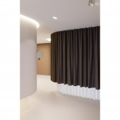
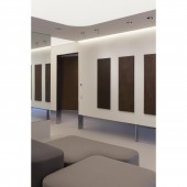
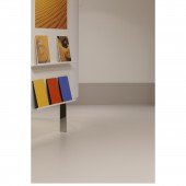
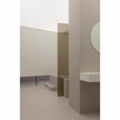
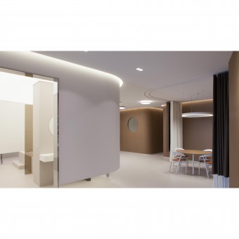
| DESIGN NAME: Liquid Floors PRIMARY FUNCTION: Showroom INSPIRATION: To emphasise both the warm and technical character of the product, the space needed a homey feel but with a rather clean and minimal design language. Applying the product in a realistic way instead of putting it on display makes it easier for future clients to envision it in their project. The earthy tones and minimal design create the kind of zen environment that's perfect to explain clients everything they need to know to be convinced of the Liquid Floor quality. UNIQUE PROPERTIES / PROJECT DESCRIPTION: Even more than showing the vast array of possibilities and colours, the Liquid Floors showroom evokes a sense of aesthetics and quality that appeals to architects and their clientele entering the place. They don't stumble upon the chunky blocks of drawers displaying the different colours you usually find in flooring showrooms but are invited to discover material applications, samples and finishing details in a natural and realistic way. OPERATION / FLOW / INTERACTION: Upon entry, visitors are welcomed in the front area of the showroom with its desk and XL screen showing several Liquid Floor projects. A large central organic element in the middle of the space separates the different areas and functions. On the left of it, a staircase shows the possible applications of Liquid Floor materials on stairs while the right side displays an array of available colours and finishes, neatly displayed as if it were paintings in an atelier or gallery. Within the central room a minimal bathroom demonstrates the application on both floor, walls and furniture.The back area can be divided into separate client zones by nicely contrasting curtains. PROJECT DURATION AND LOCATION: opening of the project was december 2018 Location : Vosveld 11a, 2110 Wijnegem belgium FITS BEST INTO CATEGORY: Interior Space and Exhibition Design |
PRODUCTION / REALIZATION TECHNOLOGY: The owner of Liquid Floors is also the owner of Kanvas (stretch ceilings). We have used the Kanvas products to create the acoustic and intimate organic box in the showroom where the new collections of liquid floors can be displayed in an exhibition/museum setting. SPECIFICATIONS / TECHNICAL PROPERTIES: 250 M2 TAGS: showroom, design, organic, natural, kanvas, liquid, interior, exhibition RESEARCH ABSTRACT: Inspirational research was conducted through discussions and interviews with the owner of Liquid Floors and visits to the former showroom. CHALLENGE: The challenge was to find a natural flow and layout of the available space, keeping in mind the course of the sales talks while showing the different applications of the Liquid Floor products at the same time. Instead of showing different colours and finished on the floor of seperated areas we chose to have one main colour and finish on the entire floor surface to emphasise on the beauty of the product in large spaces. To bring this effect out even more, the walls of the central dividing element don't touch the floor and the supporting metal structure is highly polished to seemingly disappear. ADDED DATE: 2019-02-26 21:46:39 TEAM MEMBERS (4) : Creative Director: Ruud Belmans , Design Director: Carine Aussems , Client Service Director: Tom Vanhemelrijck and IMAGE CREDITS: Image 1: Studio Bild Image 2: Studio Bild Image 3: Studio Bild Image 4: Studio Bild Image 5: Studio Bild |
||||
| Visit the following page to learn more: https://wewantmore.studio/work/liquid-fl |
|||||
| AWARD DETAILS | |
 |
Liquid Floors Showroom by Wewantmore is Runner-up for A' Design Award in Interior Space and Exhibition Design Category, 2018 - 2019.· Press Members: Login or Register to request an exclusive interview with WeWantMore. · Click here to register inorder to view the profile and other works by WeWantMore. |
| SOCIAL |
| + Add to Likes / Favorites | Send to My Email | Comment | Testimonials |

