Cereal Code Customizable Snack by Eunbi Yun, Jinsol Lee and Hyeona Lee |
Home > Winners > #73287 |
 |
|
||||
| DESIGN DETAILS | |||||
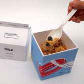
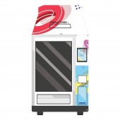
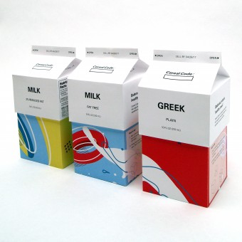
| DESIGN NAME: Cereal Code PRIMARY FUNCTION: Customizable Snack INSPIRATION: The inspiration for cereal code came from a vending machine. "How to get a full/healthy meals when you are in a hurry?" That's the main pain point we wanted to solve. It should be "Quick" "Simple" but also, it should be "Nutritious&quo UNIQUE PROPERTIES / PROJECT DESCRIPTION: Cereal Code is a full meal for those in a hurry. It helps its customers benefit from enjoying a complete meal any time of the day. As can show its name, it is a combination of Cereal and Code which came from a Vending machine code from each choice by customers. The customer builds a snack of cereals, toppings, and either milk or yogurt. The customized meal has own codes by code entry and the final combination becomes to its name. The possibilities are as endless as the vending machine options! OPERATION / FLOW / INTERACTION: Here is the way to get Cereal Code. The customer approaches the vending machine and uses the available touchscreen to begin the purchasing experience. She is prompted by the screen to begin selecting dry ingredients. While she makes her selections, the machine is stacking the ingredients inside the box. She does not need to fill the box completely, but the on-screen monitor tells her when she has reached the limit, as the box has space reserved for the milk or yogurt when the ingredients are later combined by hand. After filling the box to her satisfaction, the customer will then select a carton of milk or yogurt to be included. As the transaction is completed, the machine stacks the carton on top of the box. The customer now has a carrying solution that makes healthy snacking convenient and simple, with no mess or preparation. PROJECT DURATION AND LOCATION: The project started in January 2017 and finished in April 2017 in Atlanta, Georgia and it was published in "International Yearbook Communication Design 2017/2018" in November 2017. FITS BEST INTO CATEGORY: Graphics, Illustration and Visual Communication Design |
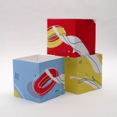
PRODUCTION / REALIZATION TECHNOLOGY: Our main concern was about how we get full balanced cereals when we're in hurry. We brought a vending machine concept to get accessibility to our main target easily. Then, it needed two separate packages for cereal/topping and milk/yogurt. Also, all the package should be customizable in the vending machine by a customer. And, the customer should have one finished package at the end of the choice. From all of the concern and research, we reached two separated package from a carton of milk. SPECIFICATIONS / TECHNICAL PROPERTIES: Whole Cereal Code Package Size: Width 74mm x Depth 74mm x Hight 150mm Carton of milk/yogurt (The upper box): Width 74mm x Depth 74mm x Height 90mm Cereal/Topping box (The bottom box): Width 70mm x Depth 70mm x Height 73mm Vending Machin: Width 980mm x Depth 810mm x Height 1900mm TAGS: Customizable, Healthy, Meals, Cereal, Vending Machine, Package Design, Brand Identity RESEARCH ABSTRACT: Cereal code start from a pain point in our real life. We have a question about "How we get a better snack/meals easily than getting junk food?" Then, we expand it, "How we get healthy food for those in a hurry" As a research study for that First, we looked into lunchtime and menu for people who were in hurries, such as students and workers. Then, we set up our personas who have different ages and occupations. We studied their lifestyles, thoughts, and could build up correct targeting. CHALLENGE: The process to develop a package was the most complicated and time-consuming part. We needed to build up the new design which did not exist before. Until we built two separated package from a carton of milk, we had to consider, the structure and convenience of the package for practicality. It has to be separated into two pieces for cereal and milk/yogurt. The cereal package has to be able to hold various toppings, and it shouldn't be packaged as a whole to be customizable by the users. ADDED DATE: 2018-12-13 03:48:48 TEAM MEMBERS (3) : Designer: Eunbi Yun, Designer: Jinsol Lee and Designer: Hyeona Lee IMAGE CREDITS: Main image #1, Optional image #2-5: Photographer / Director / Designer, Eunbi Yun, Jinsol Lee, Hyeona Lee |
||||
| Visit the following page to learn more: http://eunbiyun.com/cerealcode | |||||
| AWARD DETAILS | |
 |
Cereal Code Customizable Snack by Eunbi Yun, Jinsol Lee and Hyeona Lee is Winner in Meta, Strategic and Service Design Category, 2018 - 2019.· Press Members: Login or Register to request an exclusive interview with Eunbi Yun, Jinsol Lee and Hyeona Lee. · Click here to register inorder to view the profile and other works by Eunbi Yun, Jinsol Lee and Hyeona Lee. |
| SOCIAL |
| + Add to Likes / Favorites | Send to My Email | Comment | Testimonials | View Press-Release | Press Kit |

