DESIGN NAME:
Water Funs Corporate Identity
PRIMARY FUNCTION:
Corporate Identity
INSPIRATION:
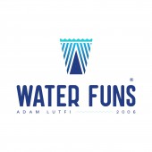
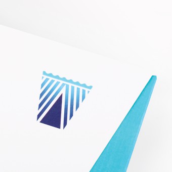
Inspired by water element as well as alphabets W and A, which is respectively the initial for Water and the name of the founder Adam, the Water Funs logo is formed in the most explicit manner to leave a profound first impression on consumers. As a high-end brand, the logo has to be straightforward and engaging. On top of that, three different contemporary wave patterns were designed to cater to the brand’s need.
UNIQUE PROPERTIES / PROJECT DESCRIPTION:
Client Water Funs has requested to instil the founder’s name, Adam into the brand. Therefore, several designs were attempted to assimilate the alphabets W and A, as well as water element onto the logo. As a result, three different patterns were designed with rippling water effect to meet the scalability of the brand. The uniqueness of this design is that it has three different wave patterns that share the same theme.
OPERATION / FLOW / INTERACTION:
Water element was infused into the brand as water is essential in the formation of life. Water Funs abides to strict regulations, produces high quality products via the latest production technology and maintain the stringent rules of cleanliness. It is time for the brand to greet the market with a refreshing image.
PROJECT DURATION AND LOCATION:
The project started in July 2017. Designing and drafting were done in August and by November, all departments in the company started adopting the new design.
FITS BEST INTO CATEGORY:
Graphics, Illustration and Visual Communication Design
|
PRODUCTION / REALIZATION TECHNOLOGY:
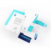
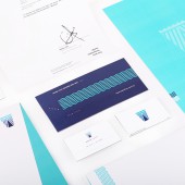
Bright White Rives Dot was chosen as the paper material of the item. As for name card and membership cards, Plike Blue 200g is used.
Other items include folder 250g, envelopes 150g, letter head 110g, name card 120g Bright White add on 200g Plike blue and member card 120g Bright White add on 200g Plike blue.
SPECIFICATIONS / TECHNICAL PROPERTIES:
Folder size 220mm x 314mm x 5mm
Envelopes 220mm x 110mm
Letter Heat 210mm x 297mm
Name Card 85mm x 50mm
Member Card 180mm x 80mm
TAGS:
Malaysia brand, water, Malaysia design
RESEARCH ABSTRACT:
Extensive research was conducted on several water products of local and overseas competitors where different characteristics and designs were adopted to attract consumers. In order to stand out among other like products, the logo was presented in a simplistic format with plain colors for a clean, minimalist style. The main focus of this project is to upgrade the image of the brand and make it stand out in the market.
CHALLENGE:
The brand 'Water Funs' needs to be retained as it is already a renowned brand in Pahang state of Malaysia. The main challenge is to modernize the brand image, and attract younger consumers with its new, refreshing new design.
ADDED DATE:
2018-02-07 05:31:59
TEAM MEMBERS (3) :
Designer : Shawn Goh Chin Siang, Copywriter: Joann Yeong Chai Wei and Sponsor : Adam Lutfi Trading Sdn. Bhd.
IMAGE CREDITS:
Shawn Goh graphic design lab.
PATENTS/COPYRIGHTS:
Copyright ©2018 Shawn Goh Chin Siang. All rights reserved.
|
