DESIGN NAME:
Acooroo
PRIMARY FUNCTION:
Brand Identity
INSPIRATION:
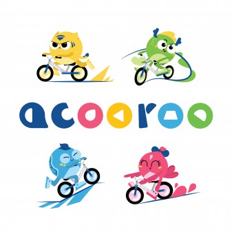
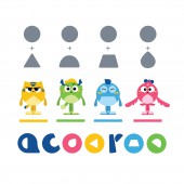
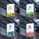
Interesting characters and storytelling engage the viewer in a powerful way. That's where the design started: introducing the mascots and a story of them being companions to the children for their bike adventures. They are based on 'The Four Divine Beasts' in Chinese culture and each one is adapted to represent one of the four balance bike riding skills (speeding up, curving, climbing, sliding). The shapes language is inspired by the movements of these skills.
UNIQUE PROPERTIES / PROJECT DESCRIPTION:
Acooroo focuses on creating fun balance bike riding services/events for preschool children in China. To portray the brand's playfulness and connect it with its audience, the identity design introduces four mascots as children's friends/training buddies for balance bike riding. And the whole identity utilizes simple shape and color languages throughout all visual elements to create a cohesive experience.
OPERATION / FLOW / INTERACTION:
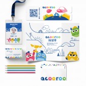
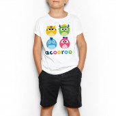
The mascots in Acooroo's visual identity are designed to connect with children by delivering information from the brand in an engaging way. And they could also be integrated into balance bike plus children related product like toys, apparel and biking equipment. The shapes and colors are designed to create a visual language system, which is used to construct additional texture and environmental graphics children could play with.
PROJECT DURATION AND LOCATION:
The visual identity project started in June 2017 and finished in December 2017.
FITS BEST INTO CATEGORY:
Graphics, Illustration and Visual Communication Design
|
PRODUCTION / REALIZATION TECHNOLOGY:
The design process involves simplifying the look of each 'Divine Beasts' (Tiger, Dragon, Turtle, Finch) to create a stylized form, and trying to symbolize them as much as possible by using simple shapes. During the process, numerous sketches and compositing tests were made to explore how the shape language of each mascot can be shared and applied in the logo and other visual elements like environmental graphic and patterns.
SPECIFICATIONS / TECHNICAL PROPERTIES:
The identity design includes a logo, primary colors and secondary colors system, four mascots in different views (designed for 3D products like toys), guidelines for font, pattern and composing illustration using the visual system. In addition, design application was made including action poses for the mascots, business card, environmental graphics, events tickets, apparels, etc.
TAGS:
Branding, Logo, VI, Children Product, Visual Communication, Graphic, Illustration
RESEARCH ABSTRACT:
Lots of attention were paid in analyzing how children between 3-6 perceive and interact with the world. Bright, pure colors and simple shapes were choose based on their still emerging skills in processing visual information. The visual system is able to construct elements in great variety to satisfy and support children's increasing curiosity to explore. Details like the rounded corner in shapes were added to create a sense of safety based on the feedback of a customers sample.
CHALLENGE:
The main challenge is to develop a simple visual language that can be easily recognized by preschool children, and flexible enough to construct all graphical elements the brand might use.
ADDED DATE:
2018-01-31 05:39:01
TEAM MEMBERS (1) :
IMAGE CREDITS:
Siran Liu, 2017.
|
